当前位置:网站首页>Hands on data analysis unit 2 section 4 data visualization
Hands on data analysis unit 2 section 4 data visualization
2022-06-23 17:17:00 【Cangye 2021】
hands-on-data-analysis Unit two Section 4 data visualization
List of articles
- hands-on-data-analysis Unit two Section 4 data visualization
- 1. Simple drawing
- 2. Visually display the distribution of survival numbers between men and women in the Titanic data set
- 3. Visually display the proportion of survival and death of men and women in the Titanic data set
- 4. Visually display the distribution of survival and death toll of people with different ticket prices in the Titanic data set .
- 5. Visually display the distribution of survival and death of people at different positions in the Titanic data set
- 6. Visually display the distribution of life and death at different ages in the Titanic data set
- 7. Visually display the age distribution of people in different positions in the Titanic dataset .
1. Simple drawing
1.1. Import library
#inline Indicates embedding a chart into Notebook in
%matplotlib inline
import numpy as np
import pandas as pd
import matplotlib.pyplot as plt
1.2. Basic drawing examples
import numpy as np
data  = np.arange(10)
data
plt.plot(data)

1.3. Examples of subgraphs
fig = plt.figure()
ax1 = fig.add_subplot(2,2,1)
ax2 = fig.add_subplot(2,2,2)
ax3 = fig.add_subplot(2,2,3)
ax4 = fig.add_subplot(2,2,4)

1.4. Example of subgraph drawing
fig = plt.figure()
ax1 = fig.add_subplot(2,2,1)
ax2 = fig.add_subplot(2,2,2)
ax3 = fig.add_subplot(2,2,3)
#k-- Is an option to draw black segment lines
plt.plot(np.random.randn(50).cumsum(),'k--')
_ = ax1.hist(np.random.randn(100),bins=20,color='k',alpha=0.3)
ax2.scatter(np.arange(30),np.arange(30)+3*np.random.randn(30))

1.5. pyplot.subplots Options
| Parameters | describe |
|---|---|
| nrows | Row number of subgraphs |
| ncols | Number of columns in a subgraph |
| sharex | All subgraphs use the same x Axis scale ( adjustment xlim Will affect all subgraphs ) |
| sharey | All subgraphs use the same y Axis scale ( adjustment ylim Will affect all subgraphs ) |
| subplot_kw | Pass in add_subplot Keyword parameter Dictionary of , Used to generate subgraphs |
| **fig_kw | Additional keyword parameters used when generating images , for example plt.subplot(2,2,figsize(8,6)) |
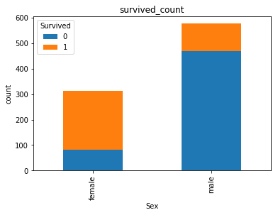
2. Visually display the distribution of survival numbers between men and women in the Titanic data set
sex = text.groupby('Sex')['Survived'].sum()
sex.plot.bar()
plt.title('survived_count')
plt.show()

3. Visually display the proportion of survival and death of men and women in the Titanic data set
text.groupby(['Sex','Survived'])['Survived'].count().unstack().plot(kind='bar',stacked='True')
plt.title('survived_count')
plt.ylabel('count')
4. Visually display the distribution of survival and death toll of people with different ticket prices in the Titanic data set .
#  Calculate the number of survival and death in different ticket prices  1 It means survival ,0 It means death
fare_sur = text.groupby(['Fare'])['Survived'].value_counts().sort_values(ascending=False)
fare_sur
fig = plt.figure(figsize=(20, 18))
fare_sur.plot(grid=True)
plt.legend()
plt.show()

5. Visually display the distribution of survival and death of people at different positions in the Titanic data set
# 1 It means survival ,0 It means death
pclass_sur = text.groupby(['Pclass'])['Survived'].value_counts()
pclass_sur
import seaborn as sns
sns.countplot(x="Pclass", hue="Survived", data=text)
6. Visually display the distribution of life and death at different ages in the Titanic data set
facet = sns.FacetGrid(text, hue="Survived",aspect=3)
facet.map(sns.kdeplot,'Age',shade= True)
facet.set(xlim=(0, text['Age'].max()))
facet.add_legend()

7. Visually display the age distribution of people in different positions in the Titanic dataset .
text.Age[text.Pclass == 1].plot(kind='kde')
text.Age[text.Pclass == 2].plot(kind='kde')
text.Age[text.Pclass == 3].plot(kind='kde')
plt.xlabel("age")
plt.legend((1,2,3),loc="best")

边栏推荐
- Safe and comfortable, a new generation of Qijun carefully interprets the love of the old father
- 千呼万唤,5G双卡双通到底有多重要?
- 你女朋友也能读懂的LAMP架构
- C. Add One--Divide by Zero 2021 and Codeforces Round #714 (Div. 2)
- 电感参数有哪些?怎么选择电感?
- MySQL事务及其特性与锁机制
- Mathematical analysis_ Certification_ Chapter 1: the union of countable sets is countable
- Opengauss database source code analysis series articles -- detailed explanation of dense equivalent query technology (Part 1)
- ABAP essay - material master data interface enhancement
- Right leg drive circuit principle? ECG acquisition is a must, with simulation files!
猜你喜欢
![[network communication -- webrtc] analysis of webrtc source code -- supplement of pacingcontroller related knowledge points](/img/18/dda0c7fa33ee6cdf2bbb2f85099940.png)
[network communication -- webrtc] analysis of webrtc source code -- supplement of pacingcontroller related knowledge points
![Leetcode: interview question 08.13 Stacking bin [top-down DFS + memory or bottom-up sorting + DP]](/img/22/220e802da7543c2b14b7057e4458b7.png)
Leetcode: interview question 08.13 Stacking bin [top-down DFS + memory or bottom-up sorting + DP]

Google Play Academy 组队 PK 赛,火热进行中!

《MPLS和VP体系结构》

数据库 实验二 查询

Mathematical analysis_ Certification_ Chapter 1: the union of countable sets is countable
Shushulang passed the listing hearing: the gross profit margin of the tablet business fell, and the profit in 2021 fell by 11% year-on-year

Interface ownership dispute

QT当中的【QSetting和.ini配置文件】以及【创建Resources.qrc】
![[network communication -- webrtc] source code analysis of webrtc -- bandwidth estimation at the receiving end](/img/b0/97dbf3d07a4ed86d6650a58a97a5fc.png)
[network communication -- webrtc] source code analysis of webrtc -- bandwidth estimation at the receiving end
随机推荐
供求两端的对接将不再是依靠互联网时代的平台和中心来实现的
JMeter stress testing tutorial
Elk log collection system deployment
Network remote access raspberry pie (VNC viewer)
ABP framework - data access infrastructure (Part 2)
WebSocket能干些啥?
The R language uses the RMSE function of the yardstick package to evaluate the performance of the regression model, the RMSE of the regression model on each fold of each cross validation (or resamplin
QT当中的【QSetting和.ini配置文件】以及【创建Resources.qrc】
TensorRT Paser加载onnx 推理使用
[go] calling Alipay to scan code for payment in a sandbox environment
图扑软件数字孪生挖掘机实现远程操控
三分钟学会如何找回mysql密码
手机开户股票开户需要多久?在线开户安全么?
【30. 串联所有单词的子串】
How to select securities companies? Is it safe to open a mobile account?
Can the asemi fast recovery diodes RS1M, us1m and US1G be replaced with each other
Rongyun: let the bank go to the "cloud" easily
数字经济加速落地,能为中小企业带来什么?
Apache foundation officially announced Apache inlong as a top-level project
Mathematical analysis_ Certification_ Chapter 1: the union of countable sets is countable