当前位置:网站首页>Learn SCI thesis drawing skills (f)
Learn SCI thesis drawing skills (f)
2022-06-23 09:15:00 【Zhuangshan】
brief introduction
In the process of consulting the literature , I saw some very good published pictures , Today, I'll study with Xiaobian , How they use R Drawn out .

Today is mainly about Picture 6 (F) —— Four dimensional scatter diagram , This figure is also commonly used in scientific research drawings . It can display data of multiple dimensions .
The detailed code introduction of the first five figures can be seen : be based on R Detailed explanation of drawing skills of scientific research papers in language (4)、 be based on R Detailed explanation of drawing skills of scientific research papers in language (3) be based on R Detailed explanation of drawing skills of scientific research papers in language (2) be based on R Detailed explanation of drawing skills of scientific research papers in language (1) . The last picture will be introduced later , Readers in the process of learning , You can apply the internal knowledge points to your own graphics drawing . Twitter has listed the main knowledge points , It is more conducive for readers to learn and consult .
So let's see , How does the author realize this function , There are many knowledge points in this article , Let's study patiently , Suggest that you practice . The corresponding code 、 Data can be found in GitHub - marco-meer/scifig_plot_examples_R: Scientific publication figure plotting examples with R Find .
mapping
Load package
First, load some packages that need to be used .
library(ggplot2)
library(viridis) #  Use color styles
Set the theme
Next , For convenience , The author set the theme before drawing , And name the function my_theme.
This part is in First tweet give , The complete code will be given at the end of the text .
Manually modify most panels , For details, please refer to this chapter article . Or watch me B Station issued 《R Language visualization course 》, There are also some simple topic settings .
Import data
use first read.csv() Import four-dimensional data , front 6 The row data is as follows .
data_F = read.csv("./data_F.csv")
head(data_F)
# K n amplitude duration
1 32.586025 3.065018  21.95444 2.3242144
2  9.012644 2.358836  60.16122 1.0029049
3 10.814589 1.829281  25.99396 0.5406435
4 23.560813 1.709909  61.18815 2.7394397
5  7.626436 1.566929  54.41945 0.7152433
6 15.295503 2.276775  39.79195 0.8423647
Drawing graphics
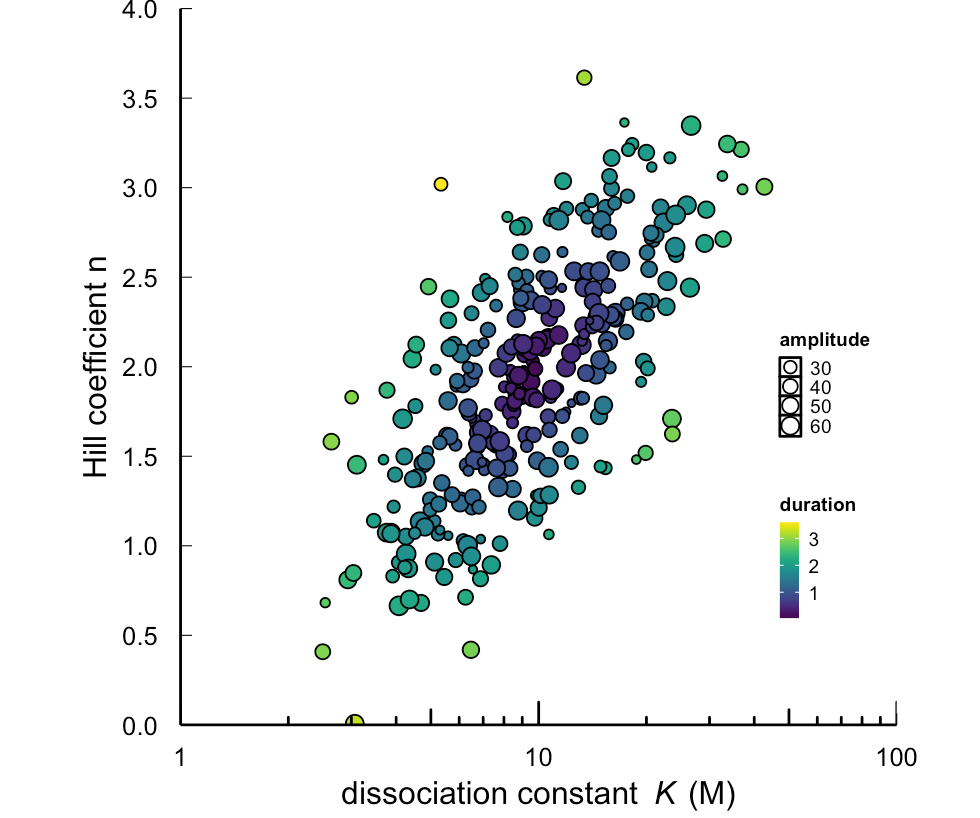
Draw a simple scatter diagram geom_point(),amplitude To set shape size ,duration As the filling basis .
base_size = 12
ggplot(data=data_F,
                  aes(x=K,y=n,
                      size=amplitude,
                      fill=duration))+
  geom_point(pch=21)
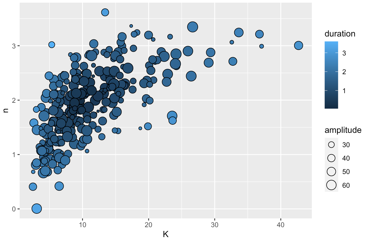
Add theme , And modify it x、y Axis scales and labels .
Be careful :x Axis into logarithmic scale (
trans = 'log10').
my_theme() +
  scale_x_continuous(expand = c(0, 0),
                     trans = 'log10',
                     labels=c(1,10,100),
                     breaks=c(1,10,100),
                     limits = c(1,100)) +
  scale_y_continuous(expand = c(0, 0),
                     breaks=c(seq(0,4,by=0.5)),
                     limits = c(0,4)) + +
  xlab(expression(paste("dissociation constant",~~italic("K")," (M)"))) +
  ylab("Hill coefficient n")

Use annotation_logticks() Add logarithmic scale .scale_size(range = c(1, 3)) Modify the size range of scatter points . It also uses viridis Color styles in the package scale_fill_viridis(option="D"). Finally, modify the legend position theme(legend.position = c(0.9,0.35)).
  annotation_logticks(sides='b') + # Add logarithmic scale
  scale_size(range = c(1, 3)) + # The size range of the scatter
  scale_fill_viridis(option="D") + # Color style
  theme(legend.position = c(0.9,0.35))  # Change the legend position
however , There is a point at bottom that is not clearly shown , Here the author uses a trick ( The last article also used ), Show these points clearly . Let's see the effect of this code :
coord_cartesian(clip = "off")

Complete code
# Panel F ----
library(ggplot2)
library(vi)
base_size = 12
my_theme <-  function() {

  theme(
    aspect.ratio = 1,
    axis.line =element_line(colour = "black"),

    # shift axis text closer to axis bc ticks are facing inwards
    axis.text.x = element_text(size = base_size*0.8, color = "black",
                               lineheight = 0.9,
                               margin=unit(c(0.3,0.3,0.3,0.3), "cm")),
    axis.text.y = element_text(size = base_size*0.8, color = "black",
                               lineheight = 0.9,
                               margin=unit(c(0.3,0.3,0.3,0.3), "cm")),

    axis.ticks = element_line(color = "black", size  =  0.2),
    axis.title.x = element_text(size = base_size,
                                color = "black",
                                margin = margin(t = -5)),
    # t (top), r (right), b (bottom), l (left)
    axis.title.y = element_text(size = base_size,
                                color = "black", angle = 90,
                                margin = margin(r = -5)),
    axis.ticks.length = unit(-0.3, "lines"),
    legend.background = element_rect(color = NA,
                                     fill = NA),
    legend.key = element_rect(color = "black",
                              fill = "white"),
    legend.key.size = unit(0.5, "lines"),
    legend.key.height =NULL,
    legend.key.width = NULL,
    legend.text = element_text(size = 0.6*base_size,
                               color = "black"),
    legend.title = element_text(size = 0.6*base_size,
                                face = "bold",
                                hjust = 0,
                                color = "black"),
    legend.text.align = NULL,
    legend.title.align = NULL,
    legend.direction = "vertical",
    legend.box = NULL,
    panel.background = element_rect(fill = "white",
                                    color  =  NA),
    panel.grid.major = element_blank(),
    panel.grid.minor = element_blank(),
    plot.title = element_text(size = base_size,
                              color = "black"),
  )

}

data_F = read.csv("./data_F.csv")
head(data_F)
panel_F <- ggplot(data=data_F,
                  aes(x=K,y=n,
                      size=amplitude,
                      fill=duration))+
  geom_point(pch=21) +
  my_theme() +
  scale_x_continuous(expand = c(0, 0),
                     trans = 'log10',
                     labels=c(1,10,100),
                     breaks=c(1,10,100),
                     limits = c(1,100)) +
  scale_y_continuous(expand = c(0, 0),
                     breaks=c(seq(0,4,by=0.5)),
                     limits = c(0,4)) +
  xlab(expression(paste("dissociation constant",~~italic("K")," (M)"))) +
  ylab("Hill coefficient n") +
  annotation_logticks(sides='b') +
  scale_size(range = c(1, 3)) +
  scale_fill_viridis(option="D") + # a color palette from the viridis package
  theme(legend.position = c(0.9,0.35)) +
  coord_cartesian(clip = "off")

panel_F
Small make up has words
The main knowledge points learned in this paper are as follows :
- Use
annotation_logticks()Add logarithmic scale . - Use
scale_size()Modify the size range of scatter points ; - Use viridis Color styles in the package
scale_fill_viridis(); - Use
theme(legend.position = )Change the legend position .
After reading this article , Believe that your skill pack has more things . Remember to practice ! Reading it doesn't mean you will ~ If you find the content useful , Prepared by Xiaowen with intention . Give me a cup of coffee !
边栏推荐
- Flink错误--Caused by: org.apache.calcite.sql.parser.SqlParseException: Encountered “time“
- Custom tag - JSP tag Foundation
- 【活动报名】SOFAStack × CSDN 联合举办开源系列 Meetup ,6 月 24 日火热开启
- Learn SCI thesis drawing skills (E)
- Redis学习笔记—发布订阅
- Redis learning notes - Database Management
- How postman does interface testing 1: how to import swagger interface documents
- General paging (1)
- How to use "tomato working method" in flowus, notation and other note taking software?
- ionic5表单输入框和单选按钮
猜你喜欢

Redis learning notes RDB of persistence mechanism

Quartz Crystal Drive Level Calculation

S5P4418裸机编程的实现(替换2ndboot)

社区文章|MOSN 构建 Subset 优化思路分享

简易学生管理
Redis learning notes - slow query analysis

GeoServer adding mongodb data source
Redis learning notes - data type: string (string)

Which is better, semrush or ahrefs? Which is more suitable for GoogleSEO keyword analysis
Redis学习笔记—持久化机制之AOF

随机推荐
Jog运动模式
Redis学习笔记—数据类型:字符串(string)
Redis学习笔记—持久化机制之RDB
Redis learning notes - traverse key
Aiming at the overseas pet market, "grasshand" has developed an intelligent tracking product independent of mobile phones | early project
Custom tags - JSP tag enhancements
Redis learning notes - detailed explanation of redis benchmark
力扣之滑动窗口《循序渐进》(209.长度最小的子数组、904. 水果成篮)
进入小公司的初级程序员要如何自我提高?
How to use matrix analysis to build your thinking scaffold in flowus, notation and other note taking software
什么是闭包函数
三层架构与SSM之间的对应关系
cooding代码库的使用笔记
Quartz Crystal Drive Level Calculation
Redis学习笔记—遍历键
Structure binary tree from preorder and inorder traversal for leetcode topic analysis
位绑定
S5P4418裸机编程的实现(替换2ndboot)
自定义标签——jsp标签增强
Redis学习笔记—redis-cli详解