当前位置:网站首页>Jetpack compose layout (I) - basic knowledge of layout
Jetpack compose layout (I) - basic knowledge of layout
2022-06-25 09:51:00 【seevc】
In the first chapter 《Jetpack Compose Get started quickly 》 In this article, we briefly introduce Compose, So here we are going to learn Compose Layout . Because the layout involves a lot of content , Can write separately .
The layout mainly includes : Layout Basics 、Material Components and layout 、 Custom layout 、Compose Use in ConstraintLayout.
This article focuses on Layout Basics .
Mainly involves : Composable function 、 Standard layout elements 、 Basic components 、 Layout model 、 Modifier 、 Slot layout . Here's the picture :
Composable function
Composable functions are Compose The basic building blocks of , The return value is Unit Function of , Used to describe a part of the interface , This function can accept parameters .
Composite functions can contain multiple interface elements .
Its basic format is :
@Composable
fun xxx():Unit{
....
}
Standard layout elements
stay Compose There are three layout elements in the standard :Box、Column、Row.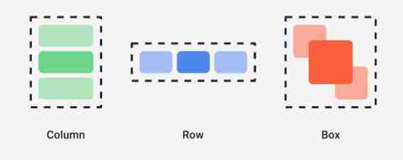
Box
Overlapping layout , similar Android View In the system FramLayout Layout , The elements overlap , Its prototype is defined as follows :
@Composable
inline fun Box(
    modifier: Modifier = Modifier,                   // Modifier
    contentAlignment: Alignment = Alignment.TopStart,// Location of content
    propagateMinConstraints: Boolean = false,       // Whether the minimum constraint passed in should be passed to the content
    content: @Composable BoxScope.() -> Unit    // Content , Interface elements
) {
    ......
}
Example
/**
 *  Standard layout  - Box
 */
@Composable
fun BoxExample(){
    Box (
        modifier = Modifier.size(width = 230.dp,height = 100.dp),
        contentAlignment = Alignment.Center
    ){  // Corresponding content Parameters  lambda On expression
        Text(text = "Text 1")
        Text(text = "Text 2")
    }
}

Column
Vertical layout , Arrange the interface elements in the vertical direction . The source code is defined as follows :
@Composable
inline fun Column(
    modifier: Modifier = Modifier,          // Modifier
    verticalArrangement: Arrangement.Vertical = Arrangement.Top,  // The vertical distribution of content elements
    horizontalAlignment: Alignment.Horizontal = Alignment.Start,    // The horizontal distribution of content elements
    content: @Composable ColumnScope.() -> Unit                      // Internal elements
) {
    ......
}
example
/**
 *  Standard layout  - Column
 */
@Composable
fun ColumnExample(){
    Column (
        modifier = Modifier.size(width = 230.dp,height = 100.dp),
        verticalArrangement = Arrangement.Center,// Center vertically
        horizontalAlignment = Alignment.End      // Horizontal to the right
    ){  // Corresponding content Parameters  lambda On expression
        Text(text = "Text 111")
        Text(text = "Text 666666")
    }
}

Row
Horizontal distribution of elements , The source code defines :
@Composable
inline fun Row(
    modifier: Modifier = Modifier,          // Modifier
    horizontalArrangement: Arrangement.Horizontal = Arrangement.Start,// Horizontal arrangement
    verticalAlignment: Alignment.Vertical = Alignment.Top,      // Vertical element arrangement
    content: @Composable RowScope.() -> Unit          // Inner subelements
) {
    ......
}
Example
/**
 *  Standard layout  - Row
 */
@Composable
fun RowExample(){
    Row (
        modifier = Modifier.size(width = 230.dp,height = 100.dp),
        horizontalArrangement = Arrangement.SpaceAround,
        verticalAlignment = Alignment.Bottom
    ){  // Corresponding content Parameters  lambda On expression
        Text(text = "Text 111")
        Text(text = "Text 666666")
    }
}

Basic components
Jetpack Compose The component library in includes :compose-ui and material. Many common basic components are in material In the library ,Compose-ui There are few components in the :Image、BasicTextField( Input box ).
Example :
// Add a picture
Image(
      // Fill in the content
      painter = painterResource(id = message.iconId),
      contentDescription = "logo",
      // Size and shape
      modifier= Modifier
          .padding(top = 2.dp)
          .size(40.dp)             // Image size
          .clip(CircleShape)       // shape
          .border(1.5.dp, MaterialTheme.colors.secondary, CircleShape)// Border style
  )
Layout model
After some understanding of the standard layout elements and components , Let's see Compose Layout process of .
First Compose The layout is an interface tree , Start from the root node of the tree and ask its child nodes to measure themselves , Then recursively complete the measurement of all child nodes , And pass the constraints down the tree to the child nodes , The measured dimensions and placement instructions are passed to the root node in turn .
Take the following composable functions as an example :
@Composable
fun SearchResult(...) {
  Row(...) {
    Image(...)
    Column(...) {
      Text(...)
      Text(..)
    }
  }
}
The layout process is shown below :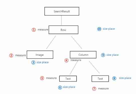
Modifier
stay Compose Modifiers in layouts are important , You can use modifiers to decorate or extend composable items . The commonly used modifiers are as follows :
backgroundBackground color of composable elements ;clickableEnables composable items to respond to user clicks , And show the ripple effect ;paddingSet a space around the element ;sizeSize of composable elements ;clipShapes of composable elements ;borderFrame and shape of composable elements ;fillMaxSizeThe size of composable elements is displayed according to the maximum size of the parent layout ;fillMaxWidthThe width of composable elements is displayed according to the maximum width of the parent layout ;fillMaxHeightThe height of composable elements is displayed according to the maximum height of the parent layout ;
Divide by the above , alsowidth、height、wrapConentHeightetc. , You can try to see the effect when you use it .
Here is an example of a circular image
/**
 *  Examples of modifier usage
 */
@Composable
fun ModifierExample(){
    // Add a picture
    Image(
        // Fill in the content
        painter = painterResource(id = R.mipmap.ic_girl),
        contentDescription = "logo",
        // Size and shape
        modifier= Modifier
            .padding(top = 2.dp)
            .background(Color.Blue)// Set a blue background
            .size(40.dp)             // Image size
            .clip(CircleShape)       // Round shape
            .border(1.5.dp, MaterialTheme.colors.secondary, CircleShape)// Border style
    )
}
The effect is as follows :
Modifier extension
Besides using Compose Outside the modifier provided , We can also extend function custom modifiers , For specific methods, please refer to Jetpack Compose Layout ( 3、 ... and ) In the article Extended layout modifier .
emphasize : The use of modifiers is sequential emphasize : The use of modifiers is sequential emphasize : The use of modifiers is sequential
for example , Take the example of background and padding Change the order , The effect will be as shown in the figure below , Look closely at the top margin of the two figures , You will find the difference 
Slot layout
Compose Composable items for fixed slots are provided in , To simplify interface elements , These are mainly in androidx.compose.material:material In the library , Such as :Drawer、FloatingActionButton、TopAppBar etc. .
Material Components use a lot of slots API, This is a Compose A model introduced , It brings a layer of customization over composable items . This approach makes components more flexible , Because they accept self configurable child elements , Instead of exposing every configuration parameter of a child element . The slot will leave a blank area in the interface , Let the developer fill in as he wishes . Here's the picture TopAppBar Slot of .
The contents about the slot position will be shown in Jetpack Compose Layout ( Two ) To explain in detail , This article will not go into further discussion .
边栏推荐
- Cubemx stm32f105rb USB flash drive reading and writing detailed tutorial
- 2台三菱PLC走BCNetTCP协议,能否实现网口无线通讯?
- Question B of the East China Cup: how to establish a population immune barrier against novel coronavirus?
- I put a two-dimensional code with rainbow candy
- Wallys/MULTI-FUNCTION IPQ6010 (IPQ6018 FAMILY) EMBEDDED BOARD WITH ON-BOARD WIFI DUAL BAND DUAL
- [buuctf.reverse] 117-120
- 广发证券靠谱吗?是否合法?开股票账户安全吗?
- Online notes on Mathematics for postgraduate entrance examination (9): a series of courses on probability theory and mathematical statistics
- Use Navicat to compare data differences and structure differences of multi environment databases, and automatic DML and DDL scripts
- Voiceprint Technology (II): Fundamentals of audio signal processing
猜你喜欢
Download the arm64 package of Debian on X86 computer

Learning notes of rxjs takeuntil operator

Wallys/MULTI-FUNCTION IPQ6010 (IPQ6018 FAMILY) EMBEDDED BOARD WITH ON-BOARD WIFI DUAL BAND DUAL

I put a two-dimensional code with rainbow candy

Compare and explain common i/o models

Etcd tutorial - Chapter 4 etcd cluster security configuration

Summarize two methods of configuring pytorch GPU environment

Chitubox micromake l3+ slicing software configuration correspondence

22 mathematical modeling contest 22 contest C

Use Navicat to compare data differences and structure differences of multi environment databases, and automatic DML and DDL scripts
随机推荐
2台三菱PLC走BCNetTCP协议,能否实现网口无线通讯?
CyCa children's physical etiquette Yueqing City training results assessment successfully concluded
Can two Mitsubishi PLC adopt bcnettcp protocol to realize wireless communication of network interface?
[MySQL learning notes 22] index
可穿戴设备或将会泄露个人隐私
Question B of the East China Cup: how to establish a population immune barrier against novel coronavirus?
vscode试图过程写入管道不存在
manhattan_slam环境配置
Set the location permission in the shutter to "always allow"
Is it safe to open an account on the compass?
在指南针上面开户好不好,安不安全?
Why should the terminal retail industry choose the member management system
Fluent creates, reads and writes JSON files
瑞吉外卖项目(二)
测试开发工程师
PMP考试多少分算通过?
Rxjs TakeUntil 操作符的学习笔记
The problem of wirengpi program running permission
汇付国际为跨境电商赋能:做合规的跨境支付平台!
[zufe expense reimbursement] zhecai invoice reimbursement specification (taking Xinmiao reimbursement as an example), which can be passed in one trip at most