当前位置:网站首页>Constraintlayout control uses full Raiders
Constraintlayout control uses full Raiders
2022-06-26 09:57:00 【Bai Ze】
ConstraintLayout Control using full Raiders
label ( The blank space to separate ): Android
List of articles
Introduce
ConstraintLayout yes Google A drag and drop layout of ViewGroup, Publishing has a long history , Even new Activity The default page layout for is ConstraintLayout, so Google Recommendation attitude towards it . In a word , With its powerful constraint functions , Can greatly reduce layout abscond , Achieve the effect of layout optimization .
In the use of ConstraintLayout Before , Go ahead and ask the soul three questions :ConstraintLayout What is it? ? Why use ConstraintLayout, What's the advantage of it ? How to use it? ?
What is it? ?
Constrained layout ConstraintLayout It's a ViewGroup, Can be in Api9 The above Android The system uses it , It appears mainly to solve the problem of too many nested layouts , Position and adjust widgets in a flexible way . from Android Studio 2.3 rise , The official template is used by default ConstraintLayout.
Why ConstraintLayout?
ConstraintLayout The original intention of is to reduce layout nesting , No matter how complex the layout is, it may be made up of a ConstraintLayout Get it done , In addition, in recent years, more and more properties are supported , And it's also Google Highly recommended ,ConstraintLayout It will be more and more indispensable in the future development and optimization . Even more screen sizes can be adapted to some extent .
How to use it? ?
↓↓↓
The examples and attributes in this article are based on 2.0.0 Of beta edition , Introduction mode :
    dependencies{
    	implementation 'androidx.constraintlayout:constraintlayout:2.0.0-beta3'
    }
Position constraints
1. The relative position
The relative position is ConstraintLayout The most basic attribute , Be similar to RelativeLayout The relative layout of , Controls the relative position of child controls .
It's more abstract , for instance :

A layout like this needs to be written in code like this :
	<Button
		android:id="@+id/btn_1"
		android:layout_width="wrap_content"
		android:layout_height="wrap_content"
		android:text="A"
		app:layout_constraintLeft_toLeftOf="parent"
		app:layout_constraintTop_toTopOf="parent" />

	<Button
		android:id="@+id/btn_2"
		android:layout_width="wrap_content"
		android:layout_height="wrap_content"
		android:text="B"
		app:layout_constraintLeft_toLeftOf="parent"
		app:layout_constraintTop_toBottomOf="@+id/btn_1" />

	<Button
		android:id="@+id/btn_3"
		android:layout_width="wrap_content"
		android:layout_height="wrap_content"
		android:text="C"
		app:layout_constraintLeft_toRightOf="@+id/btn_1"
		app:layout_constraintTop_toTopOf="parent" />
The control of visible position is mainly app:layout_constraintTop_toBottomOf="@+id/btn_1" Property implemented , For example, this attribute indicates : The View Align the top of to the target View The bottom of .
The attributes of this series are about 12 individual , Each control View Of top,bottom,left,right,start,end

app:layout_constraintTop_toTopOf="@+id/xxx"
app:layout_constraintTop_toBottomOf="@+id/xxx"
app:layout_constraintBottom_toBottomOf="@+id/xxx"
app:layout_constraintBottom_toTopOf="@+id/xxx"
app:layout_constraintLeft_toLeftOf="@+id/xxx"
app:layout_constraintLeft_toRightOf="@+id/xxx"
app:layout_constraintStart_toStartOf="@+id/xxx"
app:layout_constraintStart_toEndOf="@+id/xxx"
app:layout_constraintRight_toRightOf="@+id/xxx"
app:layout_constraintRight_toLeftOf="@+id/xxx"
app:layout_constraintEnd_toEndOf="@+id/xxx"
app:layout_constraintEnd_toStartOf="@+id/xxx"
among parent Represents the parent control , Let's say View Center can be written like this :
    app:layout_constraintTop_toTopOf="parent"
    app:layout_constraintLeft_toLeftOf="parent"
    app:layout_constraintRight_toRightOf="parent"
    app:layout_constraintBottom_toBottomOf="parent"
2. Mandatory constraint
If you want to implement such a layout :

Use ConstraintLayout The implementation code is like this :
    <Button
		......
	    android:id="@+id/btn_a"
	    app:layout_constraintStart_toStartOf="parent"
	    app:layout_constraintTop_toTopOf="parent" />

    <Button
	    android:id="@+id/btn_b"
	    ......
	    app:layout_constraintEnd_toEndOf="parent"
	    app:layout_constraintStart_toEndOf="@+id/btn_a"
	    app:layout_constraintTop_toBottomOf="@+id/btn_a" />
I could have fished happily , But one day A The length of the control suddenly becomes very long , So the following happened


B Control is not absolutely in A To the right of , And beyond the screen , It's not going to work like this , So we need to use mandatory constraints to save :
app:layout_constrainedWidth=“true”
At this time, just add the code of the previous sentence to B The control of xml It can be solved in the configuration , effect :

The longitudinal latitude corresponds to :
app:layout_constrainedHeight=“true”
3. Baseline alignment
If son View yes TextView You can also use baseline alignment :
layout_constraintBaseline_toBaselineOf="@+id/xxx"
Let's write an example to see the alignment effect :

If TextView The size and height may be different :

You can see if it is multi line text , This attribute is aligned only with the baseline of the first line of text .
Using this attribute requires some attention .
4. Center positioning
The positioning of the center of the circle can be clearly expressed by a stolen picture :


The figure is visible , Center point positioning has at least three attributes to determine the constraint relationship
- app:layout_constraintCircle="@+id/btn_aa" Constrained control Id
- app:layout_constraintCircleAngle=“0” Center offset angle , The vertical positive direction is 0 degree .
- app:layout_constraintCircleRadius=“68dp” Circle radius .
These three attributes can be used together to constrain the center of a circle .
Here is an example to try :
	<-- It is preferred to determine a center point View-->
	<Button
    	android:id="@+id/btn_aa"
        android:layout_width="wrap_content"
        android:layout_height="wrap_content"
        android:layout_marginStart="8dp"
        android:layout_marginTop="88dp"
        android:layout_marginEnd="8dp"
        android:text=" center of a circle "
        app:layout_constraintEnd_toEndOf="parent"
        app:layout_constraintStart_toStartOf="parent"
        app:layout_constraintTop_toTopOf="parent"
		app:layout_constraintBottom_toBottomOf="parent />

	<-- Constrained at the center of the circle 0 Degree position , That is right above -->
 	<View
        android:id="@+id/btn_bb"
        android:layout_width="30dp"
        android:layout_height="30dp"
        android:background="@color/colorPrimary"
        app:layout_constraintCircle="@+id/btn_aa"
        app:layout_constraintCircleAngle="0"
        app:layout_constraintCircleRadius="68dp" />

	<-- Constrained at the center of the circle 45 Degree position , That is, the upper right -->
    <View
        android:id="@+id/btn_cc"
        android:layout_width="30dp"
        android:layout_height="30dp"
        android:background="@color/colorPrimary"
        app:layout_constraintCircle="@+id/btn_aa"
        app:layout_constraintCircleAngle="45"
        app:layout_constraintCircleRadius="68dp" />
Let's see the effect :

I added a few more constraints to the above code , A clock effect is achieved , The green square says constraint angle .
5. Percentage constraint
The attributes of percentage constraint are vertical percentage and horizontal percentage , Namely :
app:layout_constraintHorizontal_bias=“0.3”
app:layout_constraintVertical_bias=“0.3”
The horizontal percentage constraint attribute means that after determining View After the left constraint point and the right constraint point , At this point View Centered relative to the position of the left and right constraint points , That is to say app:layout_constraintHorizontal_bias=“0.5”, Pictured :

I will View Set to the horizontal center position relative to the parent layout , That is to say
app:layout_constraintEnd_toEndOf="parent"
app:layout_constraintStart_toStartOf="parent"
Now switch to Design View , Click this View, Then on the right you can see

Such a display , Which is marked by the red arrow 50 It represents the default percentage constraint position . At this point, you can directly drag the buoy to modify the horizontal percentage constraint , You can also add... To your code **app:layout_constraintHorizontal_bias=“0.3”** Property to modify ( Dragging the buoy directly will generate this code ).
This is what the horizontal percentage constraint does , Empathy , The same is true for the percentage constraint in the vertical direction .
Try to write an example :
	<Button
		android:layout_width="wrap_content"
		android:layout_height="wrap_content"
		android:text="youlookwhat"
		app:layout_constraintBottom_toBottomOf="parent"
		app:layout_constraintEnd_toEndOf="parent"
		app:layout_constraintHorizontal_bias="0.2"
		app:layout_constraintStart_toStartOf="parent"
		app:layout_constraintTop_toTopOf="parent"
		app:layout_constraintVertical_bias="0.25" />
This button is in the horizontal direction relative to the parent layout 20%, Relative to the vertical direction of the parent layout 25% The location of .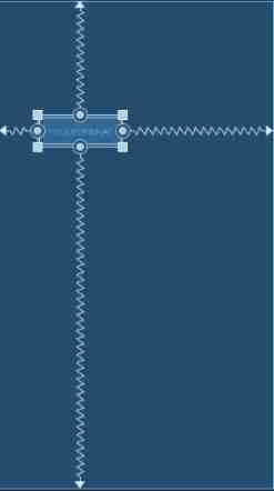
6.Chains( chain )
A set of controls are linked by bi-directional constraints to form a chain . Pictured :

Both ends of the chain must be constrained to parent Of , The style of a chain is determined by the first control of a chain :
app:layout_constraintHorizontal_chainStyle=“spread”
layout_constraintHorizontal_chainStyle There are three enumeration values :
- spread: Evenly distribute all the spaces in the latitude of the chain ( Default )
- spread_inside: Place the first and last element on the edge , And distribute the rest of the elements evenly
- packed: Center the elements in the chain at the center of the chain
A picture to illustrate :
- Be careful : The properties of a chain are controlled by the head node of the chain .
At the same time, the chain also supports weight , If you will width Set to 0dp, And add layout_constraintHorizontal_weight Property to set the weight , You can create a horizontal weight chain .
app:layout_constraintHorizontal_weight=“2” : The weight of the control in the horizontal direction
app:layout_constraintVertical_weight=“1” : The weight of the control in the vertical direction
for instance , To create a horizontal weight of 1,2,1 Chain :
    <Button
        android:id="@+id/btn_1"
        android:layout_width="0dp"
        android:layout_height="wrap_content"
        android:text=" Wo Wotou "
        app:layout_constraintHorizontal_chainStyle="spread"
        app:layout_constraintHorizontal_weight="1"
        app:layout_constraintLeft_toLeftOf="parent"
        app:layout_constraintRight_toLeftOf="@+id/btn_2"
        app:layout_constraintTop_toTopOf="parent" />

    <Button
        android:id="@+id/btn_2"
        android:layout_width="0dp"
        android:layout_height="wrap_content"
        android:text=" Four for a dollar "
        app:layout_constraintHorizontal_weight="2"
        app:layout_constraintLeft_toRightOf="@+id/btn_1"
        app:layout_constraintRight_toLeftOf="@+id/btn_3"
        app:layout_constraintTop_toTopOf="parent" />

    <Button
        android:id="@+id/btn_3"
        android:layout_width="0dp"
        android:layout_height="wrap_content"
        android:text=" Hey "
        app:layout_constraintHorizontal_weight="1"
        app:layout_constraintLeft_toRightOf="@+id/btn_2"
        app:layout_constraintRight_toRightOf="parent"
        app:layout_constraintTop_toTopOf="parent" />
effect :

7. Specify the control width height percentage size
ConstantLayout It can also refer to the stator View Percent size of ( Too powerful ).
Let's witness this attribute :
app:layout_constraintHeight_percent=“0.5” : Percentage of height relative to parent layout , Value 0~1
app:layout_constraintWidth_percent=“0.5” : Percentage of width relative to parent layout
for instance , The following ImageView Set the width to half of the parent layout , The height is also half of the parent layout :
    <ImageView
	    android:id="@+id/iv_111"
	    android:layout_width="0dp"
	    android:layout_height="0dp"
	    android:scaleType="fitXY"
	    android:src="@mipmap/hentai"
	    app:layout_constraintBottom_toBottomOf="parent"
	    app:layout_constraintHeight_percent="0.5"
	    app:layout_constraintLeft_toLeftOf="parent"
	    app:layout_constraintRight_toRightOf="parent"
	    app:layout_constraintTop_toTopOf="parent"
	    app:layout_constraintWidth_percent="0.5" />
effect :

- Be careful : Dang Kuan / When the height is set as a percentage of the parent layout , wide / The height should also be specified as 0dp, Otherwise it will not take effect .
8.goneMargin( Hide margins )
In the child view The status of is gone when ,goneMargin The set margin takes effect .
layout_goneMarginStart
layout_goneMarginEnd
layout_goneMarginLeft
layout_goneMarginTop
layout_goneMarginRight
layout_goneMarginBottom
9. Specify the aspect ratio
ConstantsLayout There is also a very interesting property :
app:layout_constraintDimensionRatio=“w,16:9”
This attribute can be used to indicate the desired aspect ratio of the child control .
For example , Set the aspect ratio of a picture to 16:9,xml Layout :
    <ImageView
    	android:id="@+id/iv_111"
    	android:layout_width="0dp"
    	android:layout_height="wrap_content"
    	android:scaleType="fitXY"
    	android:src="@mipmap/hentai"
    	app:layout_constraintBottom_toBottomOf="parent"
    	app:layout_constraintDimensionRatio="w,16:9"
    	app:layout_constraintLeft_toLeftOf="parent"
    	app:layout_constraintRight_toRightOf="parent"
    	app:layout_constraintTop_toTopOf="parent" />
Let's see the effect , The picture on the left shows the original effect of the picture , The right figure is the sub sub - graph after the specified width and height

Explain ,layout_constraintDimensionRatio The scale prefix defaults to h, Thought is the ratio of width to height , for example h,3:2 Means wide 3: high 2, And specify the attribute w,3:2, It means the aspect ratio , The high 3: wide 2.
Explain again , After my test, I found that to successfully achieve the desired aspect ratio , The width or height should have a fixed value wrap_content, The other attribute should be set to 0dp, Otherwise, the attribute will not take effect .
Auxiliary class
Group group
ConstrantLayout Provides Group To mark groups of multiple controls , Groups can specify multiple controls , And by controlling Group To implement the operation of these multiple controls .
Group A group is an independent View Control , But it doesn't really show up on the screen , The View The most common attribute is constraint_referenced_ids, Used to specify the... Contained in the group id.
app:constraint_referenced_ids=“btn_a_1,btn_a_2,btn_a_3” : Specify the controls that the group contains id.
    <androidx.constraintlayout.widget.Group
    	android:id="@+id/group_a"
    	android:layout_width="wrap_content"
    	android:layout_height="wrap_content"
    	app:constraint_referenced_ids="btn_a_1,btn_a_2,btn_a_3" />
for instance , Click to make a Group Group control to show and hide :
java Code :
    public void showHide(View view) {
    	groupA.setVisibility((groupA.getVisibility() == View.GONE) ? View.VISIBLE : View.GONE);
    }
xml Code :
    <Button
    	android:id="@+id/btn_a_1"
    	android:layout_width="wrap_content"
    	android:layout_height="wrap_content"
    	android:text="A1"
    	app:layout_constraintLeft_toLeftOf="parent"
    	app:layout_constraintTop_toTopOf="parent" />

    <Button
    	android:id="@+id/btn_a_2"
    	android:layout_width="wrap_content"
    	android:layout_height="wrap_content"
    	android:text="A2"
    	app:layout_constraintLeft_toLeftOf="parent"
    	app:layout_constraintTop_toBottomOf="@+id/btn_a_1" />

    <Button
    	android:id="@+id/btn_a_3"
    	android:layout_width="wrap_content"
    	android:layout_height="wrap_content"
    	android:text="A3"
    	app:layout_constraintLeft_toLeftOf="parent"
    	app:layout_constraintTop_toBottomOf="@+id/btn_a_2" />

    <androidx.constraintlayout.widget.Group
    	android:id="@+id/group_a"
    	android:layout_width="wrap_content"
    	android:layout_height="wrap_content"
    	app:constraint_referenced_ids="btn_a_1,btn_a_2,btn_a_3" />

    <Button
    	android:id="@+id/btn_sh"
    	android:layout_width="wrap_content"
    	android:layout_height="wrap_content"
    	android:onClick="showHide"
    	android:text=" display / implicit "
    	app:layout_constraintLeft_toLeftOf="parent"
    	app:layout_constraintRight_toRightOf="parent"
    	app:layout_constraintTop_toTopOf="parent" />
Look at the effect :

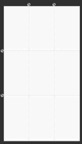
Guideline
guide Guideline It will help you finish the layout when previewing , The runtime does not display on the interface .
Guideline The two most common attributes are :
android:orientation=“horizontal” : Guide line direction , There are two enumeration values :horizontal and vertical, seeing the name of a thing one thinks of its function , Represents horizontal and vertical directions .
app:layout_constraintGuide_percent=“0.5” : The position of the guides relative to the percentage of the parent layout .
Guideline It's easy to use , Here's an example , Let's use the golden separation guide line commonly used for taking pictures :
    <androidx.constraintlayout.widget.Guideline
    	android:layout_width="wrap_content"
    	android:layout_height="wrap_content"
    	android:orientation="horizontal"
    	app:layout_constraintGuide_percent="0.33" />

    <androidx.constraintlayout.widget.Guideline
    	android:layout_width="wrap_content"
    	android:layout_height="wrap_content"
    	android:orientation="horizontal"
    	app:layout_constraintGuide_percent="0.66" />

    <androidx.constraintlayout.widget.Guideline
    	android:layout_width="wrap_content"
    	android:layout_height="wrap_content"
    	android:orientation="vertical"
    	app:layout_constraintGuide_percent="0.33" />

    <androidx.constraintlayout.widget.Guideline
    	android:layout_width="wrap_content"
    	android:layout_height="wrap_content"
    	android:orientation="vertical"
    	app:layout_constraintGuide_percent="0.66" />
effect :
Barrier barrier
Just as the name suggests, it is a constraint on View Apply a horizontal or vertical barrier between controls , To implement one to many or many to many constraints .
The text is too abstract , Or steal a picture to understand :
Pictured , This is also a common requirement , One View We need several more at the same time View The right side of the , And these View The length of is variable , No matter which individual View They don't meet the needs . It's time to Barrier Barriers to meet the demand .
Barrier It's a separate one View, It will not be displayed on the interface , You can use it safely and boldly .
Barrier The attributes of are :
app:constraint_referenced_ids=“btn_1,btn_2” : List the... Contained in the barrier View Of id, Corresponding to the three on the left in the figure View.
app:barrierDirection=“right” :Barrier Where View The location of the group , Yes right,left,top and bottom Enumeration values are optional .
app:barrierMargin=“10dp” :Barrier Distance between barrier and control .
app:barrierAllowsGoneWidgets=“true” : If Barrier The barrier contains View Set to Gone, Does it affect Barrier Location . If you don't want to let Barrier consider GONE Of view, You can do this by setting the property barrierAllowsGoneWidgets Set up by false( The default is true) To change this setting .
Knowing these four attributes , Can be handy to use Barrier 了 , for instance :
	<Button
        android:id="@+id/btn_1"
        android:layout_width="wrap_content"
        android:layout_height="wrap_content"
        android:onClick="grow"
        android:text=" Wo Wotou "
        app:layout_constraintBottom_toBottomOf="parent"
        app:layout_constraintHorizontal_bias="0.2"
        app:layout_constraintLeft_toLeftOf="parent"
        app:layout_constraintTop_toTopOf="parent"
        app:layout_constraintVertical_bias="0.35" />

    <Button
        android:id="@+id/btn_2"
        android:layout_width="wrap_content"
        android:layout_height="wrap_content"
        android:onClick="grow"
        android:text=" Four for a dollar "
        app:layout_constraintBottom_toBottomOf="parent"
        app:layout_constraintHorizontal_bias="0.2"
        app:layout_constraintLeft_toLeftOf="parent"
        app:layout_constraintTop_toTopOf="parent"
        app:layout_constraintVertical_bias="0.65" />

    <androidx.constraintlayout.widget.Barrier
        android:id="@+id/barrier_1"
        android:layout_width="wrap_content"
        android:layout_height="wrap_content"
        app:barrierAllowsGoneWidgets="true"
        app:barrierDirection="right"
        app:barrierMargin="10dp"
        app:constraint_referenced_ids="btn_1,btn_2" />

    <Button
        android:layout_width="wrap_content"
        android:layout_height="wrap_content"
        android:text=" Hey "
        app:layout_constraintBottom_toBottomOf="parent"
        app:layout_constraintLeft_toRightOf="@+id/barrier_1"
        app:layout_constraintTop_toTopOf="parent" />
Click event :
	public void grow(View view) {
        String str = ((TextView) view).getText().toString();
        str += "~~~";
        ((TextView) view).setText(str);
    }
The above code is expressed as Wo Wotou and Four for a dollar Two View Create the right barrier Barrier_1, Hey Constrained by Barrier_1 The right side of the barrier , When the four widths of the Wowotou and one dollar contained in the barrier change , Constraints or relationships do not change .
design sketch :
If you're not careful, you put Hey Top out of the window , because Hey Only wrong side constraint Barrier barrier , No constraint relationship is added for the right side , That's why this bug, At the same time, we should also pay attention to the mandatory constraint properties mentioned in this article .
Software development should be careful , Have the habit of exhausting everything possible , Avoid low level bug.
Reference resources
https://juejin.im/post/5bac92f2f265da0aba70c1bf#heading-1
https://juejin.im/post/5b013e6f51882542c760dc7b
边栏推荐
- Automated testing -- Introduction and example of pytest framework
- What you need to know to test -- URL, weak network, interface, automation
- Install new version cmake & swig & tinyspline
- Notes on sports planning on November 22, 2021
- 使用递归或while循环获取父/子层级结构的名称
- Redis notes (15) - Pipeline (the client packages and sends batch commands to save network overhead)
- 做测试需要知道的内容——url、弱网、接口、自动化、
- Recyclerview implements flow layout (LinearLayout with line wrap) (flexboxlayoutmanager)
- LeetCode 基本计算器 224. 227. follow up 394
- The basis of C language grammar -- pointer (multidimensional array, function, summary) learning
猜你喜欢

How to create an IE tab in edge browser

MySQL learning summary

Flutter's brain map notes are easy to find and search!

MapReduce & yarn theory

Software testing - how to select the appropriate orthogonal table

如何更改微信小程序二维码物料颜色

Record a time when the server was taken to mine

Specific implementation comparison between different programming languages

国际化配置

#云原生征文# 在 Google Kubernetes Cluster 上使用 HANA Expression Database Service
随机推荐
[trajectory planning] testing of ruckig Library
Deep learning (tentsorflow2. version) three good student performance problems (1)
LeetCode 958. 二叉树的完全性校验
Get the clicked position in the recyclerview
Testing practice - App testing considerations
Code statistics tools cloc and SCC
JSP file syntax
Day 3 array, pre post, character space, keyword and address pointer
Summary of common commands of vim
Druid data source for background monitoring
The 100000 line transaction lock has opened your eyes.
How to find and install the dependent libraries of Debian system
Do you know the //go: instructions in the go source code, go:linkname?
online trajectory generation
SSM项目小例子,SSM整合图文详细教程
动态库连接 - 符号冲突 - 全局符号介入
Vscode common programming fonts
What you need to know to test -- URL, weak network, interface, automation
c语言语法基础之——函数 小程序 求阶乘
QPM performance monitoring components - General