当前位置:网站首页>Deep understanding of padding
Deep understanding of padding
2022-06-23 18:16:00 【Xia'an】
In depth understanding of padding
In box size 4 Boxes content box、padding box、border box and margin box They correspond to each other CSS Medium content、padding、border and margin attribute , The main character of this article is padding box.
padding It refers to the filling room of the box .“ Mend the space ” This word is more terminological , We might as well understand it as the protective sponge wrapped outside the express goods in the express box . It's just CSS in , This “ The sponge ” The default is transparent .
1. padding With the size of the elements
because CSS In the default box-sizing yes content-box, So use padding Will increase the size of the element . for example :
.box {

  width: 80px;
  padding: 20px;
}
If other factors are not considered CSS interfere , here .box The width occupied by the element should be 120 Pixels (80px + 20px × 2), This is actually not in line with the cognition of the real world , People are used to mapping the code world to the real world , therefore , New people
It is inevitable that padding Step into a pit on the problem of size . This has also led many people to set box-sizing by border-box, Even direct global reset :
* {
     box-sizing: border-box; }
Personally, I don't recommend this approach , But many people may have such misconceptions , It is thought that box-sizing:border-box, The element size will not change . In most cases , however , If padding It's big enough , that width There's nothing we can do . for example :
.box {

  width: 80px;
  padding: 20px 60px;
  box-sizing: border-box;
}
Then width It will be invalid , The final width is 120 Pixels (60px×2), And the content inside is “ Preferred minimum width ”.
The above dimensional representation is for elements with blocky properties , For inline elements ( Does not include replacement elements such as images ) Performance is slightly different . This different performance makes many people have such a wrong understanding : Of inline elements padding It only affects the horizontal direction , Will not affect the vertical direction . This perception is inaccurate , Of inline elements padding It also affects the layout in the vertical direction , Affect visual performance . Just because inline elements have no visual width or visual height (clientHeight and clientWidth Forever 0), The behavior in the vertical direction is completely affected by line-height and vertical-align Influence , There is no visual change in the space between the previous line and the next line , therefore , It gives us the feeling of being vertical padding It didn't work .
If we add a background color or border to the inline element , Naturally, we can see that its size space is really affected by padding Affected . for example :
a {

  padding: 50px;
  background-color: #cd0000;
}
Then the performance will be as shown in the figure below .
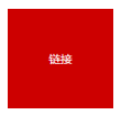
It can be seen clearly , Although the size is effective , But it has no effect on the original layout of the upper and lower elements , It's just that the vertical direction is stacked , As shown in the figure below .
CSS There are many other scenes or attributes in the, which do not affect the layout of other elements but have a cascading effect . such as ,relative Positioning of elements 、 Box shadow box-shadow as well as outline etc. . Although these cascading phenomena seem similar , But in fact, there are differences . They fall into two categories : One is pure visual layering , Does not affect external dimensions ; The other will affect the external dimension .box-shadow as well as outline Belong to the former , And here it is inline Elemental padding Cascade belongs to the latter . The way to distinguish is simple , If the parent container overflow:auto, When the cascading area exceeds the parent container , No scroll bar appears , Is pure visual ; If a scroll bar appears , Will affect the size 、 Influence layout .
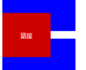
If the parent element of the above example is set overflow:auto, It will behave like the following figure .

thus it can be seen , Inline elements padding It has a dual effect on the visual layer and the layout layer , All similar to “ vertical direction padding Has no effect on inline elements ” Is obviously not correct .
So this is practical for us CSS What can development help ?
First , We can do this without affecting the current layout , Gracefully increase the click area size of links or buttons . For example , There will be some text links in the article , By default , The height of the click area of these links is affected by font-size Font size control , It has nothing to do with row height . Especially in Chrome Wait for the browser , Height 1em, Such a small height , If at the mobile end , Our fingers may not hit at one time , It may take a lot of poking , At this point, it is necessary to increase the click area size of the link , But the premise is that it does not affect the current content layout . here , We can use padding Naturally achieve the effect we want .
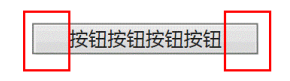
Here's a simple example , Using inline elements padding Realize highly controllable separation line . The traditional lazy implementation may be the direct use of “ Pipe, ”, Such as : Sign in | register . But use “ Pipe, ” Words , Because it's characters , So the height is uncontrollable . If the requirements for visual presentation are high , It needs to be done CSS Graphic simulation , One way to do this is to use inline elements and padding Property to implement ,CSS and HTML The code is as follows :
a + a:before {
  content: "";
  font-size: 0;
  padding: 10px 3px 1px;
  margin-left: 6px;
  border-left: 1px solid gray;
}
<a href=""> Sign in </a><a href=""> register </a>
A vertical separator not so high is displayed , As shown in the figure below .

Last , To put it simply, an inline element is vertical padding How to use it ! Everyone should know that web pages can be accessed through the address bar hash Values and pages HTML in id Anchor positioning occurs for elements with the same value ? occasionally , The elements we want to locate , For example, the title is a distance from the top of the page , For example, the page happens to have a 50 Pixel high position:fixed The navigation bar . If you follow the browser's own characteristics , The title will be located under the fixed navigation , This is obviously not what we want to see To the , Then what shall I do? ?
Many people will think of setting a... In the title bar padding-top:50px, however , Most of the time, this kind of thing that affects the layout is only theoretically feasible , Isn't there any simple and practical way ? Now , We might as well try using inline elements , Block level element settings padding-top:50px It will affect the layout , But inline elements do not , therefore , It's easy . Suppose the following is the original implementation :
<h3 id="hash"> title </h3>
h3 {
  line-height: 30px;
  font-size: 14px;
}
Then we can change it to :
<h3><span id="hash"> title </span></h3>
h3 {
  line-height: 30px;
  font-size: 14px;
}
h3 > span {
  padding-top: 58px;
}
actually , For inline elements that are not replacement elements , Not only padding The calculation of row box height will not be included ,margin and border It's all the same , The height is not calculated , But the rendering actually happens around the inline box .
2. padding The percentage of
About padding There are two important things about the attribute value of .
- and
marginDifferent properties ,paddingAttributes do not support negative values . paddingSupport percentage value , however , andheightThere are some differences in the percentage calculation rules for attributes such as , The difference is :paddingThe percentage value is calculated relative to the width in both horizontal and vertical directions .
We can use this feature to achieve some interesting layout effects . That is, design for scenarios and requirements , This design makes it easy for us to realize the adaptive equal scale rectangle effect . for example , Use div { padding: 50%; } You can achieve a square , If so : div { padding: 25% 50%; } We get an aspect ratio of 2:1 Rectangle effect .
The above percentage values are applied to elements with blocky properties , If it's an inline element , How will it behave ?
- Also calculated relative to width ;
- The default height and width details are different ;
- padding Will break the line ;
Let's first look at the of inline elements padding Line breaks , The code is as follows :
.box {
  border: 2px dashed #cd0000;
}
span {
  padding: 50%;
  background-color: gray;
}
<span> There are several words in it </span>
The effect is shown below ( Cut from Chrome browser ). There are some strange performances :“ There are ” Two words are missing ,“ written words ” Two words on the right show , The background area is not rectangular , The width of the background color is inconsistent with that of the outer container .

For inline elements , Its padding It will break , That is to say padding The area follows the line box in the inline box model , The above example has many words , One line doesn't show , therefore “ A number of ” The two words change to the next line , therefore , The original padding The area fell down with it , According to the cascade rule of coming from behind ,“ There are ” The two words are naturally just covered , So I can't see ; meanwhile , Regular rectangular areas because of line breaks , It also becomes five sides ; As for the width, it is not the same as the outer container box , It's natural , If there is no text , The natural width is exactly the same as that of the container ; Now there is “ There are several words in it ” this 6 A word , The actual width is the container width and this 6 The sum of the word widths .
3. Tag element built-in padding
Say something you may not know about padding Some little secrets of .
ol/ulList built-inpadding-left, But the unit ispxNoem. for example ,Chrome Under the browser is40px, Because of the use ofpxThis absolute unit , therefore , If... In the listfont-sizeIt's very small , be<li>Bullet of element ( Such as points or numbers ) will<ul>/<ol>The left edge of the element is very far away , Iffont-sizeThe larger , The bullet may go to<ul>/<ol>The outside of the element .- Many form elements are built-in
padding, for example :
- All browsers
<input>/<textarea>The input box is built-inpadding; - All browsers
<button>Built in buttonpadding; - Some browsers
<select>Drop down built-inpadding, Such as Firefox、IE8 And above browsers can be setpadding; - All browsers
<radio>/<chexkbox>The single check box has no built-inpadding; <button>Button element's padding The hardest to control .
Let's focus on that <button> Button element's padding. stay Chrome browsers , We set up :button { padding: 0; } Button on the padding It becomes 0, But in Firefox browsers , There are still padding, As shown in the figure below .

Try it :button::-moz-focus-inner { padding: 0; } The button will be as shown in the following figure .

And in the IE7 browsers , If there are more words , So about padding Gradually get bigger , As shown in the figure below .
The following settings are required :button { overflow: visible; } At this point, the button behaves as expected , As shown in the figure below .

Last , Button padding It is different from height calculation in different browsers , for example :
button {

  line-height: 20px;
  padding: 10px;
  border: none;
}
result , stay Chrome Under the browser is expected 40 Pixels , However Firefox The browser is inexplicable 42 Pixels , stay IE7 Under the browser is unimaginable 45 Pixels , This makes us seldom use native when making web pages <button> Button as a click button , But use <a> Tag to simulate . however , In the form , Sometimes buttons have their own interactive behavior , This is a <a> Tags cannot be emulated . Here I recommend a semantic good behavior reservation , meanwhile UI Effect bar compatible with good implementation tips , That's using <label> Elements ,HTML and CSS as follows :
<button id="btn"></button>
<label for="btn"> Button </label>

button {
  position: absolute;
  clip: rect(0 0 0 0);
}
label {
  display: inline-block;
  line-height: 20px;
  padding: 10px;
}
<label> Elemental for Property values and <button> Elemental id Values correspond to . here , The button height under all browsers is 40 Pixels , and <button> The behavior of the element is also preserved , It is a very good practical skill .
边栏推荐
- Redis 集群
- [websocket] knowledge points for developing online customer service system meaning of status code returned by websocket
- uniapp项目中防止用户重复提交
- console. Log() is an asynchronous operation???
- How to make a badge
- Landing of global organizational structure control
- Imeta | Nannong shenqirong team released microbial network analysis and visualization R package ggclusternet
- 论文阅读 (54):DeepFool: A Simple and Accurate Method to Fool Deep Neural Networks
- 手机开户一般哪个证券公司好?在线开户安全么?
- 科技互动沙盘是凭借什么收获人气的
猜你喜欢

SimpleDateFormat在多线程环境下存在线程安全问题。

Redis cluster
![[win10 vs2019 opencv4.6 configuration reference]](/img/51/62fb26123561b65f127304ede834a2.png)
[win10 vs2019 opencv4.6 configuration reference]

Self training multi sequence learning with transformer for weakly supervised video animation
![[Wwise] there is no sound problem after Wwise is embedded in unity and packaged](/img/70/4131671f5dfd36324cbe9bacea6ac4.png)
[Wwise] there is no sound problem after Wwise is embedded in unity and packaged

The battlefield of live broadcast e-commerce is not in the live broadcast room

【故障公告】取代 memcached 的 redis 出现问题造成网站故障
How to solve the problem that the esp8266-01s cannot connect to Huawei routers

信用卡产品开发周期从23周缩短至9周,银行运维组织如何转向敏捷?

论文阅读 (50):A Novel Matrix Game with Payoffs of Maxitive Belief Structure
随机推荐
org. apache. ibatis. binding. BindingException: Invalid bound statement (not found):...
论文阅读 (53):Universal Adversarial Perturbations
2022 t elevator repair test question bank and simulation test
Goframe framework: basic auth Middleware
Nodejs implements multi process
Crmeb second open SMS function tutorial
【 Huazhong University of Science and technology】 Data Sharing for retest of the initial Examination
This time, thoroughly understand the SparseArray implementation principle
Remote connection raspberry pie in VNC Viewer Mode
建立自己的网站(13)
Kerberoasting without SPN
Baidu AI Cloud product upgrade Observatory in May
云原生行业应用崛起,从“可用”到“好用”有多远?
Strong cache and negotiation cache in http
一,数组--滑动窗口问题--长度最小的子数组--水果成篮问题
Pause update Bulletin - walking Pikachu
esp8266-01s 不能连接华为路由器解决方法
org.apache.ibatis.binding.BindingException: Invalid bound statement (not found):...
手机开户一般哪个证券公司好?在线开户安全么?
全局组织结构控制之抢滩登陆