当前位置:网站首页>Detailed summary of flex layout
Detailed summary of flex layout
2022-06-25 04:59:00 【MomentYY】
Catalog
Flex Detailed summary of layout
1. know flex Layout
flex Layout (flexible Layout , Elastic layout ), Is currently the web The layout scheme most used in development .
- Two important concepts :
- Turn on flex The element of layout is called
flex container; flex containerThe immediate child element inside is calledflex items;
- Turn on flex The element of layout is called
- Set up display The attribute is flex perhaps inline-flex Can be a flex container:
- flex: bring
flex containerExist in block level form ; - inline-flex: bring
flex containerExist in the form of intra row level ;
- flex: bring
2.flex Layout model
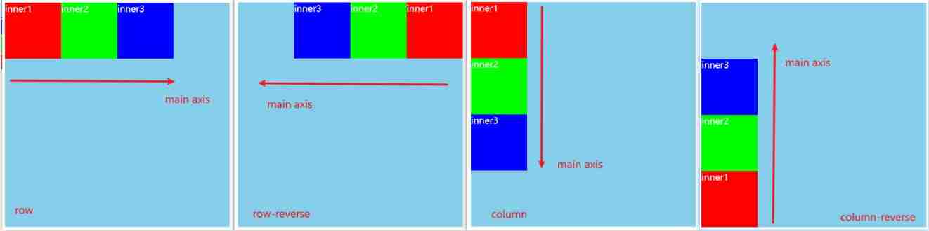
When the element is turned on flex Layout time , The layout will follow two axes .

- Spindle (main axis): Along flex The axis extending in the direction in which the element is placed ;
- Cross shaft (cross axis): Perpendicular to flex The axis of the element placement direction ;
main startandmain end: They are the start position and end position of the spindle respectively ;cross startandcross end: They are the start position and end position of the cross axis respectively ;main sizeandcross size: They are the size of the main axis and the size of the cross axis ;
3.flex Related properties
| Apply to flex container Properties on | Apply to flex items Properties on |
|---|---|
| flex-flow | flex |
| flex-direction | flex-grow |
| flex-wrap | flex-basis |
| justify-content | flex-shrink |
| align-items | order |
| align-content | align-self |
4.flex container
4.1.flex-direction
flex items The default is along main axis( Spindle ) from main start Go to main end Arrange in the direction ;
flex-direction To determine the main axis The direction of , There are four values :
- row( The default value is )
- row-reverse
- column
- column-reverse
4.2.justify-content
justify-content To determine the flex items stay main axis Alignment on , There are the following values :
- flex-start: The default value is , And main start alignment ;
- flex-end: And main end alignment ;
- center: Align center ;

- space-between:flex items Equal distance between , And main start、main end full-justified ;
- space-evenly:flex items Equal distance between , And main start、main end The distance between is equal to flex items Distance between ;
- space-around:flex items Equal distance between , And main start、main end The distance between them is flex items Half the distance between ;

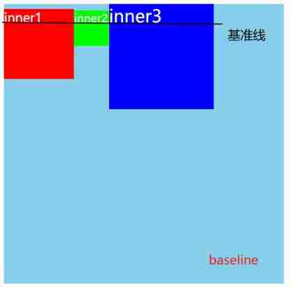
4.3.align-items
align-items To determine the flex items stay cross axis On its way , There are the following values :
normal: In a flexible layout , Effect and stretch equally ;
stretch: When flex items stay cross axis The direction of the size by auto when , Automatically stretches to fill flex container;

flex-start: And cross start alignment ;
flex-end: And cross end alignment ;
center: Align center ;

- baseline: Align with the baseline ;
4.4.flex-wrap
flex-wrap To determine the flex container Is it a single line or multiple lines , There are the following values :
- nowrap: The default value is , A single ;
- wrap: Multiple lines ;
- wrap-reverse: Multiple lines ( contrast wrap,cross start and cross end contrary );

4.5.flex-flow
- flex-flow yes flex-direction | flex-wrap Abbreviation ;
- It can be omitted , Any order ;
4.6.align-content
align-content Decided on multiple lines flex items stay cross axis Alignment on , Usage and justify-content similar , There are the following values :
- stretch: The default value is ;
- flex-start: And cross start alignment ;
- flex-end: And cross end alignment ;
- center: Align center ;

- space-between:flex items Equal distance between , And cross start、cross end full-justified ;
- space-around:flex items Equal distance between , And cross start、cross end The distance between them is flex items Half the distance between ;
- space-evenly:flex items Equal distance between , And cross start、cross end The distance between is equal to flex items Distance between ;

5.flex items
5.1.order
order To determine the flex items The arrangement order of .
- You can set any integer ( Positive integer 、 Negtive integer 、0), The smaller the value, the higher the ranking ;
- The default value is 0;

5.2.align-self
flex items Can pass align-self Cover flex container Set up align-items attribute .
- auto: The default value is , Use flex container Set up align-items attribute ;
- stretch、flex-start、flex-end、center、baseline The effect of attribute value is the same as align-items Agreement ;
- If you want to be alone items stay cross axis Alignment on , You can give it to someone alone flex item Set up align-self;
5.3.flex-grow
- flex-grow To determine the flex items How to expand ;
- You can set any non negative number ( A positive fraction 、 Positive integer 、0), The default value is 0;
- When flex container stay main axis When there is room left in the direction ,flex-grow Property will take effect ;
- If all flex items Of flex-grow The total is more than 1, Every flex item Extended size by :
flex container The remaining size * At present flex item Of flex-grow value / sum; - If all flex items Of flex-grow The total does not exceed 1, Every flex item Extended size by :
flex container The remaining size * At present flex item Of flex-grow value; - Be careful :flex itmes The extended final size No more than max-widht、max-height;
Sample code :
.box {

  display: flex;
  flex-wrap: wrap;
  width: 500px;
  height: 400px;
  background-color: skyblue;
  color: #fff;
}

.inner {

  width: 100px;
  height: 100px;
}

.inner1 {

  background-color: #f00;
  flex-grow: 0.1;
}

.inner2 {

  background-color: #0f0;
  flex-grow: 0.1;
}

.inner3 {

  background-color: #00f;
  flex-grow: 0.1;
}

.inner4 {

  background-color: #f0f;
  flex-grow: 0.1;
}
<div class="box">
  <div class="inner inner1">inner1</div>
  <div class="inner inner2">inner2</div>
  <div class="inner inner3">inner3</div>
  <div class="inner inner4">inner4</div>
</div>
Running results :
If you give each inner Set up
flex-grow: 0.1;, In the remaining 100px In the space , Each box is divided into100px * 0.1 = 10pxOf size;
If you give each inner Set up
flex-grow: 1;, In the remaining 100px in , Each box is divided into100px * 1 / 4 = 25px;
5.4.flex-shrink
- flex-shrink To determine the flex items How to contract ;
- You can set any non negative number ( A positive fraction 、 Positive integer 、0), The default value is 1;
- When flex items stay mian axis Exceeded in direction flex container Of size,flex-shrink Attributes will work ;
- If all flex items Of flex-shrink The sum of the sum exceed 1, Every flex item shrinkage size by :
flex items beyond flex container Of size * At present flex item Of flex-shrink value / sum; - If all flex items Of flex-shrink The sum of the sum No more than 1, Every flex item shrinkage size by :
flex items beyond flex container Of size * sum * Shrinkage ratio / all flex items The sum of the shrinkage ratios of;Shrinkage ratio = At present item Of flex-shrink * flex item Of base size,base size Namely flex item Put in flex container Previous size;
- flex items The final after contraction size Not less than min-width、min-height;
Sample code : Set up flex container The size is 300px, Every flex items The size is 100px, altogether 4 More than flex container Of 100px.
.box {

  display: flex;
  width: 300px;
  height: 400px;
  background-color: skyblue;
  color: #fff;
}

.inner {

  width: 100px;
  height: 100px;
}

.inner1 {

  background-color: #f00;
  flex-shrink: 1;
}

.inner2 {

  background-color: #0f0;
  flex-shrink: 1;
}

.inner3 {

  background-color: #00f;
  flex-shrink: 1;
}

.inner4 {

  background-color: #f0f;
  flex-shrink: 1;
}
<div class="box">
  <div class="inner inner1">inner1</div>
  <div class="inner inner2">inner2</div>
  <div class="inner inner3">inner3</div>
  <div class="inner inner4">inner4</div>
</div>
Running results :
When setting
flex-shrink: 1, Or not set ( The default value is 1), Every flex item Size shrinkage of :100px * 1 / 4 = 25px, The final size is100px - 25px = 75px;
When setting
flex-shrink: 0.1;, Every flex item Size shrinkage of :100px * 0.4 * 100px * 0.1 / 40px = 10px, The final size is100px - 10px = 90px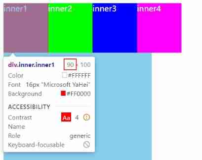
5.5.flex-basis
flex-basis Used to set flex items stay main axis In the direction of base size.
- auto: The default value is ;
- Set the specific width value : Will be overwritten before giving flex items Set up width;
decision flex items Final base size Factors , The order of priority from high to low is as follows :
- max-width\max-height\min-width\min-height;
- flex-basis;
- width\height;
- The content itself size;
5.6.flex
flex yes flex-grow | flex-shrink | flex-basis The shorthand property of , You can specify 1、2 or 3 It's worth .
- Appoint 1 It's worth :
- A unitless number : Will be regarded as
flex-growValue ; - A valid width value : Will be regarded as
flex-basisValue ; - keyword none、auto or initial;
- A unitless number : Will be regarded as
- Appoint 2 It's worth :
- The first value must be a unitless number , And as
flex-growValue ; - The second value must be one of the following :
- A unitless number : Will be regarded as
flex-shrinkValue ; - A valid width value : Will be regarded as
flex-basisValue ;
- A unitless number : Will be regarded as
- The first value must be a unitless number , And as
- Appoint 3 It's worth :
- The first value must be a unitless number : Will be regarded as
flex-growValue ; - The second value must be a unitless number : Will be regarded as
flex-shrinkValue ; - The third value must be a valid width value : Will be regarded as
flex-basisValue ;
- The first value must be a unitless number : Will be regarded as
边栏推荐
- Kotlin compose perfect todo project surface rendering background and shadow
- 两小时带你进入软件测试行业风口(附全套软件测试学习路线)
- After the newly assigned variable of the applet is modified, the original variable will also be modified
- great! Auto like, I use pyautogui!
- Rce code execution & command execution (V)
- My IC journey - the growth of senior chip design verification engineers - "Hu" said that IC engineers are perfect and advanced
- What is Ethernet and how to connect the computer
- Kotlin compose listens to the soft keyboard and clicks enter to submit the event
- CTF_ Web: Changan cup-2021 old but a little new & asuka
- 高效的NoSQL数据库服务Amozon DynamoDB体验分享
猜你喜欢


随机推荐
融合CDN,为客户打造极致服务体验!
Heavy broadcast | phase shift method + mathematical principle derivation of multi frequency heterodyne + implementation
Qdebug June 2022
Apache+php uploading large files
Region of Halcon: generation of multiple regions (3)
[image fusion] image fusion based on MATLAB directional discrete cosine transform and principal component analysis [including Matlab source code 1907]
buuctf web
API interface management setup -eolinker4.0
TeeChart Pro ActiveX 2022.1
File upload vulnerability shooting range upload labs learning (pass1-pass5)
Eyeshot Ultimate 2022 Crack By Xacker
Calculate student grade (virtual function and polymorphism)
Difference between asemi high power FET and triode
Introduction to the hardest core PWN in the whole network_ Graphic analysis
【Keil】ADuCM4050官方库的GPIO输出宏定义
Wechat likes to pay attention to the solution of invalid automatic reply
绝了!自动点赞,我用 PyAutoGUI!
Record the problem of C # print size once
Codeforces Round #802 (Div. 2) C D
Get to know the drawing component of flutter - custompaint