当前位置:网站首页>How to compare two or more distributions: a summary of methods from visualization to statistical testing
How to compare two or more distributions: a summary of methods from visualization to statistical testing
2022-06-24 22:21:00 【deephub】
Comparing the distribution of a variable in different groups is a common problem in data science . When we want to evaluate a strategy ( User experience features 、 Advertising activities 、 Drugs, etc ) When the causal effect of , The gold standard of causal inference is randomized controlled trials , It's called A /B test . In practice , We selected a sample for the study , They were randomly divided into control group (control group) And the experimental group (treatment group) Compare the results between the two groups . Randomization ensures the only difference between the two groups , In this way, we can attribute the difference in results to the experimental results .
Because it is random, the two groups of individuals will not be exactly the same (identical). But sometimes , They are not even... In their overall performance “ be similar ” Of (similar). for example , We may have more men in a group , Or older people , wait .( We usually call these characteristics covariates or control variables ). When that happens , It can no longer be determined that the difference in results is only due to experiments . therefore , After randomization , Check that all observed variables are balanced between groups , Whether there are no systematic differences is very important .
In this article , We will see a comparison of the two ( Or more ) Different methods of distribution , And assess the magnitude and importance of their differences . We will consider two different approaches , Visualization and statistics . These two methods can provide us with intuition and rigorous numerical values to quickly evaluate and explore differences , But here's the thing , It is difficult for these methods to distinguish whether these differences are systematic or caused by noise .
Suppose we need to experiment with a group of people and have randomly divided them into experimental group and control group . We want them to be as comparable as possible , So that any difference between the two groups can only be attributed to the experimental effect . We also divided the experimental groups into different groups , To test the effect of different experimental methods ( for example , A slight change in the same drug ).
For this example , I simulated 1000 Personal data sets , We looked at a set of their characteristics . I started from src Imported the data generation process dgp_rnd_assignment().DGP and src.utils Some drawing functions and libraries in .
from src.utils import *
from src.dgp import dgp_rnd_assignment

df = dgp_rnd_assignment().generate_data()
df.head()

We have 1000 Personal information , Observe their gender 、 Age and weekly income . Everyone is either assigned to 4 Two different experimental groups were either assigned to the control group .
2 Group data comparison - visualization
Let's start with the simplest : We want to compare the income distribution of the whole experimental group with that of the control group . We first explore the visualization method , Then there are statistical methods . The advantage of the first method is that we can use our intuition to judge , The advantage of the second method is that it is more rigorous to use numerical judgment .
For most visualizations , This will use Python Of seaborn library .
boxplot
The first visual method is the box diagram . Boxplot is a good compromise between summary statistics and data visualization . The center of the box represents the median , The borders represent the 1(Q1) And the 3 Four percentile (Q3). The extension line extends beyond the quadrant of the frame (Q3 - Q1) 1.5 Times the first data point . Points that fall outside the extension line are drawn separately , It is usually considered an outlier .
therefore , The boxplot provides summary statistics ( Boxes and extension lines ) And direct data visualization ( outliers ).
sns.boxplot(data=df, x='Group', y='Income');
plt.title("Boxplot");

The income distribution of the experimental group was more dispersed : The orange box is bigger , Its extension line covers a wider range . But the problem with the boxplot is that it hides the shape of the data , It tells us some aggregated Statistics , But it doesn't show the actual data distribution .
Histogram
The most intuitive way to draw a distribution map is a histogram . Histograms group data into containers of equal width (bin) in , And plot the number of observations in each container .
sns.histplot(data=df, x='Income', hue='Group', bins=50);
plt.title("Histogram");

There are also some problems with histograms
- Because the observation times of the two groups are different , Therefore, the two histograms are not comparable
- bin The number of is arbitrary
We can use stat Option to plot density instead of counting to solve the first problem , And will common_norm Set to False Normalize each histogram separately .
sns.histplot(data=df, x='Income', hue='Group', bins=50, stat='density', common_norm=False);
plt.title("Density Histogram");

In this way, the two histograms are comparable !
But an important problem still exists :bin The size of is arbitrary . In extremely exceptional circumstances , If we group less data , You will end up with at most one observation bin, If we group the data more , We'll end up with just one bin. In both cases , We can't judge . This is a classic deviation - The problem of variance tradeoffs .
Nuclear density
One possible solution is to use the kernel density function , This function attempts to use kernel density estimation (KDE) Use continuous function to approximate histogram .
sns.kdeplot(x='Income', data=df, hue='Group', common_norm=False);
plt.title("Kernel Density Function");

As you can see from the diagram , The income kernel density seems to have a higher variance in the experimental group , But the average value of each group is similar . The problem with nuclear density estimation is that it is a bit like a black box , May mask the relevant characteristics of the data .
Cumulative distribution
A more transparent representation of the two distributions is their cumulative distribution function (Cumulative Distribution Function). stay x Axis ( income ) Every point of , We plot the percentage of data points with equal or lower values . The main advantage of the cumulative distribution function is
- There is no need to make any choice ( for example bin The number of )
- No approximation is required ( For example, using KDE), The graph represents all data points
sns.histplot(x='Income', data=df, hue='Group', bins=len(df), stat="density",
             element="step", fill=False, cumulative=True, common_norm=False);
plt.title("Cumulative distribution function");
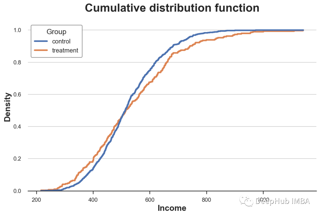
How should we explain this picture ?
- Because these two lines are 0.5 (y Axis ) More or less intersect , This means that their median values are similar
- Because the orange line is above the blue line on the left , Below the blue line on the right , This means that the distribution of the experimental group is fatter tails( Fat tail )
QQ chart
A related approach is QQ chart , among q Represents the quantile .QQ Figure plots the quantiles of two distributions . If the distribution is the same, you should get a 45 Degree line .
Python There is no original QQ Figure function , and statsmodels The package provided. qqplot function , But it's quite troublesome . therefore , We will do it by hand .
First , We need to use percentile Function to calculate the quartile of two groups .
income = df['Income'].values
income_t = df.loc[df.Group=='treatment', 'Income'].values
income_c = df.loc[df.Group=='control', 'Income'].values

df_pct = pd.DataFrame()
df_pct['q_treatment'] = np.percentile(income_t, range(100))
df_pct['q_control'] = np.percentile(income_c, range(100))
Now we can plot two quantile distributions , add 45 Degree line , Represents the perfect fit of the datum .
plt.figure(figsize=(8, 8))
plt.scatter(x='q_control', y='q_treatment', data=df_pct, label='Actual fit');
sns.lineplot(x='q_control', y='q_control', data=df_pct, color='r', label='Line of perfect fit');
plt.xlabel('Quantile of income, control group')
plt.ylabel('Quantile of income, treatment group')
plt.legend()
plt.title("QQ plot");
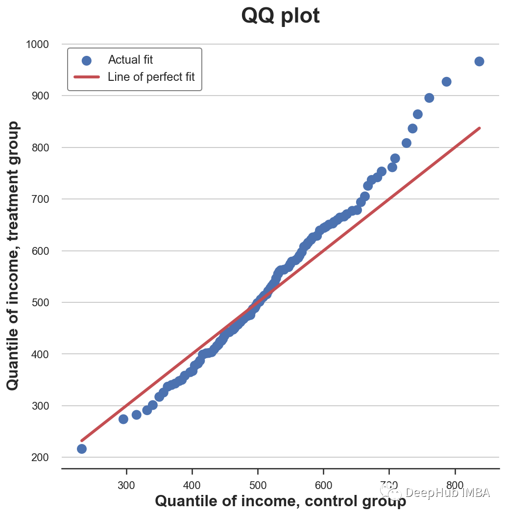
QQ Graphs provide very similar information in terms of cumulative distributions : The experimental group had the same median income ( Lines cross at the center ) But the tail is wider ( The point is below the line on the left , Above the line on the right ).
2 Group data comparison - Statistical methods
up to now , We have seen different ways to visualize the differences between distributions . The main advantage of visualization is intuition : We can observe the differences and visually evaluate them .
However , We may want to be more strict , And try to assess the statistical significance of the differences between distributions , namely answer “ Is the observed difference systematic or due to sampling noise ?” The problem of .
We will now analyze different test methods to distinguish the two distributions .
T test
The first and most common is the student t test .T Tests are usually used to compare mean values . We want to test whether the average income distribution of the two groups is the same . The test statistics of the two mean comparison test are given by the following formula :

among x̅ That's the sample mean ,s Is the sample standard deviation . Under mild conditions , Test statistics as students t Distribution asymptotic distribution .
We use scipy Medium ttest_ind Function to execute t test . This function returns the test statistics and the implied p value .
from scipy.stats import ttest_ind

stat, p_value = ttest_ind(income_c, income_t)
print(f"t-test: statistic={stat:.4f}, p-value={p_value:.4f}")

t-test: statistic=-1.5549, p-value=0.1203
Tested p The value is 0.12, Therefore, we do not reject the zero hypothesis that there is no difference between the average values of the experimental group and the control group .
Normalized mean difference (SMD)
Generally speaking , When we do randomized controlled trials or A/B When testing , It is best to test the mean difference of all variables between the experimental group and the control group .
However , because t The denominator of the test statistic depends on the sample size , therefore t Tested p Values are difficult to compare across studies . So we may get significant results in an experiment with a very small difference but a large sample size , In experiments with large differences but small sample size, we may get insignificant results .
One solution to this problem is to standardize the mean difference (SMD). seeing the name of a thing one thinks of its function , This is not an appropriate statistic , It's just a standardized difference , It can be calculated as :

Usually , lower than 0.1 The value of is considered to be a “ Small ” The difference of .
The average value of all variables in the experimental group and the control group and the distance between them are measured (t Test or SMD) Collected in a table called the balance table . have access to causalml In the library create_table_one Function to generate it . As the name of the function shows , In execution A/B When testing , The balance sheet should be the first one you want to see .
from causalml.match import create_table_one

df['treatment'] = df['Group']=='treatment'
create_table_one(df, 'treatment', ['Gender', 'Age', 'Income'])

In the first two columns , We can see the average values of different variables in the experimental group and the control group , The standard error is in brackets . In the last column ,SMD The value of indicates that the standardized difference of all variables is greater than 0.1, This suggests that the two groups may be different .
Mann–Whitney U test
Another test is Mann-Whitney U test , It compares the median of two distributions . The original hypothesis of this test is that the two groups have the same distribution , The alternative hypothesis is that one group has a greater ( Or less ) Value .
Different from the other tests we saw above ,Mann-Whitney U Test for unknown outliers .
The inspection process is as follows .
- Merge all data points and rank them ( In ascending or descending order )
- Calculation U₁ = R₁ - n₁(n₁ + 1)/2, among R₁ Is the rank sum of the first set of data points ,n₁ Is the number of data points in the first group .
- Similarly calculate the second set of U₂.
- The test statistic consists of stat = min(U₁, U₂) give .
Under the original assumption that there is no system level difference between the two distributions ( The same median ), The test statistic is asymptotically normal , With known mean and variance .
Calculation R and U The theory behind it is as follows : If the values in the first sample are greater than those in the second sample , be R₁ = n₁(n₁ + 1)/2 And as a result ,U 1 Will be zero ( The minimum value attainable ). Otherwise, if the two samples are similar ,U1 and U2 Will be very close to n1 n2 / 2( The maximum attainable ).
We use scipy Of mannwhitneyu function .
from scipy.stats import mannwhitneyu

stat, p_value = mannwhitneyu(income_t, income_c)
print(f" Mann–Whitney U Test: statistic={stat:.4f}, p-value={p_value:.4f}")

Mann–Whitney U Test: statistic=106371.5000, p-value=0.6012
What we got p The value is 0.6, This means that we do not reject the null hypothesis that there is no difference in the median between the experimental group and the control group .
Replacement test
A nonparametric alternative is the substitution test . Under the original assumption , The two distributions should be the same , Therefore, disrupting group labels should not significantly change any statistics .
You can select any statistic and check how its value in the original sample compares with its distribution in the group label arrangement . For example, the difference of the sample mean between the experimental group and the control group is used as the test statistics .
sample_stat = np.mean(income_t) - np.mean(income_c)stats = np.zeros(1000)
for k in range(1000):
    labels = np.random.permutation((df['Group'] == 'treatment').values)
    stats[k] = np.mean(income[labels]) - np.mean(income[labels==False])
p_value = np.mean(stats > sample_stat)

print(f"Permutation test: p-value={p_value:.4f}")

Permutation test: p-value=0.0530
From the replacement test p The value is 0.053, This means that 5% Weak non rejection of the original hypothesis at the level of . So how to explain p value ? This means that the difference between the mean values in the data is greater than the difference between the mean values in the replacement samples 1–0.0560 = 94.4%.
We can visualize the distribution of test statistics in the permutation and the distribution of sample values .
plt.hist(stats, label='Permutation Statistics', bins=30);
plt.axvline(x=sample_stat, c='r', ls='--', label='Sample Statistic');
plt.legend();
plt.xlabel('Income difference between treatment and control group')
plt.title('Permutation Test');

As we can see , The sample statistics are quite extreme relative to the values in the replacement samples , But not too much .
Chi square test
Chi square test is a very powerful test , It is mainly used to check the frequency difference .
One of the least known applications of chi square test is to test the similarity between two distributions . The idea is to categorize the two sets of observations . If the two distributions are the same , We would expect everyone bin The observation frequency is the same in . The important point here is that it needs to be in every bin Make enough observations in , To make the inspection effective .
Generate... Corresponding to the tenths of the income distribution in the control group bin, Then if the two distributions are the same , I counted every... In the experimental group bin Expected observations in .
# Init dataframe
df_bins = pd.DataFrame()

# Generate bins from control group
_, bins = pd.qcut(income_c, q=10, retbins=True)
df_bins['bin'] = pd.cut(income_c, bins=bins).value_counts().index

# Apply bins to both groups
df_bins['income_c_observed'] = pd.cut(income_c, bins=bins).value_counts().values
df_bins['income_t_observed'] = pd.cut(income_t, bins=bins).value_counts().values

# Compute expected frequency in the treatment group
df_bins['income_t_expected'] = df_bins['income_c_observed'] / np.sum(df_bins['income_c_observed']) * np.sum(df_bins['income_t_observed'])

df_bins

Now you can compare and process groups across bin The expected (E) And observation (O) Observe the number to perform the test . The test statistics are given by the following formula

among bin from i Indexes ,O yes bin i Number of data points observed in ,E yes bin i Expected number of data points in . Because we used the tenths of the income distribution in the control group to generate bin, So we expect to process each of the groups bin The number of observations in each bin They are the same . The asymptotic distribution of test statistics is chi square distribution .
In order to calculate test statistics and test p value , We use scipy Chi square function of .
from scipy.stats import chisquare

stat, p_value = chisquare(df_bins['income_t_observed'], df_bins['income_t_expected'])
print(f"Chi-squared Test: statistic={stat:.4f}, p-value={p_value:.4f}")

Chi-squared Test: statistic=32.1432, p-value=0.0002
Unlike all other tests described above , Chi square test strongly rejects the original hypothesis that two distributions are the same . Why is that ?
The reason is that the two distributions have similar centers but different tails , And chi square test tested the similarity of the whole distribution , Not just the center , As we did in the previous inspection .
This result tells a warning : In from p Before it's worth drawing a blind conclusion , It is very important to understand the contents of the actual inspection !
Kolmogorov-Smirnov test
Kolmogorov-Smirnov The idea of the test is to compare the cumulative distributions of the two groups . especially ,Kolmogorov-Smirnov The test statistic is the maximum absolute difference between two cumulative distributions .

among F₁ and F₂ Is two cumulative distribution functions ,x Is the value of the underlying variable .Kolmogorov-Smirnov The asymptotic distribution of the test statistic is Kolmogorov Distribution .
Just to understand , Let's plot the cumulative distribution function and test statistics . First, calculate the cumulative distribution function .
df_ks = pd.DataFrame()
df_ks['Income'] = np.sort(df['Income'].unique())
df_ks['F_control'] = df_ks['Income'].apply(lambda x: np.mean(income_c<=x))
df_ks['F_treatment'] = df_ks['Income'].apply(lambda x: np.mean(income_t<=x))
df_ks.head()

Now we need to find the point where the absolute distance between the cumulative distribution functions is the largest .
k = np.argmax( np.abs(df_ks['F_control'] - df_ks['F_treatment']))
ks_stat = np.abs(df_ks['F_treatment'][k] - df_ks['F_control'][k])
The values of test statistics can be visualized by plotting the values of two cumulative distribution functions and test statistics .
y = (df_ks['F_treatment'][k] + df_ks['F_control'][k])/2
plt.plot('Income', 'F_control', data=df_ks, label='Control')
plt.plot('Income', 'F_treatment', data=df_ks, label='Treatment')
plt.errorbar(x=df_ks['Income'][k], y=y, yerr=ks_stat/2, color='k',
             capsize=5, mew=3, label=f"Test statistic: {ks_stat:.4f}")
plt.legend(loc='center right');
plt.title("Kolmogorov-Smirnov Test");

As we can see from the picture , The value of the test statistic corresponds to the income ~650 The distance between two cumulative distributions of . For this income value, there is the largest imbalance between the two groups .
We can use scipy Medium kstest Function performs a real test .
from scipy.stats import kstest

stat, p_value = kstest(income_t, income_c)
print(f" Kolmogorov-Smirnov Test: statistic={stat:.4f}, p-value={p_value:.4f}")

Kolmogorov-Smirnov Test: statistic=0.0974, p-value=0.0355
p The value is less than 5%: We use 95% We reject the original assumption that two distributions are the same .
Comparison of multiple groups of data - visualization
up to now , We only considered two groups of cases , But what if we have multiple groups ? Some of the methods we saw above can be well extended , Others cannot .
As an example , We will now look at whether the income distribution of different experimental groups is the same .
boxplot
When we have multiple groups , The box diagram can be well extended , Because we can put different boxes side by side .
sns.boxplot(x='Arm', y='Income', data=df.sort_values('Arm'));
plt.title("Boxplot, multiple groups");

As you can see from the diagram , The income distribution of different experimental groups is different , The higher the number, the higher the average income .
Picture of violin
A very good extension of the box graph that combines aggregate statistics and kernel density estimation is the violin graph . Violin picture edge y The axis shows different densities , So they don't overlap . By default , It also adds a miniature box diagram .
sns.violinplot(x='Arm', y='Income', data=df.sort_values('Arm'));
plt.title("Violin Plot, multiple groups");

The violin chart shows that the income of different experimental groups is different .
Ridge map
Ridge map along x The axis plots multiple nuclear density distributions , It is more intuitive than the violin picture . stay matplotlib and seaborn There is no default ridge map in . Always need joypy package .
from joypy import joyplot

joyplot(df, by='Arm', column='Income', colormap=sns.color_palette("crest", as_cmap=True));
plt.xlabel('Income');
plt.title("Ridgeline Plot, multiple groups");

The ridge map shows , The higher the number, the higher the income of the experimental group . It is also easier to understand the different shapes of the distribution from this diagram .
Comparison of multiple groups of data - Statistical methods
Last , Let's consider a hypothesis test that compares multiple groups . For the sake of simplicity , We will focus on one of the most commonly used :f test .
F test
The most popular test for multiple groups is F test .F Test and compare the variance of variables between different groups . This analysis is also called analysis of variance .
F The test statistics are given by the following formula

among G It's the number of groups ,N It's observation ,x̅ Is the overall average ,x̅g Is a group g The average within . Under the original assumption of group independence ,f The statistics are F The distribution of the .
from scipy.stats import f_oneway

income_groups = [df.loc[df['Arm']==arm, 'Income'].values for arm in df['Arm'].dropna().unique()]
stat, p_value = f_oneway(*income_groups)
print(f"F Test: statistic={stat:.4f}, p-value={p_value:.4f}")

F Test: statistic=9.0911, p-value=0.0000
test p The value is basically zero , This means that the original assumption that there is no difference in income distribution between the experimental groups is strongly rejected .
summary
In this article , We see many different ways to compare two or more distributions , Both visually and statistically . This is a major problem in many applications , Especially in causal inference , We need to randomize to make the experimental group and the control group as comparable as possible .
We have also seen how different approaches can be applied to different situations . The visual method is very intuitive , But statistical methods are crucial for decision making , Because we need to be able to assess the magnitude and statistical significance of the differences .
This article code :
https://avoid.overfit.cn/post/883ffe04b1e340c8a5fd2a7ea6364cbf
author :Matteo Courthoud
边栏推荐
猜你喜欢

NIO、BIO、AIO

Flutter 如何使用在线转码工具将 JSON 转为 Model

You are using pip version 21.1.2; however, version 22.1.2 is available
NiO, bio, AIO

Want to be a test leader, do you know these 6 skills?
![leetcode:45. Jumping game II [classic greed]](/img/69/ac5ac8fe22dbb8ab719d09efda4a54.png)
leetcode:45. Jumping game II [classic greed]

Description of transparent transmission function before master and slave of kt6368a Bluetooth chip, 2.4G frequency hopping automatic connection

socket done
想当测试Leader,这6项技能你会吗?

These map operations in guava have reduced my code by 50%
随机推荐
String exercise summary 2
The process from troubleshooting to problem solving: the browser suddenly failed to access the web page, error code: 0x80004005, and the final positioning: "when the computer turns on the hotspot, the
Xinlou: Huawei's seven-year building journey of sports health
first-order-model实现照片动起来(附工具代码) | 机器学习
Uncover the secret of station B. is it true that programmers wear women's clothes and knock code more efficiently?
Practice of hierarchical management based on kubesphere
波卡生态发展不设限的奥义——多维解读平行链
Double linked list implementation
leetcode:515. Find the maximum value in each tree row [brainless BFS]
性能测试工具wrk安装使用详解
Information update on automatic control principle
Flutter 如何使用在线转码工具将 JSON 转为 Model
Industrial development status of virtual human
Why can some programmers get good offers with average ability?
Binary search tree template
关于自动控制原理资料更新
leetcode:45. Jumping game II [classic greed]
SAP interface debug setting external breakpoints
Shutter precautions for using typedef
How does flutter use the online transcoding tool to convert JSON to model