当前位置:网站首页>[applet development] common components and basic usage details
[applet development] common components and basic usage details
2022-07-25 19:06:00 【Hua Weiyun】
Learning objectives of this section :
Learn to use common components
@[toc]
1. Use of commonly used container class components
1.view Basic use of components
view Be similar to HTML Medium div, Realize the common view area .
for example : Use flex Achieve horizontal layout .
wxml Code :
<view class="container1"><view>A</view><view>B</view><view>C</view></view>wxss Code :
.container1 view{ width:100px; height:100px; text-align: center; line-height: 100px;}.container1 view:nth-child(1){ background-color: aquamarine;}.container1 view:nth-child(2){ background-color: azure;}.container1 view:nth-child(3){ background-color: darkorange;}.container1 { display: flex; justify-content: space-around;} Realization effect :
2.scroll-view Basic use of components
utilize scroll-view Rolling effect can be achieved , This effect can be scrolling up and down , It can also scroll left and right .
wxml Code :
<scroll-view class="container1" scroll-y><view>A</view><view>B</view><view>C</view></scroll-view>Modified wxss Code :
.container1 { border:1px solid red; height:110px; /* Use scroll-view Set a fixed height */Realization effect :
3.swiper and swiper-item Basic use of components
Using these two components can achieve the effect of rotating pictures :
wxml Code :
<swiper class="swiper-container"><swiper-item><view class="item">A</view></swiper-item><swiper-item> <view class="item">B</view></swiper-item><swiper-item> <view class="item">C</view></swiper-item></swiper>wxss Code :
.swiper-container{ height:150px;}.item{ height:100%; line-height: 150px; text-align: center;}swiper-item:nth-child(1) .item{ background-color: aquamarine;}swiper-item:nth-child(2) .item{ background-color: azure;}swiper-item:nth-child(3) .item{ background-color: darkorange;} Realization effect :
swiper Common properties of components
| attribute | type | The default value is | explain |
|---|---|---|---|
| indicator-dots | boolean | false | Whether to display panel indicator color |
| indicator-color | color | rgba(0,0,0,3) | Indicate the color |
| indicator-active-color | color | #000000 | The color of the currently selected indicator point |
| autoplay | boolean | false | Auto switch or not |
| interval | number | 5000 | Auto switch interval |
| circular | boolean | false | Whether to adopt the joint sliding |
example : Display panel indicator color :
<swiper class="swiper-container" indicator-dots="true" >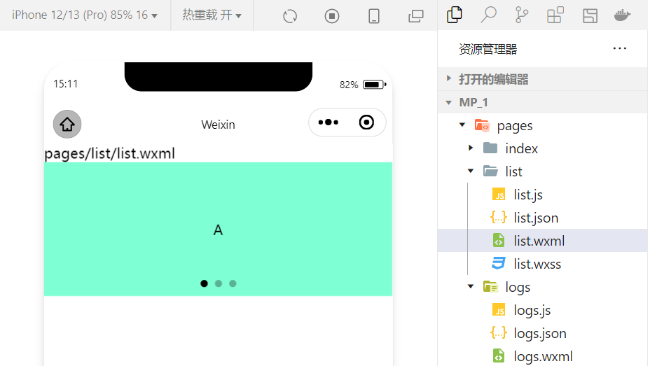
example : Specify the indicator point color and the currently selected knowledge point color :
<swiper class="swiper-container" indicator-dots="true" indicator-color="white" indicator-active-color="red">
example : Set automatic switching , The interval is set to 1s:
<swiper class="swiper-container" indicator-dots="true" indicator-color="white" indicator-active-color="red" autoplay="true" interval="1000">
It adopts joint sliding :
<swiper class="swiper-container" indicator-dots="true" indicator-color="white" indicator-active-color="red" autoplay="true" interval="1000" circular>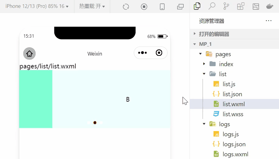
2. Use of common basic content components
1.text Basic use of components
example : adopt text Component's user-select attribute , You can press and hold the selected text content .( Used before selectable Has been abandoned !)
<view> Long press to select the text content :<text user-select>HelloWorld!</text></view>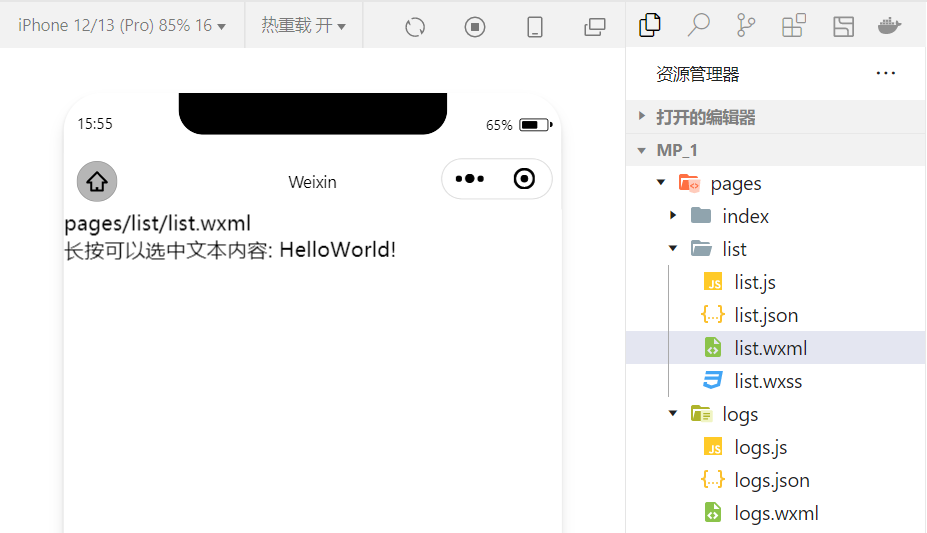
2.rich-text Basic use of components
example : adopt rich-text Component's nodes Attribute node , hold HTML The string is rendered as the corresponding UI structure .
<rich-text nodes="<h1 style='color:red'> title </h1>"> </rich-text>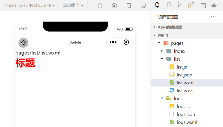
Trying to HTML The document is rendered as the corresponding UI Structure using this component .
3. Other common components
1.button Use of components
The button component in the applet is similar to HTML Button components in , At the same time, you can call the rich functions provided by wechat , for example : Get user information , Get user authorization , Forwarding, etc .
example : Use type Property sets the type of button :
<button > Default button </button><button type="primary"> Main tone button </button><button type="warn"> Warning button </button>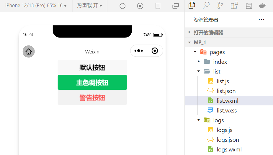
example : Use size Property to set the size of the button :
<button size="mini"> Default button </button><button type="primary" size="mini"> Main tone button </button><button type="warn" size="mini"> Warning button </button>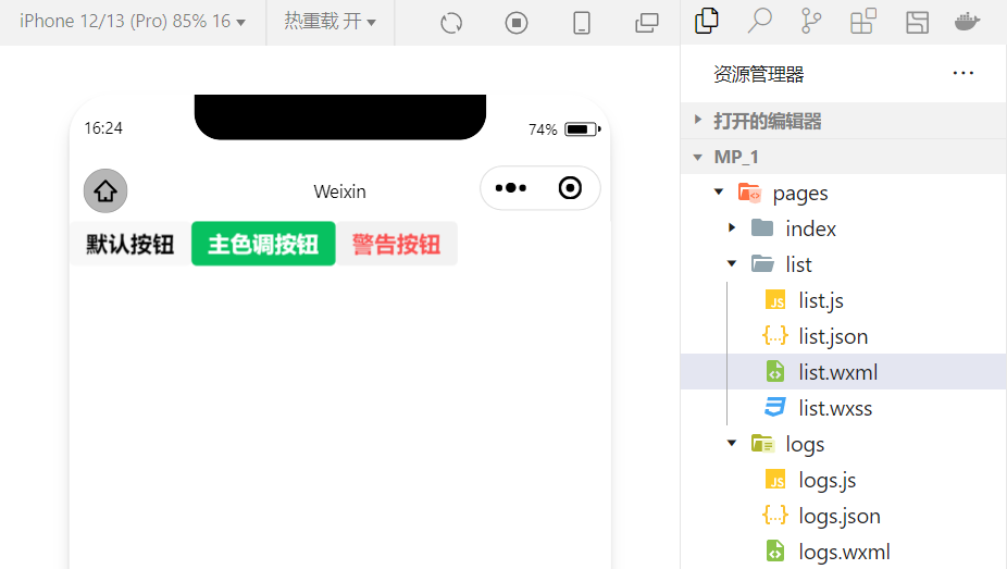
example : Use plain Property setting hollowed out button :
<button plain> Default button </button><button type="primary" plain> Main tone button </button><button type="warn" plain> Warning button </button>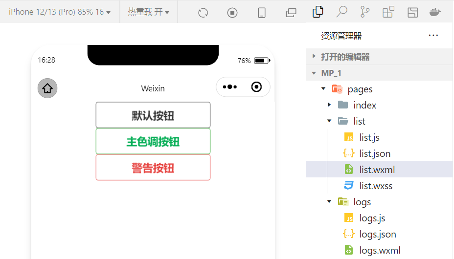
2.image Basic use of components
wxml Code :
<image src="/images/1.jpg"></image>wxss Code :
image{ border: 5px solid black;} Realization effect :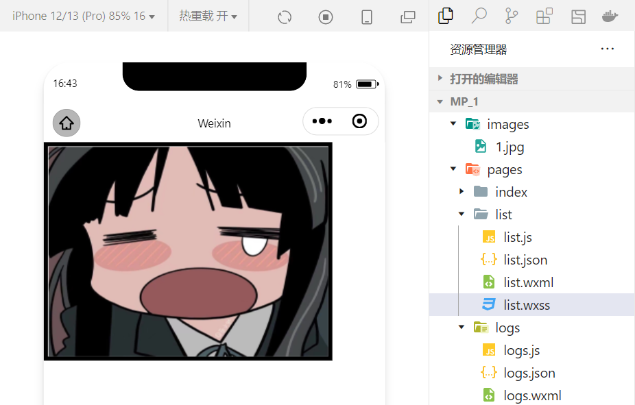
image Component's mode Property is used to specify the cropping and scaling mode of the picture , frequently-used mode The property values are as follows :
| mode value | explain |
|---|---|
| scaleToFill | ( The default value is ) Zoom mode , Do not keep aspect ratio zooming picture , Stretch the width and height of the picture completely to fill image Elements |
| aspectFit | Zoom mode , Keep the aspect ratio scaled , Make the long edges of the picture fully visible . in other words , The picture can be displayed completely . |
| aspectFill | Zoom mode , Keep the aspect ratio scaled , Only make sure that the short side of the picture is fully displayed . in other words , Pictures are usually complete only horizontally or vertically , Intercept will occur in the other direction . |
| widthFix | Zoom mode , The width does not change , Automatic height change , Keep the aspect ratio of the original image unchanged |
| heightFix | Zoom mode , The height remains the same , The width changes automatically , Keep the aspect ratio of the original image unchanged |
4. summary
This section summarizes several common components , In fact, small programs have a very rich component library , In the process of learning , Will slowly contact and skilled ! meanwhile , Learning and using components is also an important part of the applet hosting environment . In the development of small programs, we also realize that the iteration speed of technology update is very fast , So we must continue to learn new technologies !
边栏推荐
- Care for front-line epidemic prevention workers, Haocheng JIAYE and Gaomidian sub district office jointly build the great wall of public welfare
- 聚智云算,向新而生| 有孚网络“专有云”开启新纪元
- 高并发下如何保证数据库和缓存双写一致性?
- 【云原生之kubernetes】kubernetes集群下Secret存储对象的管理
- Virtual machine VMware installation steps (how to install software in virtual machine)
- How to change the chords after the tune of the song is changed
- 2022年IAA行业品类发展洞察系列报告·第二期
- App test point (mind map)
- Gan, why ".Length! == 3??
- 基础乐理--配置和弦
猜你喜欢

With 8 years of product experience, I have summarized these practical experience of continuous and efficient research and development
乐理基础 调式

Pixel2mesh generates 3D meshes from a single RGB image eccv2018

网上商城系统MySql数据库设计项目实战

浅析IM即时通讯开发出现上网卡顿?网络掉线?

Based on easycv to reproduce Detr and dab-detr, the correct opening method of object query

Ultimate doll 2.0 | cloud native delivery package

How to change the chords after the tune of the song is changed

ThreadLocal夺命11连问

Huawei switch system software upgrade and security vulnerability repair tutorial
随机推荐
telnet安装以及telnet(密码正确)无法登录!
Based on easycv to reproduce Detr and dab-detr, the correct opening method of object query
The difference between PHP equal to = = and identity equal to = = =
QT compiled successfully, but the program could not run
Fearless of high temperature and rainstorm, how can Youfu network protect you from worry?
阿里云免费SSL证书申请详细流程
Typescript object proxy use
Juzhi cloud computing opens a new era to the "proprietary cloud" of Youfu network
软件测试流程(思维导图)
SQL 实现 Excel 的10个常用功能,附面试原题
无惧高温暴雨,有孚网络如何保您无忧?
I3 status configuration
MySQL sub query (selected 20 sub query exercises)
【云原生之kubernetes】kubernetes集群下Secret存储对象的管理
Go code checking tool
C 调的满级和玄
基础乐理--配置和弦
Alibaba cloud technology expert haochendong: cloud observability - problem discovery and positioning practice
怎样设计产品帮助中心?以下几点不可忽视
What is hpapaas platform?