当前位置:网站首页>Hard liver! Super detailed basic introduction to Matplotlib!!!
Hard liver! Super detailed basic introduction to Matplotlib!!!
2022-06-25 22:00:00 【Xiaobai learns vision】
Click on the above “ Xiaobai studies vision ”, Optional plus " Star standard " or “ Roof placement ”
Heavy dry goods , First time delivery 

source : Dream by dream er
https://zhumenger.blog.csdn.net/article/details/106530281
【 Introduction 】: Excellent data visualization , It will make your data analysis and other work even better , Let people print ( l ) like ( job ) deep ( Add ) moment ( pay ).matplotlib yes python Excellent data visualization library ,python A necessary tool for data analysis , This article is specially arranged for you matplotlib Detailed usage , Come and learn !
--- Here is the text ---
Data visualization is very important , Because the wrong or insufficient data representation may destroy the excellent data analysis work .
matplotlib The library is dedicated to developing 2D Chart ( Include 3D Chart ) Of , Highlight the advantages :
It's extremely simple to use .
Gradually 、 Interactive way to realize data visualization .
Use of expressions and text LaTeX Typesetting .
Strong control over image elements .
Can output PNG、PDF、SVG and EPS Etc .
install
conda install matplotlibperhaps
pip install matplotlibmatplotlib framework
matplotlib One of the main tasks of , Is to provide a set of graphical objects to represent and manipulate ( Main object ) And the functions and tools of its internal objects . It can not only deal with graphics , It also provides event handling tools , Have the ability to add animation effects to graphics . With these additional features ,matplotlib Can generate interactive charts of events triggered by keyboard keys or mouse movements .
Logically speaking ,matplotlib The overall structure of is 3 layer , One way communication between layers :
Scripting ( Script ) layer .
Artist ( performance ) layer .
Backend ( Back end ) layer .
One 、matplotlib The basic usage of
import numpy as np
import matplotlib.pyplot as plt


x = np.linspace(-np.pi, np.pi, 30) #  Generate... Within the interval 30 An equal difference
y = np.sin(x)
print('x = ', x)
print('y = ', y)
Output :
x =  [-3.14159265 -2.92493109 -2.70826953 -2.49160797 -2.2749464  -2.05828484
 -1.84162328 -1.62496172 -1.40830016 -1.19163859 -0.97497703 -0.75831547
 -0.54165391 -0.32499234 -0.10833078  0.10833078  0.32499234  0.54165391
  0.75831547  0.97497703  1.19163859  1.40830016  1.62496172  1.84162328
  2.05828484  2.2749464   2.49160797  2.70826953  2.92493109  3.14159265]
y =  [-1.22464680e-16 -2.14970440e-01 -4.19889102e-01 -6.05174215e-01
 -7.62162055e-01 -8.83512044e-01 -9.63549993e-01 -9.98533414e-01
 -9.86826523e-01 -9.28976720e-01 -8.27688998e-01 -6.87699459e-01
 -5.15553857e-01 -3.19301530e-01 -1.08119018e-01  1.08119018e-01
  3.19301530e-01  5.15553857e-01  6.87699459e-01  8.27688998e-01
  9.28976720e-01  9.86826523e-01  9.98533414e-01  9.63549993e-01
  8.83512044e-01  7.62162055e-01  6.05174215e-01  4.19889102e-01
  2.14970440e-01  1.22464680e-16]
Draw a curve
plt.figure() #  Create a new window
plt.plot(x, y) #  Draw a picture x And y Related curves
plt.show()# Display images 
Draw multiple curves and add axes and labels
import numpy as np
import matplotlib.pyplot as plt


x = np.linspace(-np.pi, np.pi, 100) #  Generate... Within the interval 21 An equal difference
y = np.sin(x)
linear_y = 0.2 * x + 0.1


plt.figure(figsize = (8, 6)) #  Customize the size of the window


plt.plot(x, y)
plt.plot(x, linear_y, color = "red", linestyle = '--') #  Custom colors and representations


plt.title('y = sin(x) and y = 0.2x + 0.1') #  Define the title of the curve
plt.xlabel('x') #  Define the horizontal axis label
plt.ylabel('y') #  Define vertical axis labels


plt.show()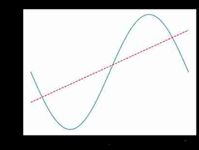
Specify the coordinate range and Set axis scale
import numpy as np
import matplotlib.pyplot as plt


x = np.linspace(-np.pi, np.pi, 100) #  Generate... Within the interval 21 An equal difference
y = np.sin(x)
linear_y = 0.2 * x + 0.1


plt.figure(figsize = (8, 6)) #  Customize the size of the window


plt.plot(x, y)
plt.plot(x, linear_y, color = "red", linestyle = '--') #  Custom colors and representations


plt.title('y = sin(x) and y = 0.2x + 0.1') #  Define the title of the curve
plt.xlabel('x') #  Define the horizontal axis label
plt.ylabel('y') #  Define vertical axis labels
plt.xlim(-np.pi, np.pi)
plt.ylim(-1, 1)


#  To reset x Axis scale
# plt.xticks(np.linspace(-np.pi, np.pi, 5))
x_value_range = np.linspace(-np.pi, np.pi, 5)
x_value_strs = [r'$\pi$', r'$-\frac{\pi}{2}$', r'$0$', r'$\frac{\pi}{2}$', r'$\pi$']
plt.xticks(x_value_range, x_value_strs)
plt.show() # Display images 
Define the coordinate axis with the origin at the center
import numpy as np
import matplotlib.pyplot as plt


x = np.linspace(-np.pi, np.pi, 100)
y = np.sin(x)
linear_y = 0.2 * x + 0.1


plt.figure(figsize = (8, 6))


plt.plot(x, y)
plt.plot(x, linear_y, color = "red", linestyle = '--')


plt.title('y = sin(x) and y = 0.2x + 0.1')
plt.xlabel('x')
plt.ylabel('y')
plt.xlim(-np.pi, np.pi)
plt.ylim(-1, 1)


# plt.xticks(np.linspace(-np.pi, np.pi, 5))
x_value_range = np.linspace(-np.pi, np.pi, 5)
x_value_strs = [r'$\pi$', r'$-\frac{\pi}{2}$', r'$0$', r'$\frac{\pi}{2}$', r'$\pi$']
plt.xticks(x_value_range, x_value_strs)


ax = plt.gca() #  Get the axis
ax.spines['right'].set_color('none') #  Hide the upper and right axes
ax.spines['top'].set_color('none')


#  Set the position of the left and lower axes
ax.spines['bottom'].set_position(('data', 0)) #  Set the lower axis to y = 0 The location of
ax.spines['left'].set_position(('data', 0)) #  Set the coordinate axis on the left to  x = 0  The location of


plt.show() # Display images 
legend legend
Use xticks() and yticks() Function to replace the axis label , Pass in two columns of values for each function . The first list stores the location of the scale , The second list stores the label of the scale .
import numpy as np
import matplotlib.pyplot as plt


x = np.linspace(-np.pi, np.pi, 100)
y = np.sin(x)
linear_y = 0.2 * x + 0.1


plt.figure(figsize = (8, 6))


#  Label the curve
plt.plot(x, y, label = "y = sin(x)")
plt.plot(x, linear_y, color = "red", linestyle = '--', label = 'y = 0.2x + 0.1')


plt.title('y = sin(x) and y = 0.2x + 0.1')
plt.xlabel('x')
plt.ylabel('y')
plt.xlim(-np.pi, np.pi)
plt.ylim(-1, 1)


# plt.xticks(np.linspace(-np.pi, np.pi, 5))
x_value_range = np.linspace(-np.pi, np.pi, 5)
x_value_strs = [r'$\pi$', r'$-\frac{\pi}{2}$', r'$0$', r'$\frac{\pi}{2}$', r'$\pi$']
plt.xticks(x_value_range, x_value_strs)


ax = plt.gca()
ax.spines['right'].set_color('none')
ax.spines['top'].set_color('none')


ax.spines['bottom'].set_position(('data', 0))
ax.spines['left'].set_position(('data', 0))


#  Mark the information of the curve
plt.legend(loc = 'lower right', fontsize = 12)
plt.show()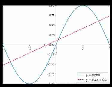
legend Methods loc Optional parameter settings
| Location string | Location number | Position statement |
|---|---|---|
| ‘best’ | 0 | The best position |
| ‘upper right’ | 1 | Upper right corner |
| ‘upper left’ | 2 | top left corner |
| ‘lower left’ | 3 | The lower left corner |
| ‘lower right’ | 4 | The lower right corner |
| ‘right’ | 5 | On the right side |
| ‘center left’ | 6 | The left side is vertically centered |
| ‘center right’ | 7 | The right side is vertically centered |
| ‘lower center’ | 8 | The lower part is horizontally centered |
| ‘upper center’ | 9 | Center horizontally above |
| ‘center’ | 10 | precise middle |
Two 、 Histogram
Method used :plt.bar
import numpy as np
import matplotlib.pyplot as plt


plt.figure(figsize = (16, 12))
x = np.array([1, 2, 3, 4, 5, 6, 7, 8])
y = np.array([3, 5, 7, 6, 2, 6, 10, 15])
plt.plot(x, y, 'r', lw = 5) #  Specifies the color and width of the line


x = np.array([1, 2, 3, 4, 5, 6, 7, 8])
y = np.array([13, 25, 17, 36, 21, 16, 10, 15])
plt.bar(x, y, 0.2, alpha = 1, color='b') #  Generate a histogram , Indicates the width of the graph , Transparency and color
plt.show()
Sometimes the histogram will appear in x Both sides of the shaft , Easy to compare , The code implementation is as follows :
import numpy as np
import matplotlib.pyplot as plt


plt.figure(figsize = (16, 12))
n = 12
x = np.arange(n) #  Generate in order from 12 Numbers within
y1 = (1 - x / float(n)) * np.random.uniform(0.5, 1.0, n)
y2 = (1 - x / float(n)) * np.random.uniform(0.5, 1.0, n)


#  Set the color of the histogram and the boundary color
#+y It means that x Above the axis  -y It means that x Below the shaft
plt.bar(x, +y1, facecolor = '#9999ff', edgecolor = 'white')
plt.bar(x, -y2, facecolor = '#ff9999', edgecolor = 'white')


plt.xlim(-0.5, n) #  Set up x The scope of the shaft ,
plt.xticks(()) #  You can set the scale to null , Eliminate scale
plt.ylim(-1.25, 1.25) #  Set up y The scope of the shaft
plt.yticks(())


# plt.text() Write text to the image , Set location , Set text ,ha Set the horizontal direction to its way ,va Set the vertical alignment
for x1, y in zip(x, y2):
    plt.text(x1, -y - 0.05, '%.2f' % y, ha = 'center', va = 'top')
for x1, y in zip(x, y1):
    plt.text(x1, y + 0.05, '%.2f' % y, ha = 'center', va = 'bottom')
plt.show()
3、 ... and 、 Scatter plot
import numpy as np
import matplotlib.pyplot as plt
N = 50
x = np.random.rand(N)
y = np.random.rand(N)
colors = np.random.rand(N)
area = np.pi * (15 * np.random.rand(N))**2
plt.scatter(x, y, s = area,c = colors, alpha = 0.8)


plt.show()
Four 、 Contour map
import matplotlib.pyplot as plt
import numpy as np


def f(x, y):
    return (1 - x / 2 + x ** 5 + y ** 3) * np.exp(-x ** 2 - y ** 2)


n = 256
x = np.linspace(-3, 3, n)
y = np.linspace(-3, 3, n)
X, Y = np.meshgrid(x, y)  #  Generate grid coordinates   take x Shaft with y All points in the square area of the axis are obtained
line_num = 10 #  Number of contours


plt.figure(figsize = (16, 12))


#contour  Function for generating contour lines
# The first two parameters represent the coordinates of the point , The third parameter represents a function equal to a contour line , The fourth parameter indicates how many contours are generated
C = plt.contour(X, Y, f(X, Y), line_num, colors = 'black', linewidths = 0.5) #  Set the color and the width of the line segment
plt.clabel(C, inline = True, fontsize = 12) #  Get the exact value of each contour line


#  Fill color , cmap  Indicates how to fill ,hot Indicates the color filled with heat
plt.contourf(X, Y, f(X, Y), line_num, alpha = 0.75, cmap = plt.cm.hot)


plt.show()
5、 ... and 、 Processing images
import matplotlib.pyplot as plt
import matplotlib.image as mpimg #  Import a library for processing pictures
import matplotlib.cm as cm #  Import a library that handles colors colormap


plt.figure(figsize = (16, 12))
img = mpimg.imread('image/fuli.jpg')#  Read the picture
print(img) # numpy data
print(img.shape) #


plt.imshow(img, cmap = 'hot')
plt.colorbar() #  Get the value corresponding to the color
plt.show()
[[[ 11 23 63]
[ 12 24 64]
[ 1 13 55]
...
[ 1 12 42]
[ 1 12 42]
[ 1 12 42]]
[[ 19 31 71]
[ 3 15 55]
[ 0 10 52]
...
[ 0 11 39]
[ 0 11 39]
[ 0 11 39]]
[[ 22 34 74]
[ 3 15 55]
[ 7 19 61]
...
[ 0 11 39]
[ 0 11 39]
[ 0 11 39]]
...
[[ 84 125 217]
[ 80 121 213]
[ 78 118 214]
...
[ 58 90 191]
[ 54 86 187]
[ 53 85 186]]
[[ 84 124 220]
[ 79 119 215]
[ 78 117 218]
...
[ 55 87 188]
[ 55 87 188]
[ 55 87 188]]
[[ 83 121 220]
[ 80 118 219]
[ 83 120 224]
...
[ 56 88 189]
[ 58 90 191]
[ 59 91 192]]]
(728, 516, 3)
utilize numpy The matrix gets the picture
import matplotlib.pyplot as plt
import matplotlib.cm as cm #  Import a library that handles colors colormap
import numpy as np


size =  8
#  Get one 8*8 Values in (0, 1) The matrix between
a = np.linspace(0, 1, size ** 2).reshape(size, size)


plt.figure(figsize = (16, 12))
plt.imshow(a)
plt.show()
6、 ... and 、3D chart
import numpy as np
import matplotlib.pyplot as plt
from mpl_toolkits.mplot3d import Axes3D #  Import Axes3D object


fig = plt.figure(figsize = (16, 12))
ax = fig.add_subplot(111, projection = '3d') #  obtain 3d Images


x = np.arange(-4, 4, 0.25)
y = np.arange(-4, 4, 0.25)
X, Y = np.meshgrid(x, y) #  Generate grid
Z = np.sqrt(X ** 2 + Y ** 2)


#  Draw a curved surface               #  The span corresponding to rows and columns          #  Set the color
ax.plot_surface(X, Y, Z, rstride = 1, cstride = 1, cmap = plt.get_cmap('rainbow'))
plt.show()
Above is matplotlib Data visualization based on test data , Combined with the data in the actual project , The code is slightly modified , Can have an impressive effect .
download 1:OpenCV-Contrib Chinese version of extension module
stay 「 Xiaobai studies vision 」 Official account back office reply : Extension module Chinese course , You can download the first copy of the whole network OpenCV Extension module tutorial Chinese version , cover Expansion module installation 、SFM Algorithm 、 Stereo vision 、 Target tracking 、 Biological vision 、 Super resolution processing And more than 20 chapters .
download 2:Python Visual combat project 52 speak
stay 「 Xiaobai studies vision 」 Official account back office reply :Python Visual combat project , You can download the Image segmentation 、 Mask detection 、 Lane line detection 、 Vehicle count 、 Add Eyeliner 、 License plate recognition 、 Character recognition 、 Emotional tests 、 Text content extraction 、 face recognition etc. 31 A visual combat project , Help fast school computer vision .
download 3:OpenCV Actual project 20 speak
stay 「 Xiaobai studies vision 」 Official account back office reply :OpenCV Actual project 20 speak , You can download the 20 Based on OpenCV Realization 20 individual Actual project , Realization OpenCV Learn advanced .
Communication group
Welcome to join the official account reader group to communicate with your colleagues , There are SLAM、 3 d visual 、 sensor 、 Autopilot 、 Computational photography 、 testing 、 Division 、 distinguish 、 Medical imaging 、GAN、 Wechat groups such as algorithm competition ( It will be subdivided gradually in the future ), Please scan the following micro signal clustering , remarks :” nickname + School / company + Research direction “, for example :” Zhang San + Shanghai Jiaotong University + Vision SLAM“. Please note... According to the format , Otherwise, it will not pass . After successful addition, they will be invited to relevant wechat groups according to the research direction . Do not Send ads within the group , Or you'll be invited out , Thanks for your understanding ~


边栏推荐
- MySQL modifies multiple tables and adds multiple fields through SQL
- HNU network counting experiment: Experiment 5 network layer and link layer protocol analysis (packettracer)
- org. apache. ibatis. exceptions. PersistenceException:
- Set eye color
- Canoe learning notes (4)
- Créer le premier site Web avec idea
- Input a line of characters to count the English letters, spaces, numbers and other characters
- After osx-kvm modifies EFI, oc: failed to load configuration, osx-kvm generates opencore Qcow2 reports an error, libguestfs: error: source '
- [proteus simulation] Arduino uno+ key controls 2-bit digital tube countdown
- The difference between strcpy and memcpy
猜你喜欢

Simple record of fire & spell effects

Free cloud function proxy IP pool just released

Win11开始菜单右键空白?Win11开始菜单右键没反应解决方法

JS disable the browser PDF printing and downloading functions (pdf.js disable the printing and downloading functions)

How testers write functional test cases

Support JPEG format in GD Library in php7.4

Summary of digital image processing knowledge points

Bear market guide | some essential lessons and specific survival rules
. Thoughts on software trends in the 20th anniversary of net

Processing of limit operator in Presto

随机推荐
Is it safe to open an account with qiniu securities?
leetcode: 49. Grouping of alphabetic words
Common singleton functions traverse dictionary functions
Build the first website with idea
了解有哪几个C标准&了解C编译管道
GridView component of swiftui 4 new features (tutorial includes source code)
Pat 1073 scientific notation (20 points) (18 points not finished)
Command 'GCC' failed with exit status 1 when PIP install mysqlclient
On merging and sorting
Windows11 windows security center cannot open Windows Defender cannot open
"Exclusive interview with IDC people" Suzhou Shengwang: the road of IDC transformation in the post epidemic Era
When we talk about the metauniverse, what are we talking about?
Jmeter- (II) basic interface and common components for interface testing
Zhiyun health is about to go public: long-term losses, meinian health Yu Rong has withdrawn, and it is difficult to be optimistic about the future
Order by keyword syntax problems encountered in SQL Server learning
Bat script simple command
ASC - DAY2
Robotframework rewrite framework add case control
Concept and understanding of variables
What is a ZFS file system