当前位置:网站首页>Drawing library Matplotlib styles and styles
Drawing library Matplotlib styles and styles
2022-07-24 21:27:00 【Hua Weiyun】
1. Matplotlib style
In order to meet different application requirements ,Matplotlib It contains 28 Different styles , When drawing , You can choose different drawing styles according to your needs . Use the following code to get Matplotlib All available styles in :
import matplotlib as mplfrom matplotlib import pyplot as plt# see Matplotlib Available drawing styles print(plt.style.available)The available styles printed out are as follows :
['Solarize_Light2', '_classic_test_patch', '_mpl-gallery', '_mpl-gallery-nogrid', 'bmh', 'classic', 'dark_background', 'fast', 'fivethirtyeight', 'ggplot', 'grayscale', 'seaborn', 'seaborn-bright', 'seaborn-colorblind', 'seaborn-dark', 'seaborn-dark-palette', 'seaborn-darkgrid', 'seaborn-deep', 'seaborn-muted', 'seaborn-notebook', 'seaborn-paper', 'seaborn-pastel', 'seaborn-poster', 'seaborn-talk', 'seaborn-ticks', 'seaborn-white', 'seaborn-whitegrid', 'tableau-colorblind10'] Use plt.style.use("style") You can change the default drawing style , among style by Matplolib Styles available in :
import matplotlib as mplfrom matplotlib import pyplot as pltimport numpy as np# Set the default drawing style to seaborn-darkgridplt.style.use("seaborn-darkgrid") x = np.linspace(0, 2 * np.pi, 100)y = np.cos(x)plt.plot(x, y)plt.show()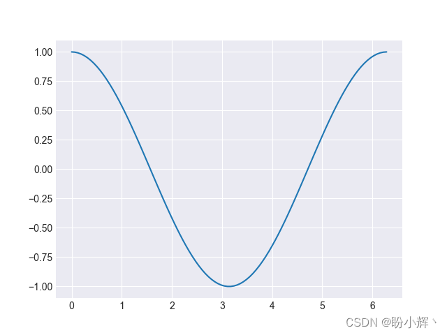
You can see , And in 《Matplotlib Graph drawing 》 Compared with the same figure drawn in , Its style is quite different . besides ,Maplotlib There are also some very interesting styles in , For example, hand-painted style :
import matplotlib as mplfrom matplotlib import pyplot as pltimport numpy as np# Enable freehand style plt.xkcd()x = np.linspace(0, 2 * np.pi, 100)y = np.cos(x)plt.plot(x, y)plt.show()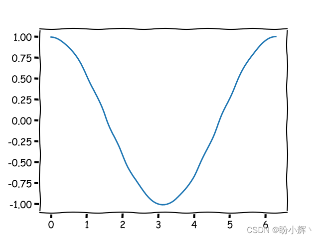
You can see , The method of using hand drawn style is very simple , Just before drawing , call plt.xkcd() Function :
import matplotlib as mplfrom matplotlib import pyplot as pltimport numpy as np# Enable freehand style plt.xkcd()data = [[10., 20., 30., 20.],[40., 25., 53., 18.],[6., 22., 52., 19.]]x = np.arange(4)plt.bar(x + 0.00, data[0], color = 'b', width = 0.25)plt.bar(x + 0.25, data[1], color = 'g', width = 0.25)plt.bar(x + 0.50, data[2], color = 'r', width = 0.25)plt.show()
except Matplotlib In addition to its own preset style , We can also customize colors and styles to build custom styles that meet our needs .
2. Use custom colors
2.1 Custom color
Matplotlib There are many ways to define colors in , Common methods include :
A triple (
Triplets): Color can be described as a real triplet , That is, the color of red 、 blue 、 Green weight , Each of these components is in[0,1]Within the interval . therefore ,(1.0, 0.0, 0.0)It means pure red , and(1.0, 0.0, 1.0)It means pink .Four tuple (
Quadruplets): Their first three elements have the same definition as triples , The fourth element defines the transparency value . This value is also[0,1]Within the interval . When rendering graphics to a picture file , Use transparent colors to mix the drawing with the background .Predefined name :
MatplotlibStandardHTMLThe color name is interpreted as the actual color . for example , character stringredIt can be expressed as red . At the same time, some colors have concise aliases , As shown in the following table :Alias Color Show b blue g green r red c cyan m magenta y yellow k black w white HTMLColor string :MatplotlibCan beHTMLThe color string is interpreted as the actual color . These strings are defined as#RRGGBB, amongRR、GGandBBThey are red with hexadecimal encoding 、 Green and blue components .Grayscale string :
MatplotlibInterprets the string representation of floating-point values as grayscale , for example0.75Indicates medium light gray .
2.2 Draw a graph with custom colors
By setting plt.plot() The parameters of the function color ( Or equivalent abbreviation is c), You can set the color of the curve , As shown below :
import numpy as npimport matplotlib.pyplot as pltdef pdf(x, mu, sigma): a = 1. / (sigma * np.sqrt(2. * np.pi)) b = -1. / (2. * sigma ** 2) return a * np.exp(b * (x - mu) ** 2)x = np.linspace(-6, 6, 1000)for i in range(5): samples = np.random.standard_normal(50) mu, sigma = np.mean(samples), np.std(samples) plt.plot(x, pdf(x, mu, sigma), color = str(.15*(i+1)))plt.plot(x, pdf(x, 0., 1.), color = 'k')plt.plot(x, pdf(x, 0.2, 1.), color = '#00ff00')plt.plot(x, pdf(x, 0.4, 1.), color = (0.9,0.9,0.0))plt.plot(x, pdf(x, 0.4, 1.), color = (0.9,0.9,0.0,0.8))plt.show()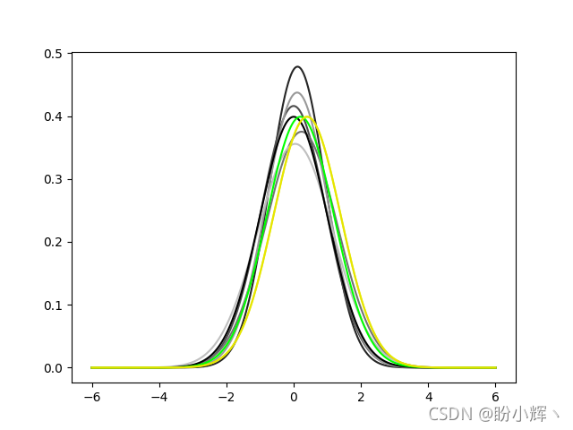
2.3 Draw a scatter chart with custom colors
You can control the color of the scatter chart in the same way as you control the graph , There are two forms available :
- Use the same color for all points : All points will be displayed in the same color .
- Define different colors for each point : Provide different colors for each point .
2.3.1 Use the same color for all points
Using two sets of points extracted from binary Gaussian distribution y_1 and y_2, The color of the midpoint in each group is the same :
import numpy as npimport matplotlib.pyplot as plty_1 = np.random.standard_normal((150, 2))y_1 += np.array((-1, -1)) # Center the distrib. at <-1, -1>y_2 = np.random.standard_normal((150, 2))y_2 += np.array((1, 1)) # Center the distrib. at <1, 1>plt.scatter(y_1[:,0], y_1[:,1], color = 'c')plt.scatter(y_2[:,0], y_2[:,1], color = 'b')plt.show()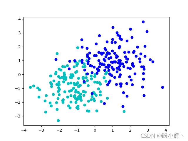
2.3.2 Define different colors for each point
We sometimes encounter such drawing scenes , You need to draw different colors for different categories of points , To observe the differences between different categories . With Fisher’s iris Data sets For example , The data in its dataset is similar to the following :
5.0,3.3,1.4,0.2,Iris-setosa7.0,3.2,4.7,1.4,Iris-versicolo Each point of the dataset is stored in a comma separated list . The last column gives the label of each point ( Tags contain three categories :Iris-virginica、Iris-versicolor and Iris-Vertosa). In the example , The color of these points will depend on their labels , As shown below :
import numpy as npimport matplotlib.pyplot as pltlabel_set = ( b'Iris-setosa', b'Iris-versicolor', b'Iris-virginica',)def read_label(label): return label_set.index(label)data = np.loadtxt('iris.data', delimiter = ',', converters = { 4 : read_label })color_set = ('c', 'y', 'm')color_list = [color_set[int(label)] for label in data[:,4]]plt.scatter(data[:,0], data[:,1], color = color_list)plt.show()
For three possible labels , We specify a unique color , Color in color_set In the definition of , Tag in label_set In the definition of .label_set No i A label with color_set No i Associated with two colors . Then we use them to convert the label list into a color list color_list. Then just call plt.scatter() All points and their colors can be displayed at once .
In addition to the above methods , We can also call... Separately by calling three different categories plt.scatter() To achieve , But this will require more code . Another thing to note : If two points may have the same coordinates , But there are different labels , The color displayed will be the color of the point drawn after , We can also use color values with transparent channels , Used to display overlapping points .
2.4 Use custom colors for the edges of data points in a scatter chart
And color The color of the parameter control point is the same , have access to edgecolor Parameter controls the color of the edge of the data point , You can set the same color for the edges of each point :
import numpy as npimport matplotlib.pyplot as pltdata = np.random.standard_normal((100, 2))plt.scatter(data[:,0], data[:,1], color = '1.0', edgecolor='r')plt.show()
In addition to setting the same color for the edges of each point , You can also set the color of the edges of each point as described in the section defining different colors for each point .
2.5 Draw a bar chart with custom colors
Controls the colors used to draw bar charts, which work the same way as curves and scatter charts , That is, through optional parameters color:
import numpy as npimport matplotlib.pyplot as pltw_pop = np.array([5., 30., 45., 22.])m_pop = np.array( [5., 25., 50., 20.])x = np.arange(4)plt.barh(x, w_pop, color='m')plt.barh(x, -m_pop, color='c')plt.show()
Again , Use plt.bar() and plt.barh() The function customizes the color of the bar graph to work in the same way as plt.scatter() Exactly the same , Just set the optional parameters color, At the same time, you can also use parameters edgecolor Controls the color of the bar edges .`
import numpy as npimport matplotlib.pyplot as pltvalues = np.random.random_integers(99, size = 50)color_set = ('c', 'm', 'y', 'b')color_list = [color_set[(len(color_set) * val) // 100] for val in values]plt.bar(np.arange(len(values)), values, color = color_list)plt.show()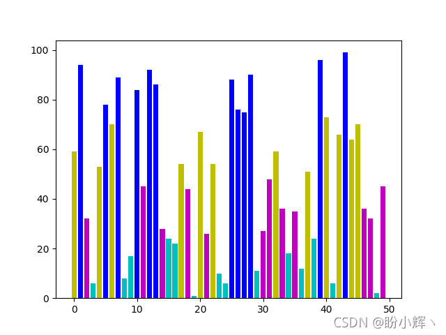
2.6 Draw pie charts with custom colors
The method of customizing the color of pie chart is similar to that of bar chart :
import numpy as npimport matplotlib.pyplot as pltcolor_set = ('c', 'm', 'y', 'b')values = np.random.rand(6)plt.pie(values, colors = color_set)plt.show() Pie charts are acceptable
 colors Parameters ( Be careful , Here is colors, Not in plt.plot() Used in color ) A list of colors . however , If the number of colors is less than the number of elements in the input value list , that plt.pie() The colors in the color list will be recycled . In the example , Use a list of four colors , To color a pie chart with six values , Two of these colors will be used twice .
2.7 Draw a box diagram with custom colors
Use the following code , Modify the line color in the box drawing :
import numpy as npimport matplotlib.pyplot as pltvalues = np.random.randn(100)b = plt.boxplot(values)for name, line_list in b.items(): for line in line_list: line.set_color('m')plt.show()
2.8 Use color mapping to draw a scatter plot
If you want to use multiple colors in the drawing , Defining each color one by one is not the best solution , Color mapping can solve this problem . Color mapping uses a variable to correspond to a value ( Color ) The continuous function of defines the color .Matplotlib Several common color mappings are provided ; Most are continuous color gradients . Color mapping in matplotib.cm Defined in module , Provides functions for creating and using color maps , It also provides predefined color mapping options .
function plt.scatter() Accept color List of values of parameters , When provided cmap Parameter values , These values will be interpreted as the index of the color map :
import numpy as npimport matplotlib.cm as cmimport matplotlib.pyplot as pltn = 256angle = np.linspace(0, 8 * 2 * np.pi, n)radius = np.linspace(.5, 1., n)x = radius * np.cos(angle)y = radius * np.sin(angle)plt.scatter(x, y, c = angle, cmap = cm.hsv)plt.show()
stay matplotlib.cm A large number of predefined color mappings are provided in the module , among cm.hsv Contains a full spectrum of colors .
2.9 Use color mapping to draw bar charts
plt.scatter() Function has built-in support for color mapping , Other drawing functions also have built-in support of color mapping . however , Some functions ( Such as plt.bar() ) No built-in support for color mapping , under these circumstances ,Matplotlib You can explicitly generate colors from color maps :
import numpy as npimport matplotlib.cm as cmimport matplotlib.pyplot as pltimport matplotlib.colors as colvalues = np.random.random_integers(99, size = 50)cmap = cm.ScalarMappable(col.Normalize(0, 99), cm.binary)plt.bar(np.arange(len(values)), values, color = cmap.to_rgba(values))plt.show()
The above code first creates a color map cmap, So that [0, 99] Values in the range are mapped to matplotlib.cm.binary The color of the . then , function cmap.to_rgba Convert value list to color list . therefore , Even though plt.bar() There is no built-in color mapping support , But you can still use uncomplicated code to realize color mapping .
2.10 Create a custom color scheme
Matplotlib The default color used is mainly considered for printed documents or publications . therefore , By default , The background is white , And the label 、 Axes and other annotations are displayed in black , In some different use environments , The color scheme we may need to use ; for example , Set the graphic background to black , The annotation is set to white .
stay Matplotlib in , Various objects ( Such as axis 、 Graphics and labels ) Can be modified separately , But changing the color configuration of these objects one by one is not the best solution . We can use it in 《Matplotlib Installation and configuration 》 Methods introduced , Change all objects by modifying the configuration set , To configure its default color or style :
import numpy as npimport matplotlib as mplfrom matplotlib import pyplot as pltmpl.rc('lines', linewidth = 2.)mpl.rc('axes', facecolor = 'k', edgecolor = 'w')mpl.rc('xtick', color = 'w')mpl.rc('ytick', color = 'w')mpl.rc('text', color = 'w')mpl.rc('figure', facecolor = 'k', edgecolor ='w')mpl.rc('axes', prop_cycle = mpl.cycler(color=[(0.1, .5, .75),(0.5, .5, .75)]))x = np.linspace(0, 7, 1024)plt.plot(x, np.sin(x))plt.plot(x, np.cos(x))plt.show()
3. Use custom styles
3.1 Control line styles and lineweights
In practice , Except for color , In most cases, we also need to control the line style of graphics , Add variety to line styles .
3.1.1 Line style
import numpy as npimport matplotlib.pyplot as pltdef gaussian(x, mu, sigma): a = 1. / (sigma * np.sqrt(2. * np.pi)) b = -1. / (2. * sigma ** 2) return a * np.exp(b * (x - mu) ** 2)x = np.linspace(-6, 6, 1024)plt.plot(x, gaussian(x, 0., 1.), color = 'y', linestyle = 'solid')plt.plot(x, gaussian(x, 0., .5), color = 'c', linestyle = 'dashed')plt.plot(x, gaussian(x, 0., .25), color = 'm', linestyle = 'dashdot')plt.show()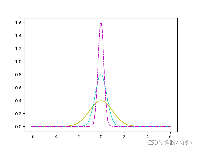
Use plt.plot() Of linestyle Parameters to control the style of the curve , Other available line styles include :solid、dashed、dotted、dashdot. Again , Line style settings are not limited to plt.plot(), This parameter can be used for any drawing composed of lines , It can also be said that linestyle Parameters are available for all commands involving line rendering . for example , You can modify the line style of the bar chart :
import numpy as npimport matplotlib.pyplot as pltn = 10a = np.random.random(n)b = np.random.random(n)x = np.arange(n)plt.bar(x, a, color='c')plt.bar(x, a+b, bottom=a, color='w', edgecolor='black', linestyle = 'dashed')plt.show() Because in the bar chart 、 Pie chart and other graphics , The default border color is white , So to show these lines on a white background , Need to pass through
 edgecolor Parameter to change the default color of the edge line .
3.1.2 Line width
Use linewidth Parameter can change the thickness of the line . By default ,linewidth Set to 1 A unit of . Using the thickness of lines can visually emphasize a specific curve .
import numpy as npimport matplotlib.pyplot as pltdef gaussian(x, mu, sigma): a = 1. / (sigma * np.sqrt(2. * np.pi)) b = -1. / (2. * sigma ** 2) return a * np.exp(b * (x - mu) ** 2)x = np.linspace(-6, 6, 1024)for i in range(64): samples = np.random.standard_normal(50) mu, sigma = np.mean(samples), np.std(samples) plt.plot(x, gaussian(x, mu, sigma), color = '.75', linewidth = .5)plt.plot(x, gaussian(x, 0., 1.), color = 'c', linewidth = 3.)plt.show()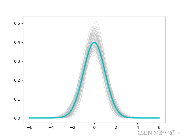
3.2 Control fill patterns
Matplotlib A hatch pattern is provided to fill the plane . These patterns , It plays an important role in graphics containing only black and white .
import numpy as npimport matplotlib.pyplot as pltn = 10a = np.random.random(n)b = np.random.random(n)x = np.arange(n)plt.bar(x, a, color='w', hatch='x', edgecolor='black')plt.bar(x, a+b, bottom=a, color='w', edgecolor='black', hatch='/')plt.show()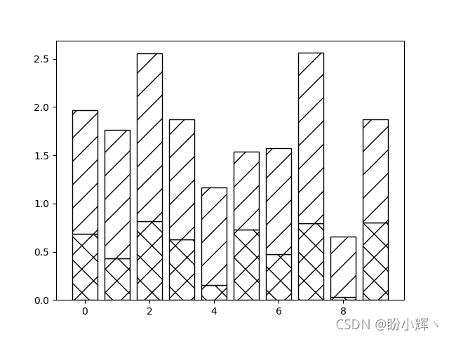
Functions with filling and rendering ( Such as plt.bar() ) Optional parameters can be used hatch Control fill patterns , Optional values for this parameter include :/, \, |, -, +, x, o, O,. and *, Each value corresponds to a different hatch pattern ;edgecolor Parameters can be used to control the color of the hatch pattern .
3.3 Control marks
3.3.1 Controls the marker style
stay 《Matplotlib Graph drawing 》 in , We've learned how to draw curves , And understand that the curve is composed of connecting lines between points ; Besides , The scatter chart shows each point in the dataset . and Matplotlib Offers a variety of shapes , You can replace the style of points with other types of markers .
There are several ways to specify tags :
- Predefined Tags : Predefined shapes , Expressed as
[0, 8]An integer within a range or some predefined string . - Vertex list : List of value pairs , Coordinates used as the shape path .
- Regular polygon : Express
NTriples of regular polygons with edges(N, 0, angle), amongangleFor the angle of rotation . - Star polygon : It is represented as a triple
(N, 1, angle), representativeNSide positive star , amongangleFor the angle of rotation .
import numpy as npimport matplotlib.pyplot as plta = np.random.standard_normal((100, 2))a += np.array((-1, -1))b = np.random.standard_normal((100, 2))b += np.array((1, 1))plt.scatter(a[:,0], a[:,1], color = 'm', marker = 'x')plt.scatter(b[:,0], b[:,1], color = 'c', marker = '^')plt.show()
You can see , Use marker Parameters , You can specify different tags for each data set .
We have learned how to define different colors for each point in the scatter diagram , What if we need to define different styles for each point ? The problem lies in , And color Different parameters ,marker Input styles are not accepted as parameter lists . therefore , We can't achieve plt.scatter() To display multiple point sets with different markers . The solution is , Separate the data points of each type into different sets , And call... Separately for each collection plt.scatter() call :
import numpy as npimport matplotlib.pyplot as pltlabel_list = ( b'Iris-setosa', b'Iris-versicolor', b'Iris-virginica',)colors = ['c','y','m']def read_label(label): return label_list.index(label)data = np.loadtxt('iris.data', delimiter = ',', converters = { 4 : read_label })marker_set = ('^', 'x', '.')for i, marker in enumerate(marker_set): data_subset = np.asarray([x for x in data if x[4] == i]) plt.scatter(data_subset[:,0], data_subset[:,1], color = colors[i], marker = marker)plt.show() about
about plt.plot(), You can also access tag styles using the same tag parameters . When data points are dense , Using markers to display each point will cause confusion in the picture , therefore Matplotlib Provides markevery Parameters , Allow every N A dot displays a marker :
import numpy as npimport matplotlib.pyplot as pltx = np.linspace(-6, 6, 1024)y_1 = np.sinc(x)y_2 = np.sinc(x) + 1plt.plot(x, y_1, marker = 'x', color = '.75')plt.plot(x, y_2, marker = 'o', color = 'k', markevery = 64)plt.show()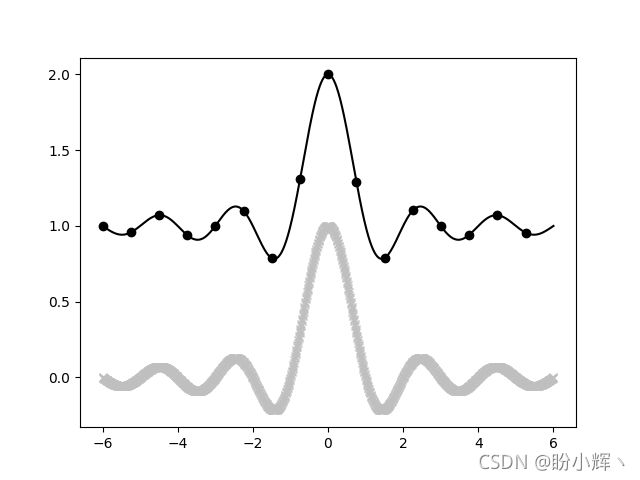
3.3.1 Control tag size
The size of the tag is optional s Control :
import numpy as npimport matplotlib.pyplot as plta = np.random.standard_normal((100, 2))a += np.array((-1, -1))b = np.random.standard_normal((100, 2))b += np.array((1, 1))plt.scatter(a[:,0], a[:,1], c = 'm', s = 100.)plt.scatter(b[:,0], b[:,1], c = 'c', s = 25.)plt.show() The size of the tag is determined by
 plt.scatter() Parameters of s Set up , However, it should be noted that it sets the surface area ratio of the mark rather than the radius .plt.scatter() The function can also accept a list as s Parameter input , It represents the size of each point :
import numpy as npimport matplotlib.pyplot as pltm = np.random.standard_normal((1000, 2))r_list = np.sum(m ** 2, axis = 1)plt.scatter(m[:, 0], m[:, 1], c = 'w', edgecolor='c', marker = 'o', s = 32. * r_list)plt.show()
plt.plot() Functions are allowed in markersize ( Or abbreviated as ms ) Parameter to change the size of the tag , However, this parameter does not accept a list as input .
3.3.3 Create custom tags
although Matplotlib A variety of marker shapes are available . But in some cases, we may still not find a shape suitable for specific needs . for example , We may want to use company logos, etc. as shapes .
stay Matplotlib in , Describe the shape as a path —— The connection of a series of points . therefore , If we want to define our own tag shape , A series of points must be provided :
import numpy as npimport matplotlib.path as mpathfrom matplotlib import pyplot as pltshape_description = [ ( 1., 2., mpath.Path.MOVETO), ( 1., 1., mpath.Path.LINETO), ( 2., 1., mpath.Path.LINETO), ( 2., -1., mpath.Path.LINETO), ( 1., -1., mpath.Path.LINETO), ( 1., -2., mpath.Path.LINETO), (-1., -2., mpath.Path.LINETO), (-1., -1., mpath.Path.LINETO), (-2., -1., mpath.Path.LINETO), (-2., 1., mpath.Path.LINETO), (-1., 1., mpath.Path.LINETO), (-1., 2., mpath.Path.LINETO), ( 0., 0., mpath.Path.CLOSEPOLY),]u, v, codes = zip(*shape_description)my_marker = mpath.Path(np.asarray((u, v)).T, codes)data = np.random.rand(8, 8)plt.scatter(data[:,0], data[:, 1], c = 'm', marker = my_marker, s = 75)plt.show()
Through the above example , You can see , All marked plt Drawing functions have an optional parameter marker, The parameter value can be predefined Matplotlib Mark , It can also be a custom path instance , The path object is in matplotlib.path Defined in module .Path Object's constructor takes a list of coordinates and a list of instructions as input ; One command per coordinate , Use a list to fuse coordinates and instructions , Then pass the coordinate list and instructions to the path constructor , As shown below :
u, v, codes = zip(*shape_description)my_marker = mpath.Path(np.asarray((u, v)).T, codes)The shape is described by the movement of the cursor :
MOVETO: This command moves the cursor to the specified coordinates , Don't draw lines .LINETO: This draws a line between the current point of the cursor and the target point , Move the cursor to the target point .CLOSEPOLY: This command is only used to close the path , Each shape ends with this indication .
Theoretically , Any shape is possible , We just need to describe its path . But in practice , If you want to use complex shapes , It is better to carry out the conversion work in advance .
Related links
Matplotlib Installation and configuration
Matplotlib Quick start
Matplotlib Graph drawing
边栏推荐
- Is it safe for Hengtai securities to open an account?
- Oracle creates table spaces and views table spaces and usage
- what? Does the multi merchant system not adapt to app? This is coming!
- Intranet penetration learning (I) introduction to Intranet
- ECCV 2022 open source | target segmentation for 10000 frames of video
- How does redis realize inventory deduction and prevent oversold? (glory Collection Edition)
- Want to open an account and fry American crude oil, but always worry about insecurity?
- Practical skills!!
- 95. Puzzling switch
- Five common misuse of async/await
猜你喜欢

rogabet note 1.1

Together again Net program hangs dead, a real case analysis of using WinDbg

Five digital transformation strategies of B2B Enterprises

ERROR 2003 (HY000): Can‘t connect to MySQL server on ‘localhost:3306‘ (10061)

Case analysis of building cross department communication system on low code platform
![[shallow copy and deep copy], [heap and stack], [basic type and reference type]](/img/cc/d43e0046d83638f381c34b463f64a2.png)
[shallow copy and deep copy], [heap and stack], [basic type and reference type]

MySQL - multi table query - seven join implementations, set operations, multi table query exercises
![[SOC] the first project of SOC Hello World](/img/ae/326312cb3b5a372c7b8b048936a9f2.png)
[SOC] the first project of SOC Hello World

Practical skills!!

Build your own stock analysis system based on b\s architecture
随机推荐
Multiplication and addition of univariate polynomials
Is there any capital requirement for the online account opening of Ping An Securities? Is it safe
ECCV 2022 open source | target segmentation for 10000 frames of video
With this PDF, I successfully got offers from ant, jd.com, Xiaomi, Tencent and other major manufacturers
Scientific computing toolkit SciPy Fourier transform
90% of people don't know the most underestimated function of postman!
HSPF (hydraulic simulation program FORTRAN) model
[crawler knowledge] better than lxml and BS4? Use of parser
Practical skills!!
RESNET interpretation and 1 × 1 Introduction to convolution
climb stairs
Baidu PaddlePaddle easydl helps improve the inspection efficiency of high-altitude photovoltaic power stations by 98%
How to gracefully realize regular backup of MySQL database (glory Collection Edition)
Spark related FAQ summary
Career development suggestions shared by ten CIOs
Teach you five ways to crack the computer boot password
2787: calculate 24
findContours
95. Puzzling switch
Defects of matrix initialization