当前位置:网站首页>Jetpack compose layout (III) - custom layout
Jetpack compose layout (III) - custom layout
2022-06-25 09:52:00 【seevc】
In the first chapter 《Jetpack Compose Get started quickly 》 In this article, we briefly introduce Compose, So here we are going to learn Compose Layout . Because the layout involves a lot of content , Can write separately .
The layout mainly includes : Layout Basics 、Material Components and layout 、 Custom layout 、Compose Use in ConstraintLayout.
Custom layout Knowledge points involved :
Compose The process of layout
stay Compose in , Interface elements are represented by composable functions , This kind of function will emit part of the interface after being called , This part of the interface will then be added and displayed in the interface tree on the screen . Every interface element has a parent element , There may also be multiple child elements . Besides , Each element has a position in its parent element , Designated as (x, y) Location ; Also have a size , Designated as width and height.
The parent element defines the constraints of its child elements . The element needs to define dimensions within these constraints . Constraints can limit the minimum and maximum of elements width and height. If an element has child elements , It may measure each child element , To help determine its size . Once an element has determined and reported its own size , There is an opportunity to define how to place its child elements relative to itself .
The process of arranging each node in the interface tree is divided into three steps :1. Measure all sub items 2. Determine your own size 3. Place its children 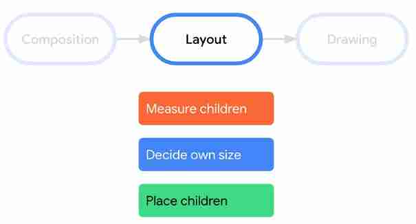
* Be careful :Compose Multiple measurements are not allowed on the interface . It means , Layout elements cannot measure any child elements multiple times in order to try different measurement configurations .
Extended layout modifier layout
Use layout Modifier to modify the measurement and layout of elements .Layout It's a lambda; Its parameters include elements that you can measure ( With measurable Form transfer ) And the incoming constraints of the composable item ( With constraints Form transfer ). A custom layout modifier might look like this :
fun Modifier.customLayoutModifier(...) =
    this.layout { measurable, constraints ->
        ...
    })
Let's say Text For example, the top inner margin of , If there is such a demand : Set the inner margin with reference to the baseline of the first line of text , As shown in the figure below :
Text location Y = Set height - Text height
The code is as follows :
/**
 * 1. Custom layout modifiers - Change the distance between the text baseline and the top
 */
fun Modifier.firstBaselineToTop(firstBaselineToTop: Dp)=layout { measurable, constraints ->
    // Measure first
    val placeable = measurable.measure(constraints)
    check(placeable[FirstBaseline] != AlignmentLine.Unspecified)
    val firstBaseLine = placeable[FirstBaseline]
    // Text location Y
    val placeableY = firstBaselineToTop.roundToPx() - firstBaseLine
    val height = placeable.height + placeableY
    // Rearrange
    layout(placeable.width,height){
        placeable.placeRelative(0,placeableY)
    }
}
The end result is the same as pading The effect is compared , Here's the picture :
Create a custom layout Layout
stay Android View If you want to customize the layout in the system , You have to inherit ViewGroup And realize the measurement and layout functions , And in the Compose It is much simpler to customize the layout in , Can be used directly Layout Items can be combined to achieve ,Layout Allow manual measurement and placement of sub items .Column and Row Is the Layout Built from .
Here, you should pay attention to the... In the custom modifier layout distinguish .
Let's take customizing a vertical layout as an example ( similar Column), The code is as follows :
/**
 * 2. Customize Layout Implement vertical layout of components
 */
@Composable
fun MyBasicColumn(
    modifier: Modifier = Modifier,
    content:@Composable ()->Unit
){
    // Step one :
    // among measurables,constraints by Layout Of the last parameter lambda How to write it
    Layout(content = content, modifier = modifier){ measurables,constraints ->
        // Step two : By giving constraints to points constraints Measure the components
        val placeables = measurables.map {
            it.measure(constraints)
        }
        // Get the total height of all elements
        val wrapHeight = placeables.sumOf {
            it.height
        }
        // Step three : Layout , Set the allowable layout size
        layout(constraints.maxWidth,wrapHeight){
            var yPosition = 0
            // Step four : Set the location of each component
            placeables.forEach {placeable->
                // Setup component x,y coordinate
                placeable.placeRelative(x = 0,y=yPosition)
                // Calculate the... Of the next component y coordinate
                yPosition += placeable.height
            }
        }
    }
}
It is worth noting that :Layout And layout The modifier is similar to , But the first parameter measurables Is a list of sub items to be measured , and constraints Is a constraint from the parent .
The example effect is as follows :
In addition, there is a customized Waterfall flow layout , If you are interested, you can have a look at .
design sketch :
Layout direction
If you need to change the orientation of the layout , have access to LocalLayoutDirection Realization . Support to modify the layout direction :Ltr( From left to right )、Rtl( Right to left ).
Here's an example :
/**
 * 3. Layout direction
 */
@Composable
fun ChangeColumnDirection(){
    CompositionLocalProvider(LocalLayoutDirection provides LayoutDirection.Rtl ) {
        Column(Modifier.fillMaxWidth()) {
            Text("Title")
            Text("Subtitle")
        }
    }
}
Effect of the sample :
This is the end of the custom layout , Relatively little content .
边栏推荐
- 在指南针上面开股票账户好不好,安不安全?
- Notes on writing questions in C language -- monkeys eat peaches
- 203 postgraduate entrance examination Japanese self-study postgraduate entrance examination experience post; Can I learn Japanese by myself?
- Simple waterfall effect
- Is it safe to open a stock account through the account opening QR code of the account manager?
- PHP obtains the IP address, and the apache2 server runs without error
- Solution to the problem of repeated startup of esp8266
- [competition - Rural Revitalization] experience sharing of Zhejiang Rural Revitalization creative competition
- Cubemx stm32f105rb USB flash drive reading and writing detailed tutorial
- 瑞萨RA系列-开发环境搭建
猜你喜欢

Remove the mosaic, there's a way, attached with the running tutorial

Vscode attempted to write the procedure to a pipeline that does not exist

manhattan_ Slam environment configuration

How to download the school logo, school name and corporate logo on a transparent background without matting

Cubemx stm32f105rb USB flash drive reading and writing detailed tutorial
manhattan_slam环境配置

Learning notes of rxjs takeuntil operator

How to delete a blank page that cannot be deleted in word

Use Navicat to compare data differences and structure differences of multi environment databases, and automatic DML and DDL scripts
![[SSL: CERTIFICATE_VERIFY_FAILED] certificate verify failed: unable to get local issuer certificate](/img/75/a06e20b4394579cbd9f6d3a075907a.jpg)
[SSL: CERTIFICATE_VERIFY_FAILED] certificate verify failed: unable to get local issuer certificate
随机推荐
Vscode attempted to write the procedure to a pipeline that does not exist
neo4jDesktop(neo4j桌面版)配置自动启动(开机自启)
2021mathorcupc topic optimal design of heat dissipation for submarine data center
The problem of wirengpi program running permission
匯付國際為跨境電商賦能:做合規的跨境支付平臺!
Lvs-dr mode single network segment case
Shuttle JSON, list, map inter transfer
[design completion - opening report] zufeinfo 2018 software engineering major (including FAQ)
可穿戴设备或将会泄露个人隐私
Mengyou Technology: six elements of tiktok's home page decoration, how to break ten thousand dollars in three days
Solution to the problem of repeated startup of esp8266
How to download the school logo, school name and corporate logo on a transparent background without matting
Grabcut image segmentation in opencv
8. Intelligent transportation project (1)
Set the location permission in the shutter to "always allow"
Swift recursively queries the array for the number closest to the specified value
[buuctf.reverse] 117-120
I put a two-dimensional code with rainbow candy
Data-driven anomaly detection and early warning of 21 May Day C
Applet cloud development joint table data query and application in cloud function