当前位置:网站首页>15. Notes on the button style of WPF
15. Notes on the button style of WPF
2022-06-25 12:08:00 【komla168】
Preface :Button It can be regarded as a control used in development , Start with native styles , A rectangular shape , Then set up Button Of Content attribute . With the deepening of learning , It needs to be set Button Background color of , It will need to be changed later Button To meet the higher requirements of design .
One 、 brief introduction
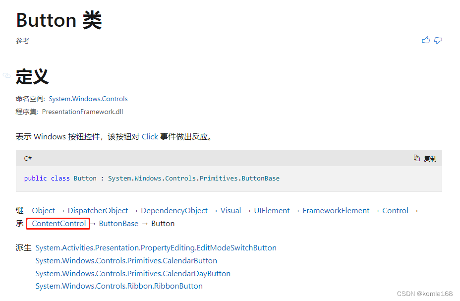
You can see ,Button Inherited to ContentControl Control , Button There is one Content Property and this Content It can be a variety of control forms , see Button You can see , What is used to carry this content is a ContentPresenter Control .

You can see this on the official website ContentPresenter Class inheritance

Two 、Background
Simply as follows
<Button Background="AliceBlue"/>You can see , This Background The property type is Brush, So we can use different Brush To change Button Of Background, So that Background More abundant .

Right on the official website Brush Annotations ,Brush There are multiple successors , Both can be used.

2.1 LinearGradientBrush
<Button Width="60" Height="60">
    <Button.Background>
        <LinearGradientBrush EndPoint="0.851,0.838" StartPoint="0.115,0.169">
            <GradientStop Color="#FFA21212" Offset="0"/>
            <GradientStop Color="#FFF8C906" Offset="1"/>
        </LinearGradientBrush>
    </Button.Background>
</Button>
2.2 RadialGradientBrush
<Button Width="60" Height="60">
    <Button.Background>
        <RadialGradientBrush>
            <GradientStop Color="#FFA21212" Offset="1"/>
            <GradientStop Color="#FFF8C906" Offset="0"/>
        </RadialGradientBrush>
    </Button.Background>
</Button>
2.3 ImageBrush
            <Button Width="60" Height="60">
                <Button.Background>
                    <ImageBrush ImageSource="/ project .png"/>
                </Button.Background>
            </Button>
2.4 DrawingBrush
            <Button Width="60" Height="60">
                <Button.Background>
                    <DrawingBrush Viewport="0,0,0.5,0.5" TileMode="Tile">
                        <DrawingBrush.Drawing>
                            <GeometryDrawing Brush="Red">
                                <GeometryDrawing.Geometry>
                                    <GeometryGroup>
                                        <EllipseGeometry RadiusX="20" RadiusY="45" Center="50,50" />
                                        <EllipseGeometry RadiusX="45" RadiusY="20" Center="50,50" />
                                    </GeometryGroup>
                                </GeometryDrawing.Geometry>
                                <GeometryDrawing.Pen>
                                    <Pen Thickness="10">
                                        <Pen.Brush>
                                            <LinearGradientBrush>
                                                <GradientStop Offset="0.0" Color="Black" />
                                                <GradientStop Offset="1.0" Color="Gray" />
                                            </LinearGradientBrush>
                                        </Pen.Brush>
                                    </Pen>
                                </GeometryDrawing.Pen>
                            </GeometryDrawing>
                        </DrawingBrush.Drawing>
                    </DrawingBrush>
                </Button.Background>
            </Button>
2.5 VisualBrush
            <Button Width="60" Height="60">
                <Button.Background>
                    <VisualBrush>
                        <VisualBrush.Visual>
                            <StackPanel Background="White">
                                <Rectangle Width="25" Height="25" Fill="Orange" Margin="6" />
                                <TextBlock FontSize="10pt" Margin="2">BrawDraw</TextBlock>
                                <Button Margin="10">Button</Button>
                            </StackPanel>
                        </VisualBrush.Visual>
                    </VisualBrush>
                </Button.Background>
            </Button>
Two 、Content


2.1 character string
<!--Create a Button with a string as its content.-->
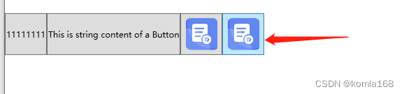
<Button Content="1111111111" Height="60" Width="60"/>
<Button>This is string content of a Button</Button>2.2 DateTime object
<!--Create a Button with a DateTime object as its content.-->
<Button xmlns:sys="clr-namespace:System;assembly=mscorlib">
  <sys:DateTime>2004/3/4 13:6:55</sys:DateTime>
</Button>
2.3 UIElement
<!--Create a Button with a single UIElement as its content.-->
<Button>
  <Rectangle Height="40" Width="40" Fill="Blue"/>
</Button>
2.4 panel
<!--Create a Button with a panel that contains multiple objects
as its content.-->
<Button>
  <StackPanel>
    <Ellipse Height="40" Width="40" Fill="Blue"/>
    <TextBlock TextAlignment="Center">Button</TextBlock>
  </StackPanel>
</Button>
2.5 explain
Because the Content property is of type Object, there are no restrictions on what you can put in a ContentControl. The Content is displayed by a ContentPresenter, which is in the ControlTemplate of the ContentControl. Every ContentControl type in WPF has a ContentPresenter in its default ControlTemplate.
because Content The type of property is Object, So what can be put in ContentControl There is no limit to . The Content Property through ContentPresenter Show , And this ContentPresenter Exist in ContentControl Of ControlTemplate Properties of the .WPF Each of them ContentControl Type controls have a ContentPresenter attribute , Default exists ControlTemplate in .

3、 ... and 、 appearance
The ContentPresenter uses the following logic to display the Content (ContentPresenter It's used to show Content Of , Here is the display logic ):
If the ContentTemplate property on the ContentPresenter is set, the ContentPresenter applies that DataTemplate to the Content property and the resulting UIElement and its child elements, if any, are displayed. For more information about DataTemplate objects, see Data Templating Overview.( If ContentTemplate Set up ContentPresenter attribute , that ContentPresenter Just apply DataTemplate As Content Properties and UIElement And its child elements .)
If the ContentTemplateSelector property on the ContentPresenter is set, the ContentPresenter applies the appropriate DataTemplate to the Content property and the resulting UIElement and its child elements, if any, are displayed.( It's about the same as the last one , Is to put ContentTemplate Instead of ContentTemplateSelector)
If there is a DataTemplate associated with the type of Content, the ContentPresenterapplies that DataTemplate to the Content property and the resulting UIElement and its child elements, if any, are displayed.( If there is DataTemplate And type Content Associated types , be ContentPresenter Just use DataTemplate As its Content)
If Content is a UIElement object, the UIElement is displayed. If the UIElement already has a parent, an exception occurs.( If Content It's a UIElement object , Just show this UIElement object )
If there is a TypeConverter that converts the type of Content to a UIElement, the ContentPresenter uses that TypeConverter and the resulting UIElement is displayed.( Application of converter ,Content and UIElement transformation )
If there is a TypeConverter that converts the type of Content to a string, the ContentPresenter uses that TypeConverter and creates a TextBlock to contain that string. The TextBlock is displayed.( Application of converter ,Content and string transformation , And create a TextBlock Control to host this sting)
If the content is an XmlElement, the value of the InnerText property is displayed in a TextBlock.(Content yes XmlElement)
The ContentPresenter calls the ToString method on the Content and creates a TextBlock to contain the string returned by ToString. The TextBlock is displayed.(ContentPresenter Will be in Content On the call Tosting Method and create a TextBlock To carry this string)
3.1 Native style
        <Style x:Key="ButtonStyle2" TargetType="{x:Type Button}">
            <Setter Property="FocusVisualStyle" Value="{StaticResource FocusVisual1}"/>
            <Setter Property="Background" Value="{StaticResource Button.Static.Background1}"/>
            <Setter Property="BorderBrush" Value="{StaticResource Button.Static.Border1}"/>
            <Setter Property="Foreground" Value="{DynamicResource {x:Static SystemColors.ControlTextBrushKey}}"/>
            <Setter Property="BorderThickness" Value="1"/>
            <Setter Property="HorizontalContentAlignment" Value="Center"/>
            <Setter Property="VerticalContentAlignment" Value="Center"/>
            <Setter Property="Padding" Value="1"/>
            <Setter Property="Template">
                <Setter.Value>
                    <ControlTemplate TargetType="{x:Type Button}">
                        <Border x:Name="border" Background="{TemplateBinding Background}" BorderBrush="{TemplateBinding BorderBrush}" BorderThickness="{TemplateBinding BorderThickness}" SnapsToDevicePixels="true">
                            <ContentPresenter x:Name="contentPresenter" Focusable="False" HorizontalAlignment="{TemplateBinding HorizontalContentAlignment}" Margin="{TemplateBinding Padding}" RecognizesAccessKey="True" SnapsToDevicePixels="{TemplateBinding SnapsToDevicePixels}" VerticalAlignment="{TemplateBinding VerticalContentAlignment}"/>
                        </Border>
                        <ControlTemplate.Triggers>
                            <Trigger Property="IsDefaulted" Value="true">
                                <Setter Property="BorderBrush" TargetName="border" Value="{DynamicResource {x:Static SystemColors.HighlightBrushKey}}"/>
                            </Trigger>
                            <Trigger Property="IsMouseOver" Value="true">
                                <Setter Property="Background" TargetName="border" Value="{StaticResource Button.MouseOver.Background1}"/>
                                <Setter Property="BorderBrush" TargetName="border" Value="{StaticResource Button.MouseOver.Border1}"/>
                            </Trigger>
                            <Trigger Property="IsPressed" Value="true">
                                <Setter Property="Background" TargetName="border" Value="{StaticResource Button.Pressed.Background1}"/>
                                <Setter Property="BorderBrush" TargetName="border" Value="{StaticResource Button.Pressed.Border1}"/>
                            </Trigger>
                            <Trigger Property="IsEnabled" Value="false">
                                <Setter Property="Background" TargetName="border" Value="{StaticResource Button.Disabled.Background1}"/>
                                <Setter Property="BorderBrush" TargetName="border" Value="{StaticResource Button.Disabled.Border1}"/>
                                <Setter Property="TextElement.Foreground" TargetName="contentPresenter" Value="{StaticResource Button.Disabled.Foreground1}"/>
                            </Trigger>
                        </ControlTemplate.Triggers>
                    </ControlTemplate>
                </Setter.Value>
            </Setter>
        </Style>
The design of appearance is in ControlTemplate Attribute , This native has not changed much , If you set Content by string, It will be like the last one above ,Content call ToString To transform and create a TextBlock To host the converted string.
3.2 UIElement
Use image As Content The elements of , As mentioned in Article 4 above .
<Button Height="60" Width="60">
    <Image Source="/ project .png"/>
</Button>
3.2 modify ControlTemplate
Native style , The border is obvious , At this time, it needs to be modified ControlTemplate 了
<Style x:Key="ButtonStyle1" TargetType="{x:Type Button}">
            <Setter Property="FocusVisualStyle" Value="{StaticResource FocusVisual}"/>
            <Setter Property="Background" Value="{StaticResource Button.Static.Background}"/>
            <Setter Property="BorderBrush" Value="{StaticResource Button.Static.Border}"/>
            <Setter Property="Foreground" Value="{DynamicResource {x:Static SystemColors.ControlTextBrushKey}}"/>
            <Setter Property="BorderThickness" Value="1"/>
            <Setter Property="HorizontalContentAlignment" Value="Center"/>
            <Setter Property="VerticalContentAlignment" Value="Center"/>
            <Setter Property="Padding" Value="1"/>
            <Setter Property="Template">
                <Setter.Value>
                    <ControlTemplate TargetType="{x:Type Button}">
                        <Grid>
                            <Grid.RowDefinitions>
                                <RowDefinition Height="0"/>
                                <RowDefinition Height="*"/>
                            </Grid.RowDefinitions>
                            <Image Source="/Resource/send.png" Margin="0 10 0 0"/>
                            <Border x:Name="border"  BorderThickness="1" SnapsToDevicePixels="true" Grid.Row="1">
                                <ContentPresenter x:Name="contentPresenter" Focusable="False" HorizontalAlignment="{TemplateBinding HorizontalContentAlignment}" Margin="{TemplateBinding Padding}" RecognizesAccessKey="True" SnapsToDevicePixels="{TemplateBinding SnapsToDevicePixels}" VerticalAlignment="{TemplateBinding VerticalContentAlignment}"/>
                            </Border>
                        </Grid>
                        <ControlTemplate.Triggers>
                            <Trigger Property="IsDefaulted" Value="true">
                                <Setter Property="BorderBrush" TargetName="border" Value="{DynamicResource {x:Static SystemColors.HighlightBrushKey}}"/>
                            </Trigger>
                            <Trigger Property="IsMouseOver" Value="true">
                                <Setter Property="Background" TargetName="border" Value="{StaticResource Button.MouseOver.Background}"/>
                                <Setter Property="BorderBrush" TargetName="border" Value="{StaticResource Button.MouseOver.Border}"/>
                            </Trigger>
                            <Trigger Property="IsPressed" Value="true">
                                <Setter Property="Background" TargetName="border" Value="{StaticResource Button.Pressed.Background}"/>
                                <Setter Property="BorderBrush" TargetName="border" Value="{StaticResource Button.Pressed.Border}"/>
                            </Trigger>
                            <Trigger Property="IsEnabled" Value="false">
                                <Setter Property="Background" TargetName="border" Value="{StaticResource Button.Disabled.Background}"/>
                                <Setter Property="BorderBrush" TargetName="border" Value="{StaticResource Button.Disabled.Border}"/>
                                <Setter Property="TextElement.Foreground" TargetName="contentPresenter" Value="{StaticResource Button.Disabled.Foreground}"/>
                            </Trigger>
                        </ControlTemplate.Triggers>
                    </ControlTemplate>
                </Setter.Value>
            </Setter>
        </Style>
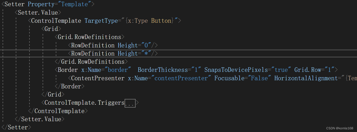
We put ControlTemplate Take it out and have a look , Use a... In the original style Border Wrap a ContentPrensenter.

After modification, it uses Grid As ContentPresenter Parent container of . Actually, there are two layers here , The height of the first floor is 0, Actually, it's just one floor .
Here's another question , After the mouse moves up , There will be a background , Disgraceful
The background is in ControlTemplate.Triggers Set in the , The property set is IsMouseOver. Want to remove this background , The violent point directly comments out the code .

3.3 upgrade
Moving the mouse will enlarge this Content, In my code Content Set to Image Type of .
        <Style x:Key="ButtonStyle" TargetType="{x:Type Button}">
            <Setter Property="VerticalAlignment" Value="Center"/>
            <Setter Property="HorizontalAlignment" Value="Center"/>
            <Setter Property="VerticalContentAlignment" Value="Center"/>
            <Setter Property="HorizontalContentAlignment" Value="Center"/>
            <Setter Property="Template">
                <Setter.Value>
                    <ControlTemplate  TargetType="{x:Type Button}">
                        <ControlTemplate.Resources>
                            <Storyboard x:Key="Storyboard1">
                                <DoubleAnimationUsingKeyFrames Storyboard.TargetProperty="(UIElement.RenderTransform).(TransformGroup.Children)[0].(ScaleTransform.ScaleX)" Storyboard.TargetName="grid">
                                    <SplineDoubleKeyFrame KeyTime="0:0:0.5" Value="1.25"/>
                                </DoubleAnimationUsingKeyFrames>
                                <DoubleAnimationUsingKeyFrames Storyboard.TargetProperty="(UIElement.RenderTransform).(TransformGroup.Children)[0].(ScaleTransform.ScaleY)" Storyboard.TargetName="grid">
                                    <SplineDoubleKeyFrame KeyTime="0:0:0.5" Value="1.25"/>
                                </DoubleAnimationUsingKeyFrames>
                            </Storyboard>
                            <Storyboard x:Key="Storyboard2">
                                <DoubleAnimationUsingKeyFrames Storyboard.TargetProperty="(UIElement.RenderTransform).(TransformGroup.Children)[0].(ScaleTransform.ScaleX)" Storyboard.TargetName="grid">
                                    <SplineDoubleKeyFrame KeyTime="0:0:0.5" Value="1"/>
                                </DoubleAnimationUsingKeyFrames>
                                <DoubleAnimationUsingKeyFrames Storyboard.TargetProperty="(UIElement.RenderTransform).(TransformGroup.Children)[0].(ScaleTransform.ScaleY)" Storyboard.TargetName="grid">
                                    <SplineDoubleKeyFrame KeyTime="0:0:0.5" Value="1"/>
                                </DoubleAnimationUsingKeyFrames>
                            </Storyboard>
                        </ControlTemplate.Resources>
                        <Grid x:Name="grid" RenderTransformOrigin="0.5,0.5">
                            <Grid.RenderTransform>
                                <TransformGroup>
                                    <ScaleTransform/>
                                    <SkewTransform/>
                                    <RotateTransform/>
                                    <TranslateTransform/>
                                </TransformGroup>
                            </Grid.RenderTransform>
                            <Label Name="lbl" Content="{TemplateBinding Content}" Background="Transparent" Height="{TemplateBinding Height}"
                           Width="{TemplateBinding Width}" VerticalAlignment="Center" HorizontalAlignment="Center"/>
                        </Grid>
                        <ControlTemplate.Triggers>
                            <Trigger Property="IsFocused" Value="True"/>
                            <Trigger Property="IsDefaulted" Value="True"/>
                            <Trigger Property="IsMouseOver" Value="True">
                                <!--<Setter Property="Background" TargetName="lbl" Value="red"/>-->
                                <Trigger.ExitActions>
                                    <BeginStoryboard x:Name="Storyboard_Copy1_BeginStoryboard" Storyboard="{StaticResource Storyboard2}"/>
                                </Trigger.ExitActions>
                                <Trigger.EnterActions>
                                    <BeginStoryboard Storyboard="{StaticResource Storyboard1}"/>
                                </Trigger.EnterActions>
                            </Trigger>
                            <Trigger Property="IsPressed" Value="True">
                                <Setter Property="Background" TargetName="lbl" Value="#000000FF"/>
                            </Trigger>
                            <Trigger Property="IsEnabled" Value="False"/>
                        </ControlTemplate.Triggers>
                    </ControlTemplate>
                </Setter.Value>
            </Setter>
        </Style>
Added an animation , And then in IsMouseOver Event .
Four 、 Citations
4.1 Button class (System.Windows.Controls) | Microsoft Docs
4.2 ContentPresenter class (System.Windows.Controls) | Microsoft Docs
4.3 Brush class (System.Windows.Media) | Microsoft Docs
4.4 sketch WPF The brush in (Brush)_Andrewniu The blog of -CSDN Blog _brush wpf
4.5 ContentControl.Content attribute (System.Windows.Controls) | Microsoft Docs
边栏推荐
- JSON format processing
- Effective reading of literature
- Why can't you Ping the website but you can access it?
- The idea of mass distribution of GIS projects
- 一款好用的印章设计工具 --(可转为ofd文件)
- Startups must survive
- Under what circumstances will Flink combine operator chains to form operator chains?
- 网络上开户买股票是否安全呢?
- . Using factory mode in net core
- How to open an account for trading futures Shanghai nickel products online
猜你喜欢

Deeply understand Flink SQL execution process based on flink1.12

How far is it from the DBF of VFP to the web salary query system?

Flink deeply understands the graph generation process (source code interpretation)

devsecops与devops的理解与建设

flutter常用命令及问题

Why can't you Ping the website but you can access it?

Detailed explanation of Flink checkpoint specific operation process and summary of error reporting and debugging methods

Explain factor analysis in simple terms, with case teaching (full)

Old ou, a fox friend, has had a headache all day. The VFP format is always wrong when it is converted to JSON format. It is actually caused by disordered code

Actual combat summary of Youpin e-commerce 3.0 micro Service Mall project
随机推荐
Eureka accesses the console and reports an error: whitelabel error page
R语言使用glm函数构建泊松对数线性回归模型处理三维列联表数据构建饱和模型、epiDisplay包的poisgof函数对拟合的泊松回归模型进行拟合优度检验(检验模型效果)
黑马畅购商城---6.品牌、规格统计、条件筛选、分页排序、高亮显示
Using DBF of VFP to web salary query system
Dark horse shopping mall ---1 Project introduction - environment construction
The latest IT learning route in 2020
Share 7 immortal wallpaper websites, let the new wallpaper give you a little joy, and don't fall into the repetition year after year.
一套自动化无纸办公系统(OA+审批流)源码:带数据字典
Continue to cut the picture after the ArcGIS Server is disconnected
Thingspanel releases Internet of things mobile client (multiple pictures)
The temporary table from XML to VFP is simple and easy to use and worth collecting
Use of JSP sessionscope domain
JS monitors the width and height changes of div
confluence7.4. X upgrade record
Detailed explanation of Flink checkpoint specific operation process and summary of error reporting and debugging methods
Thingpanel publie le client mobile IOT (Multi - images)
Use PHP script to view the opened extensions
Dark horse shopping mall ---3 Commodity management
VFP develops a official account to receive coupons, and users will jump to various target pages after registration, and a set of standard processes will be sent to you
cnds