当前位置:网站首页>Standard implementation of streaming layout: a guide to flexboxlayout
Standard implementation of streaming layout: a guide to flexboxlayout
2022-06-26 09:57:00 【Bai Ze】
One 、FlexboxLayout What is it?
FlexboxLayout yes Google A powerful open source control , Direct inheritance ViewGroup, The effect is similar to the enhanced version LinearLayout, But with LinearLayout There is no connection .
The official original words are :
FlexboxLayout is a library project which brings the similar capabilities of CSS Flexible Box Layout Module to Android.
intend :FlexBoxLayout Is for Android Brought with CSS Flexible Box Layout(CSS Elastic box ) Libraries with similar functions .
Github Address :https://github.com/google/flexbox-layout
Two 、 How to use FlexboxLayout
FlexBoxLayout There are many properties , Next, verify the functions of each attribute one by one
Citation depends on
If you migrate to AndroidX:
dependencies {
    implementation 'com.google.android:flexbox:2.0.1'
}
otherwise :
dependencies {
    implementation 'com.google.android:flexbox:1.0.0'
}
Simple use in layout
<com.google.android.flexbox.FlexboxLayout
        android:layout_width="match_parent"
        android:layout_height="wrap_content"
        android:background="@color/colorPrimary"
        app:flexWrap="wrap">

        <TextView
            style="@style/TextStyle"
            android:text=" Push and instant messaging "/>

        <TextView
            style="@style/TextStyle"
            android:text=" bluetooth " />

        <TextView
            style="@style/TextStyle"
            android:text=" The programmer "/>

        <TextView
            style="@style/TextStyle"
            android:text=" Movie paradise " />

        <TextView
            style="@style/TextStyle"
            android:text=" Guo Degang " />

        <TextView
            style="@style/TextStyle"
            android:text=" travel —— On the road " />

        <TextView
            style="@style/TextStyle"
            android:text=" The avengers 4" />

    </com.google.android.flexbox.FlexboxLayout>
TextStyle as follows :
 <style name="TextStyle">
        <item name="android:layout_margin">5dp</item>
        <item name="android:layout_width">wrap_content</item>
        <item name="android:layout_height">wrap_content</item>
        <item name="android:background">@drawable/shape_pink_border</item>
        <item name="android:ellipsize">end</item>
        <item name="android:maxLines">1</item>
        <item name="android:padding">8dp</item>
        <item name="android:textColor">@android:color/white</item>
    </style>
shape_pink_border file :
<shape xmlns:android="http://schemas.android.com/apk/res/android">
    <corners android:radius="8dp"/>
    <stroke android:width="1dp" android:color="@android:color/holo_red_light"/>
</shape>
Run to see the effect :
You can see that the content has come out , But they are all in the same line , This is obviously not the effect I want .
Then the next step is FlexboxLayout The properties have come out to save the field :
3、 ... and 、FlexboxLayout Property introduction
FlexboxLayout Direct attributes
1. app:flexWrap=“nowrap”
Simply speaking , This attribute indicates whether the line breaks and the direction of the line breaks .
Visible from above ,flexWrap Property has three enumerated values , Namely nowrap、wrap and wrap_reverse
nowrap: Single line display , Don't wrap , The default is this property .wrap: When the content exceeds one line , Word wrap . effect :
wrap_reverse: Reverse wrap ( The next line is above the current line )
2. app:flexDirection=“row”
This attribute indicates the direction of the spindle , The arrangement of sub elements is added according to the axis direction .
Take a look at the source code , so flexDirection The enumeration values of are row and row_reverse,column and column_reverse
row: The spindle direction shall be horizontal ( That's ok ) Direction layout , The default is this property . effect :
row_reverse: The spindle direction shall be horizontal ( That's ok ) The direction is reversed . effect :
As can be seen from the renderings ,rowIs drawn from left to right ,row_reverseyes row The reverse of , That is, draw from right to left . EmpathycolumnIs the same .column: The spindle direction shall be vertical ( Column ) Direction layout . effect :
column_reverse: The spindle direction shall be vertical ( Column ) The direction is reversed ( From the bottom up ).
3. app:justifyContent=“flex_start”
About this property , There is an official statement :
<!-- Omitting flex-flow property since it's reflected in the parent flex container. Set the flexDirection and/or flexWrap to the parent flex container explicitly if you want to use the flex-flow similar way to the web. -->
The function is to control the alignment of elements on the spindle , Need to cooperate with flexDirection or flexWrap Attribute to use .
Look at the source code , so app:justifyContent Attributes are flex_start、flex_end、center、space_between、space_around and space_evenly6 Enumeration values .
Next, change the above two attributes to :
		app:flexWrap="wrap"
        app:flexDirection="row"
Look at the effect .
flex_start: Align left , The default value is .flex_end: Right alignment .
center: Align center .
space_between: full-justified .
space_around: Spread alignment .
space_evenly: The child elements are evenly distributed in a row .
4. app:alignItems=“stretch”
This attribute indicates that the element is in Each axis Alignment on .
Be careful : If set
alignContent, And it's not worth it stretch, Then the attribute is invalid .

app:alignItems Attributes are flex_start、flex_end、center、baseline and stretch
The following FlexBoxLayout Specify a height , And for TextView Add different padding Look at the effect .
stretch: The default value is , If the child element has no height set , The height of the parent layout .
flex_start: Top alignment .
flex_end: Bottom alignment .
center: Align center .
baseline: Align according to the baseline of the first element .
The following picture can directly express the function of this attribute . picture source 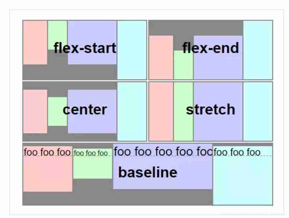
5. app:alignContent=“stretch”
The attribute represents Each axis Alignment throughout the layout .
app:alignContent Attributes are flex_start、flex_end、center、space_between、space_around and stretch6 Enumeration values .
stretch: The default value is , The axis occupies the entire parent layout .flex_start: Align all grid lines at the top .
flex_end: Align all grid lines at the bottom .
center: Center all grid lines .
space_between: Align all grid lines at both ends .
space_around: Align all grid lines dispersedly .
A word in , The axis direction can be determined byflexDirectionProperty to specify , Pay attention to attribute collocation , The lines .
6. dividerDrawable (reference)
Horizontal and vertical split lines .
7. dividerDrawableHorizontal / dividerDrawableVertical (reference)
level / Vertical split line .
8. showDivider
Displays the horizontal and vertical split line method .
Enumeration values are :
none
No display .beginning
middle
end
9. showDividerHorizontal / showDividerVertical
Display level / Vertical split line method .
FlexboxLayout Child element attribute
1. app:layout_order=“1”
Specify the child element sorting priority , The smaller the value, the higher the ranking , The default value is 1. Set the value type as float.
Pictured , bluetooth TextView The elements are in xml Is ranked as the second , But for it layout_order Property specified as 2, bluetooth Ranked last .
2. app:layout_flexGrow=“0”
Assign the weight of the remaining controls on the same axis , The default value is 0, Means not participating in the distribution . The usage is similar to LinearLayout Of weight, however weight The entire parent layout control is assigned , and layout_flexGrow The same row is allocated / The remaining space of the column .
for instance : take bluetooth Of layout_flexGrow Set to 1, Program Of layout_flexGrow Property set to 2
Pictured , bluetooth And Program Are involved in the allocation of remaining space , because Program The weight set is 2, So than bluetooth Double the space allocated .
3. app:layout_flexShrink=“0”
Sub element scaling , If line feed is set (flexWrap=“wrap or wrap_reverse”) The property is invalid .
Set the value type as float,0 Means no zoom , The greater the numerical , Larger scale , The default is 1, Invalid negative value .
Example : Push and instant messaging Set to 0( Don't zoom ), travel —— On the road Set to 2( Double zoom )
4. app:layout_flexBasisPercent="-1"
Official explanation :
	<!--
            The initial length in a percentage format relative to its parent. This is similar to the
            flex-basis property in the original CSS specification.
            (https://www.w3.org/TR/css-flexbox-1/#flex-basis-property)
            But unlike the flex-basis property, this attribute only accepts a value in fraction
            (percentage), whereas flex-basis property accepts width values such as 1em, 10px and
            the 'content' string.
            But specifying initial fixed width values can be done by specifying width values in
            layout_width (or layout_height, varies depending on the flexDirection). Also the same
            effect can be done by specifying "wrap_content" in layout_width (or layout_height) if
            developers want to achieve the same effect as 'content'.
            Thus, this attribute only accepts fraction values, which can't be done through
            layout_width (or layout_height) for simplicity.
        -->
Indicates that the child element length is a percentage of its parent layout length , Sets the of the element layout_flexBasisPercent The original length of the child element will be overwritten , The default value is -1. It should be noted that , Only when the length of the parent layout is specifically set can it take effect .
The set value is percentage , for example 50%.
Example : Set the width of the first element to that of the parent layout 50%(app:layout_flexBasisPercent="50%").
5. app:layout_alignSelf=“auto”
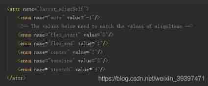
Used and alignItems Same property , The difference is alignItems All elements are set , and layout_alignSelf Act on a single element .
One thing to note is that , If the parent layout is set alignContent, And the enumeration value is not stretch, Then the modified attribute is invalid .
layout_alignSelf The enumeration values of are auto,flex_start,flex_end,center,baseline and stretch, The functions and alignItems Same attribute .
Example : take Push and instant messaging Set to flex_start, Bluetooth layout_alignSelf Set to stretch. effect :

6.app:layout_wrapBefore=“false”
Forced line wrap , The default is false.
If... Is set for child element layout_wrapBefore The attribute is false, Then this child element will start a new line .
example : by bluetooth Set up layout_wrapBefore The attribute is true
7. layout_minWidth / layout_minHeight
Limit FlexboxLayout Child elements ( Width or height ) Not less than the minimum , No matter what layout_flexShrink What are the attributes , Child elements will not be reduced to less than the minimum value set .
8. layout_maxWidth / layout_maxHeight
Limit FlexboxLayout Child elements ( Width or height ) Not greater than minimum , No matter what layout_flexGrow What are the attributes , Child elements will not be magnified to greater than the minimum value set .
Summary
FlexBoxLayout There are so many common attributes of , The combination of these attributes can achieve a very flexible effect .
Four 、 And RecyclerView In combination with
The official not only provides FlexboxLayout Layout , It also provides FlexboxLayoutManager Come and RecyclerView In combination with .
The second one is FlexboxLayoutManager that can be used within RecyclerView.
although RecyclerView Before that StaggeredGridLayoutManager To provide a waterfall effect , But still specify the row / Number of columns 、 by comparison ,FlexboxLayoutManager More flexible , And the application scenarios are different .
Next RecyclerView Of layoutManager Set to FlexboxLayoutManager
Let's take a look at the effect :
The white background is set to FlexboxLayoutManager Of RecyclerView, The green background is FlexboxLayout, so FlexboxLayoutManagery And FlexboxLayout Can achieve the same effect .
Main code :
		val flexboxLayoutManager = FlexboxLayoutManager(this)
        flexboxLayoutManager.flexWrap = FlexWrap.WRAP
        flexboxLayoutManager.flexDirection = FlexDirection.ROW
        flexboxLayoutManager.justifyContent = JustifyContent.FLEX_START
        flexboxLayoutManager.alignItems = AlignItems.FLEX_START
		//flexboxLayoutManager.alignContent = AlignContent.FLEX_START

        val adapter = FlexAdapter()
        initData(adapter)
        rv_flex.layoutManager = flexboxLayoutManager
        rv_flex.adapter = adapter
Be careful :flexboxLayoutManager.alignContent,
FlexboxLayoutManagerI won't support it alignContent attribute
to glance at setAlignContent Source code :
	@Override
    public void setAlignContent(@AlignContent int alignContent) {
        throw new UnsupportedOperationException("Setting the alignContent in the "
                + "FlexboxLayoutManager is not supported. Use FlexboxLayout "
                + "if you need to use this attribute.");
    }
so ,FlexboxLayoutManager I won't support it alignContent attribute , If the setting is forced, the following exceptions will be reported .
Caused by: java.lang.UnsupportedOperationException: Setting the alignContent in the FlexboxLayoutManager is not supported. Use FlexboxLayout if you need to use this attribute.
that FlexboxLayoutManager and FlexboxLayout What other uses are different ? The official table gives a good explanation .
| Attribute / Feature | FlexboxLayout | FlexboxLayoutManager (RecyclerView) |
|---|---|---|
| flexDirection |  | |
| flexWrap | | (except wrap_reverse) |
| justifyContent | | |
| alignItems | | |
| alignContent | | - |
| layout_order | | - |
| layout_flexGrow | | |
| layout_flexShrink | | |
| layout_alignSelf | | |
| layout_flexBasisPercent | | |
| layout_(min/max)Width | | |
| layout_(min/max)Height | | |
| layout_wrapBefore | | |
| Divider | | |
| View recycling | - | |
| Scrolling | *1 | |
5、 ... and 、 practice
 Such a drain layout , If you encounter , It seems that you can only customize View, Or seek the library written by others . But there is. FlexboxLayout Then it can be solved perfectly .
 6、 ... and 、 summary
Empty talk misses the country , Work hard to prosper the country
If you really want to understand FlexboxLayout Properties of , It is essential to practice and read the source code yourself , Don't talk much , Let's practice more .
FlexboxLayout And FlexboxLayoutManager Flexible streaming layout can be perfectly realized , And the library has been added to androidX 了 ,Google Dada really broke her heart for our development .
Reference resources
https://blog.csdn.net/tabolt/article/details/51799226
https://www.jianshu.com/p/3c471953e36d
https://www.oschina.net/news/73442/google-flexbox-layout
边栏推荐
- Vscode common programming fonts
- LeetCode 0710. Random numbers in the blacklist - preprocessing implementation o (1) value
- Jupyter Notebook遇到的问题
- c语言语法基础之——指针( 多维数组、函数、总结 ) 学习
- Internationalization configuration
- 同花顺炒股软件安全性怎样?在同花顺怎么开户
- 力扣------从数组中移除最大值和最小值
- 我的创作纪念日
- Automated testing -- Introduction and use of pytest itself and third-party modules
- Openxcap usage
猜你喜欢

Upgrade idea to 2021.2 shortcut keys

Notes on sports planning on November 22, 2021

logback

c语言语法基础之——局部变量及存储类别、全局变量及存储类别、宏定义 学习

How to create an IE tab in edge browser

Detailed explanation of the network security competition questions (2) of the 2021 national vocational college skills competition (secondary vocational group)

Day 3 array, pre post, character space, keyword and address pointer

Automated testing -- Introduction and use of pytest itself and third-party modules

Logview Pro can be used if the log is too large

Extracting public fragments from thymeleaf
随机推荐
The basis of C language grammar -- function nesting, Fibonacci sum of recursive applet and factorial
In the fragment, the input method is hidden after clicking the confirm cancel button in the alertdialog (this is valid after looking for it on the Internet for a long time)
Go learning notes (83) - code specification and common development skills
自动化测试——pytest框架介绍及示例
Jupyter Notebook遇到的问题
Enter the page input box to automatically obtain the focus
Leetcode refers to offer II 091 Paint house - modify in place
c语言语法基础之——指针(字符、一维数组) 学习
Wechat official account reported error 10003
Upgrade idea to 2021.2 shortcut keys
动态库连接 - 符号冲突 - 全局符号介入
SQL高级教程
Test instructions - common interface protocol analysis
DAY 3 数组,前置后置,字符空间,关键词和地址指针
调用api接口生成不同颜色的微信小程序二维码
Halcon photometric stereoscopic
SQL advanced tutorial
The 100000 line transaction lock has opened your eyes.
Automated testing -- Introduction and use of pytest itself and third-party modules
Flutter's brain map notes are easy to find and search!