当前位置:网站首页>【小程序开发】常用组件及基本使用详解
【小程序开发】常用组件及基本使用详解
2022-07-25 18:59:00 【华为云】
本节学习目标:
学会使用常用的组件
@[toc]
1.常用的容器类组件的使用
1.view组件的基本使用
view类似于HTML中的div,实现了普通的视图区域。
例如:使用flex实现横向布局。
wxml代码:
<view class="container1"><view>A</view><view>B</view><view>C</view></view>wxss代码:
.container1 view{ width:100px; height:100px; text-align: center; line-height: 100px;}.container1 view:nth-child(1){ background-color: aquamarine;}.container1 view:nth-child(2){ background-color: azure;}.container1 view:nth-child(3){ background-color: darkorange;}.container1 { display: flex; justify-content: space-around;}实现效果: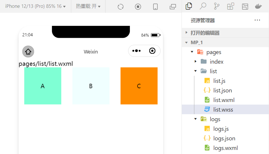
2.scroll-view组件的基本使用
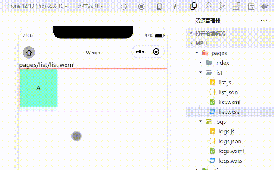
利用scroll-view可以实现滚动的效果,这个效果可以是上下滚动,也可以是左右滚动。
wxml代码:
<scroll-view class="container1" scroll-y><view>A</view><view>B</view><view>C</view></scroll-view>修改的wxss代码:
.container1 { border:1px solid red; height:110px; /*使用scroll-view时设置固定的高度*/实现效果:
3.swiper和swiper-item组件的基本使用
利用这两个组件可以实现轮播图效果:
wxml代码:
<swiper class="swiper-container"><swiper-item><view class="item">A</view></swiper-item><swiper-item> <view class="item">B</view></swiper-item><swiper-item> <view class="item">C</view></swiper-item></swiper>wxss代码:
.swiper-container{ height:150px;}.item{ height:100%; line-height: 150px; text-align: center;}swiper-item:nth-child(1) .item{ background-color: aquamarine;}swiper-item:nth-child(2) .item{ background-color: azure;}swiper-item:nth-child(3) .item{ background-color: darkorange;}实现效果: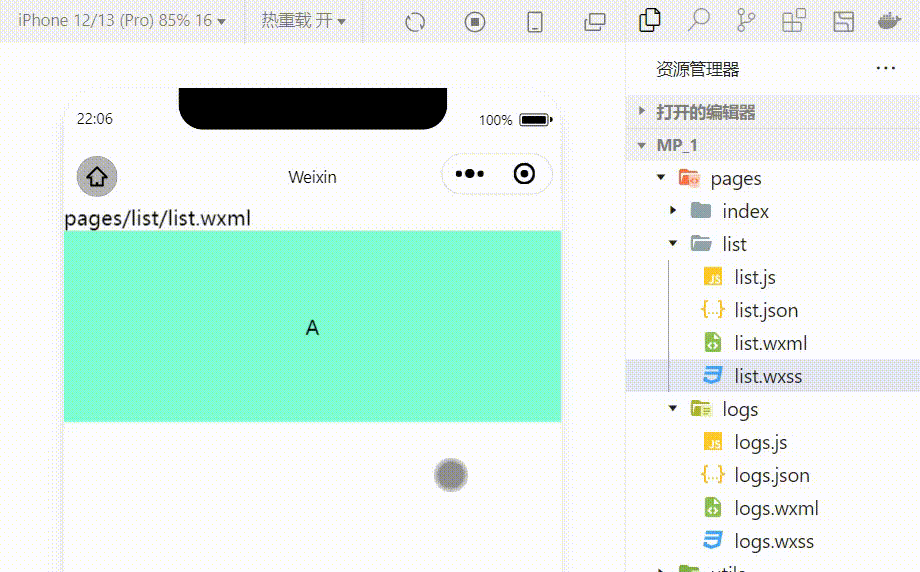
swiper组件的常用属性
| 属性 | 类型 | 默认值 | 说明 |
|---|---|---|---|
| indicator-dots | boolean | false | 是否显示面板指示色 |
| indicator-color | color | rgba(0,0,0,3) | 指示点颜色 |
| indicator-active-color | color | #000000 | 当前选中的指示点的颜色 |
| autoplay | boolean | false | 是否自动切换 |
| interval | number | 5000 | 自动切换时间间隔 |
| circular | boolean | false | 是否采用衔接滑动 |
例:显示面板指示色:
<swiper class="swiper-container" indicator-dots="true" >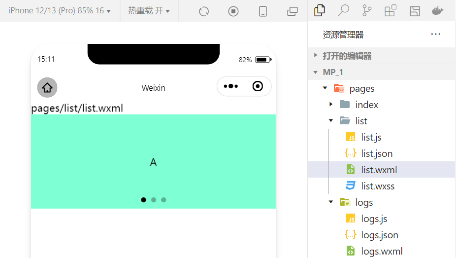
例:指定指示点颜色和当前选中知识点颜色:
<swiper class="swiper-container" indicator-dots="true" indicator-color="white" indicator-active-color="red">
例:设置自动切换,间隔设置为1s:
<swiper class="swiper-container" indicator-dots="true" indicator-color="white" indicator-active-color="red" autoplay="true" interval="1000">
采用衔接滑动:
<swiper class="swiper-container" indicator-dots="true" indicator-color="white" indicator-active-color="red" autoplay="true" interval="1000" circular>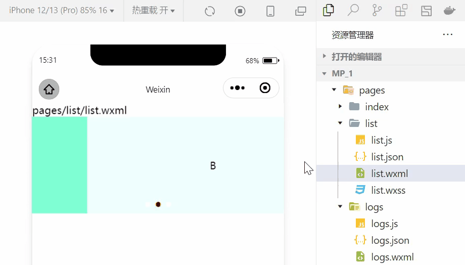
2.常用的基础内容组件的使用
1.text组件的基本使用
例:通过 text 组件的user-select 属性,可以实现长按选中文本内容的效果。(之前使用的selectable已经被废弃!)
<view>长按可以选中文本内容:<text user-select>HelloWorld!</text></view>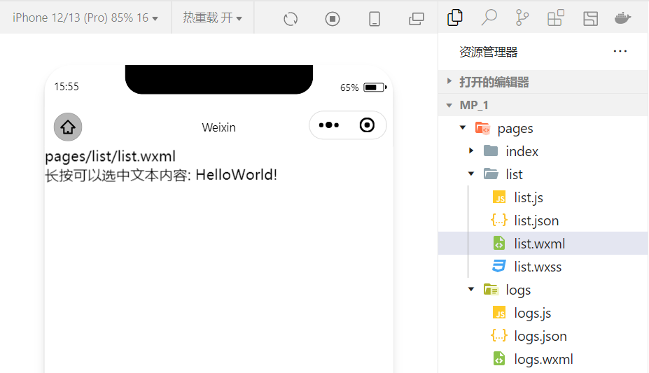
2.rich-text 组件的基本使用
例:通过 rich-text 组件的 nodes 属性节点,把 HTML 字符串渲染为对应的 UI 结构。
<rich-text nodes="<h1 style='color:red'>标题</h1>"> </rich-text>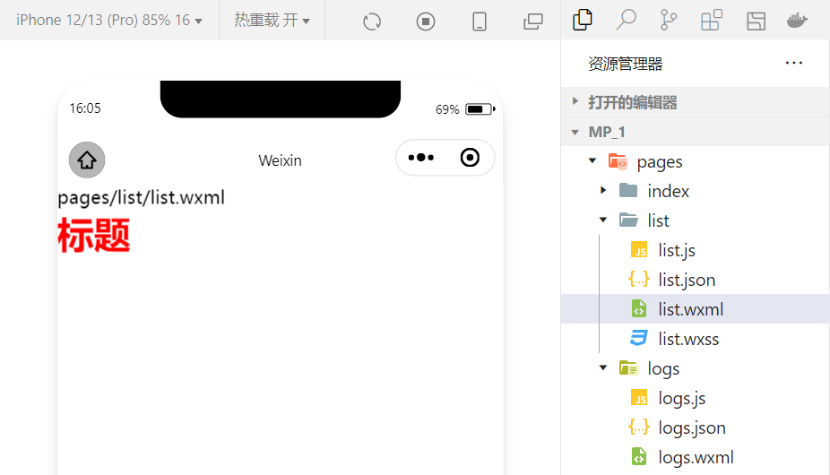
在想要把HTML文档渲染为相应的UI结构时使用该组件。
3.其他常用的组件
1.button组件的使用
小程序中的按钮组件类似于HTML中的按钮组件,同时可以调用微信提供的丰富的功能,例如:获取用户信息,获取用户授权,转发等。
例:使用type属性设置按钮的类型:
<button >默认按钮</button><button type="primary">主色调按钮</button><button type="warn">警告按钮</button>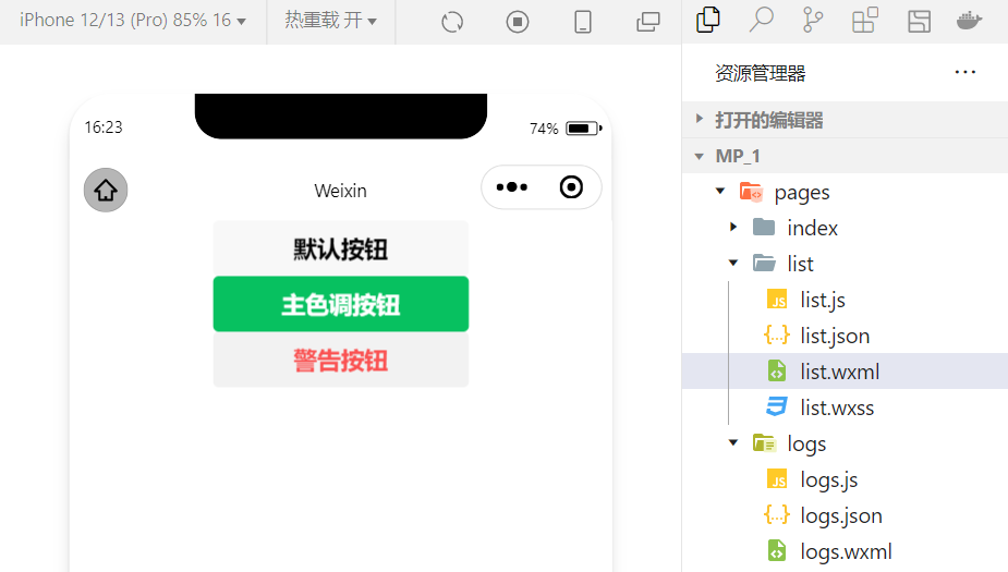
例:使用size属性设置按钮的大小:
<button size="mini">默认按钮</button><button type="primary" size="mini">主色调按钮</button><button type="warn" size="mini">警告按钮</button>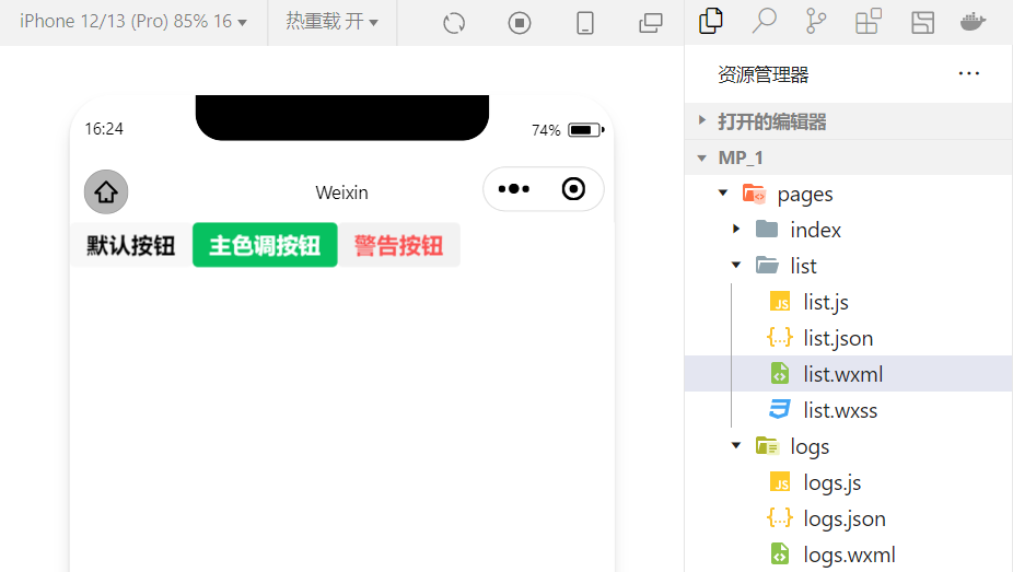
例:使用plain属性设置镂空按钮:
<button plain>默认按钮</button><button type="primary" plain>主色调按钮</button><button type="warn" plain>警告按钮</button>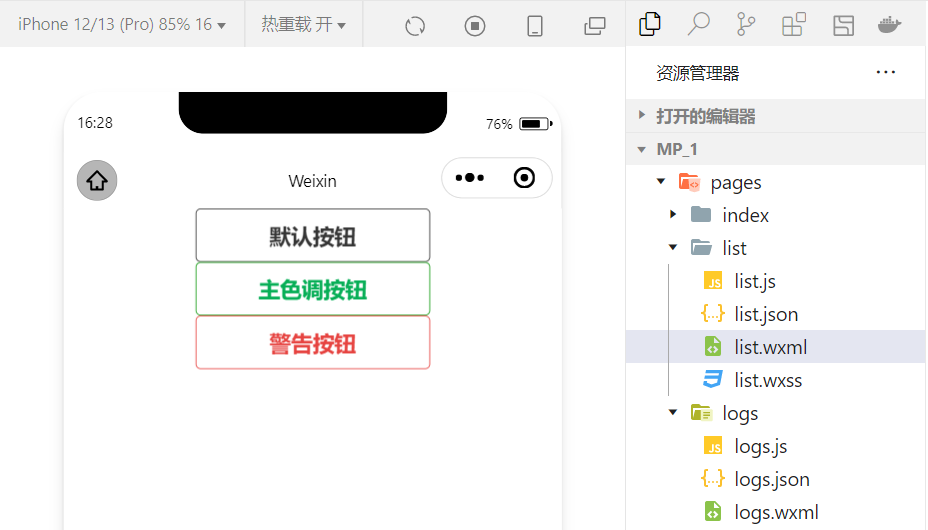
2.image组件的基本使用
wxml代码:
<image src="/images/1.jpg"></image>wxss代码:
image{ border: 5px solid black;}实现效果: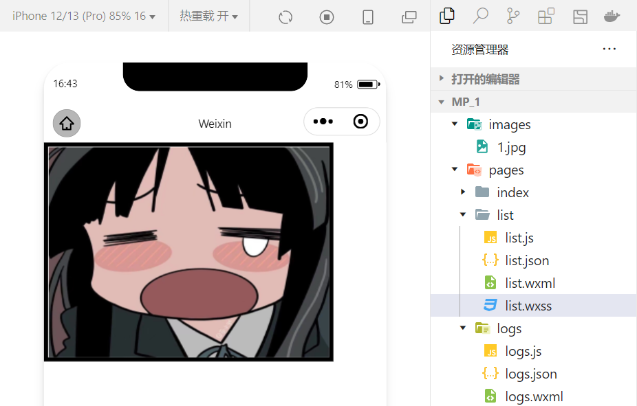
image 组件的 mode 属性用来指定图片的裁剪和缩放模式,常用的 mode 属性值如下:
| mode 值 | 说明 |
|---|---|
| scaleToFill | (默认值)缩放模式,不保持纵横比缩放图片,使图片的宽高完全拉伸至填满 image 元素 |
| aspectFit | 缩放模式,保持纵横比缩放图片,使图片的长边能完全显示出来。也就是说,可以完整地将图片显示出来。 |
| aspectFill | 缩放模式,保持纵横比缩放图片,只保证图片的短边能完全显示出来。也就是说,图片通常只在水平或垂直方向是完整的,另一个方向将会发生截取。 |
| widthFix | 缩放模式,宽度不变,高度自动变化,保持原图宽高比不变 |
| heightFix | 缩放模式,高度不变,宽度自动变化,保持原图宽高比不变 |
4.总结
本节对几个常用的组件做一个总结,实际上小程序拥有十分丰富的组件库,在学习的过程中,就会慢慢接触并熟练!同时,组件的学习和使用也是小程序宿主环境的一个重要部分。小程序开发中我们也体会到了技术更新迭代的速度很快,所以必须持续的学习新的技术!
边栏推荐
- MySQL子查询篇(精选20道子查询练习题)
- JMeter performance test actual video (what are the common performance test tools)
- 一个免费的镜像下载仓库网站
- Typescript reflection object reflection use
- Vc/pe is running towards Qingdao
- 7/24 training log
- 有孚原力超算,为客户提供定制化高性能计算服务
- Yarn 安装与使用教程[通俗易懂]
- Summer Challenge [FFH] this midsummer, a "cool" code rain!
- 进程间的通信(管道通信)
猜你喜欢

Twitter acquired a public opinion war, which was turned into a child quarrel by musk

Share six practical applet plug-ins
分享六个实用的小程序插件

Yyds dry inventory interview must brush top101: reverse linked list

How to design product help center? The following points cannot be ignored

ThreadLocal Kills 11 consecutive questions

There are several browser cores. How to upgrade if the browser version is too low

Baklib: make excellent product instruction manual

微软Azure和易观分析联合发布《企业级云原生平台驱动数字化转型》报告

黄鹤楼超震撼视角,这样的VR全景你绝对没见过!
随机推荐
HTTP cache tongtianpian, there may be something you want
弱网测试工具-QNET
无惧高温暴雨,有孚网络如何保您无忧?
阿里云技术专家秦隆:可靠性保障必备——云上如何进行混沌工程?
【云原生之kubernetes】kubernetes集群下Secret存储对象的管理
【开源工程】STM32C8T6+ADC信号采集+OLED波形显示
接口自动化测试平台FasterRunner系列(四)- 持续集成、解决多域名
优维低代码:Use Resolves
srec_cat 常用参数的使用
[encryption weekly] has the encryption market recovered? The cold winter has not thawed yet! Check the major events in the encryption market last week!
接口自动化测试平台FasterRunner系列(三)- 操作示例
21 days proficient in typescript-4 - type inference and semantic check
房企打响“保交战”
The bank's wealth management subsidiary accumulates power to distribute a shares; The rectification of cash management financial products was accelerated
对迁移学习中域适应的理解和3种技术的介绍
这种动态规划你见过吗——状态机动态规划之股票问题(上)
[applet development] page navigation details
分享六个实用的小程序插件
Huawei recruited "talented teenagers" twice this year; 5.4 million twitter account information was leaked, with a selling price of $30000; Google fired engineers who believed in AI consciousness | gee
Deng Qinglin, a technical expert of Alibaba cloud: Best Practices for disaster recovery and remote multi activity across availability zones on cloud