当前位置:网站首页>flex布局
flex布局
2022-06-28 07:36:00 【有勇气的牛排】
1 布局原理
flex是flexible Box的缩写,意为“弹性布局”,用来为盒装模型提供的最大的灵活性,任何一个容器都可以指定为flex布局。
- 当我们为父盒子设为flex布局以后,子元素的
float、vertical-align数据将失效。 - 名字:伸缩布局 = 弹性布局 = 伸缩盒布局 = 弹性盒布局 = flex布局
采用Flex布局的元素,称为Flex容器(flex 容器),简称容器。它的所有子元素自动成为容器成员,称为flex项目(flex item),简称“项目”
总结: 就是通过给父盒子添加flex属性,来控制子盒子的位置和排列方式。
2 flex布局父项常见属性
2.1 常见父项属性
flex-direction:设置主轴的方向justify-content:设置主轴上的子元素排列方式flex-warp:设置子元素是否换行align-content:设置侧轴上子元素的排列方式(多行)allign-items:设置侧轴上的子元素排列方式(单行)flex-flow:复合属性,相当于同时设置了flex-direction和flexwarp
2.2 flex-direction设置主轴的方向
2.2.1 主轴与侧轴
- 默认主轴方向:X轴 = 水平
- 默认侧轴方向:Y轴 = 竖向向下
| 属性值 | 说明 |
|---|---|
row | 默认值从左到右 |
row-reverse | 从右到左 |
column | 从上到下 |
column-reverse | 从下到上 |
 div {

	width: 800px;
    height: 200px;
    background-color: pink;
    /* 给父级添加flex属性 */
    display: flex;
    /* 默认主轴为 row横(默认),column竖 */
    flex-direction: column-reverse;
}

div span {

    width: 150px;
    height: 100px;
    background-color: yellow;
}
<div>
    <span>1</span>
    <span>2</span>
    <span>3</span>
</div>
2.3 justify-content 设置主轴上的子元素排列方式
justify-content 属性定义了项目在主轴上的对齐方式
注意:使用这个属性之前一定要确定好主轴是哪个
| 属性值 | 说明 |
|---|---|
flex-start | 默认值 从头部开始 如果主轴是x轴,则从左到右 |
flex-end | 从尾部开始排列 |
center | 在主轴居中对其(如果是x轴,则水平居中) |
space-around | 平分剩余空间 |
space-between | 先两边贴边,再平分剩余空间(重要) |
div {

	width: 800px;
    height: 200px;
    background-color: pink;
    /* 给父级添加flex属性 */
    display: flex;
    /* 默认主轴为 row横(默认),column竖 */
    flex-direction: column-reverse;
    /* justify-content 设置主轴上子元素的排列方式 */
    justify-content: center;
}
2.4 flex-warp 设置子元素是否换行
默认情况下,项目都排在一条线(又称:“轴线”)上。
定义:flex布局中默认是不换行的。
如果元素太多,会缩小子元素的宽度,放到父元素里面。
| 属性值 | 说明 |
|---|---|
nowrap | 默认值,不换行 |
wrap | 换行 |
2.5 align-items 设置侧轴上的子元素排列方式(单行)
该属性是控制子项在侧轴(默认y轴)上的排列方式,在子项为单项的时候使用。
| 属性值 | 说明 |
|---|---|
flex-start | 默认值 从上到下 |
flex-end | 从下到上 |
center | 挤在一起居中(垂直居中) |
stretch | 拉伸(子盒子不要给高度) |
2.6 align-content 设置侧轴上的子元素的排列方式(多行)
设置子项在侧轴上的排列方式,并且只能用于子项出现 换行 的情况(多行)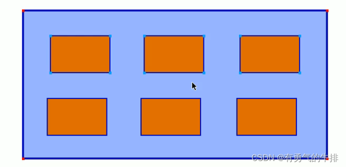
| 属性值 | 说明 |
|---|---|
flex-start | 默认值在侧轴的头部开始排列 |
flex-end | 在侧轴的尾部开始排列 |
center | 在侧轴的中间显示 |
space-around | 子项在侧轴平分剩余空间 |
space-between | 子项在侧轴先分布再两头,在平分剩余空间 |
strech | 设置子项元素高度平分元素高度 |
div {

    width: 800px;
    height: 300px;
    background-color: pink;
    display: flex;
    /* 换行 */
    flex-wrap: wrap;
    align-content: center;
    justify-content: center;
}

div span {

    width: 150px;
    height: 100px;
    background-color: yellow;
    margin: 10px;
}
<div>
    <span>1</span>
    <span>2</span>
    <span>3</span>
    <span>4</span>
    <span>5</span>
    <span>6</span>
</div>

2.6 align-content和align-items区别
- align-items适用于单行情况下,只有上对齐、下对齐、居中和拉伸
- align-content适应于换行(多行)情况下(单行情况下无效),可以设置上对齐、下对齐、居中、拉升以及平均分配剩余空间等属性值。
2.7 flex-flow
flex-flow 属性是flex-direction和flex-wrap 属性的复合属性。
例如:设置主轴和换行(换列)
flex-direction: column;
flex-wrap: wrap;
或
flex-flow: column wrap;
3 flex布局子项常见属性
3.1 flex 属性
定义子项目分配剩余空间,用flex来表示占多少份数。
.item {

	flex: <number>;		/* default 0 */
}
例如:左右固定,中间占据剩余所有空间
section {

    display: flex;
    width: 60%;
    height: 150px;
    background-color: pink;
    margin: 0 auto;
}

section div:nth-child(1) {

    width: 100px;
    height: 150px;
    background-color: red;
}

section div:nth-child(2) {

    flex: 1;
    background-color: yellow;
}

section div:nth-child(3) {

    width: 100px;
    height: 150px;
    background-color: blue;
}
<section>
    <div></div>
    <div></div>
    <div></div>
</section>

三个盒子平均三等分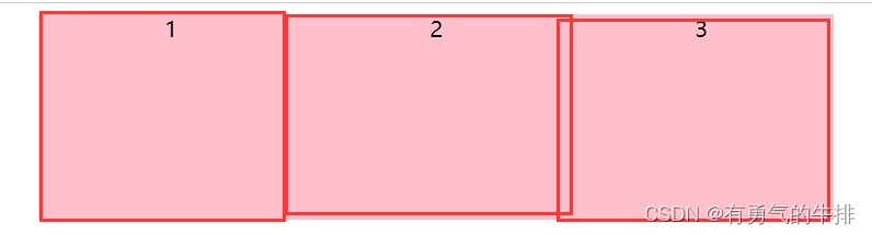
section {

    display: flex;
    width: 60%;
    height: 150px;
    background-color: pink;
    margin: 0 auto;
}

section div{

    flex: 1;
    text-align: center;
}
<section>
    <div>1</div>
    <div>2</div>
    <div>3</div>
</section>
4.2 align-self 控制子项在侧轴上的排列方式
align-self 属性允许单个项目有其他项目不一样的对齐方式,可覆盖align-items属性。
默认值为auto,表示集成父元素的align-items属性,如果没有父元素,则等同于stretch

section {

    display: flex;
    width: 60%;
    height: 150px;
    background-color: pink;
    margin: 0 auto;
}

section div {

    flex: 1;
    text-align: center;
}

section div:nth-child(3) {

    /* 自己对齐一个位置 */
    align-self: flex-end;
    background-color: yellow;
}
<section>
    <div>1</div>
    <div>2</div>
    <div>3</div>
</section>
4.3 order 属性定义项目的排列顺序
数值越小,排列越靠前,默认为0
注意:和z-index不一样
section div:nth-child(3) {

    flex: 1;
    order:-1;
}
参考地址:https://www.bilibili.com/video/BV1N54y1i7dG
边栏推荐
- Hash slot of rediscluster cluster cluster implementation principle
- Principle and practice of bytecode reference detection
- Self discipline challenge 30 days
- okcc呼叫中心没有电脑的坐席能不能开展工作?
- Sword finger offer II 091 Paint the house
- Block transmission by golang gin framework
- Practice and exploration of vivo live broadcast application technology
- R language ggmap visual cluster
- Source code analysis of kubernetes' process of deleting pod
- Jetpack - defects of livedata component and Countermeasures
猜你喜欢

Analyze 5 indicators of NFT project

Unity-UI-shadow组件
Block transmission by golang gin framework
Evolution of vivo push platform architecture

The practice of event driven architecture in vivo content platform

Vivo browser rapid development platform practice - Overview

安全培训是员工最大的福利!2022新员工入职安全培训全员篇
一个小工具可以更快的写爬虫
分析 NFT 项目的 5 个指标

goland IDE和delve调试位于kubernetes集群中的go程序
随机推荐
R 语言 Hitters 数据分析
R language ggmap visual cluster
Installing redis on Linux
kubernetes删除pod的流程的源码简析
7-1 懂的都懂
2021 VDC: technological architecture evolution of vivo Internet service for 100 million users | PPT download attached
8 figures | analyze Eureka's first synchronization registry
Solving the longest palindrome substring by dynamic programming
7-1 understand everything
卸载重装最新版mysql数据库亲测有效
Tencent continued to lay off staff in the second half of the year, and all business groups reduced by at least 10%. What do you think of this? Followers
The practice of event driven architecture in vivo content platform
打新债注册开户靠谱吗?安全吗?
ACM notes
golang gin框架进行分块传输
R 语言 Kolmogorov-Smirnov 检验 2 个样本是否遵循相同的分布。
看似简单的光耦电路,实际使用中应该注意些什么?
股票炒股注册开户靠谱吗?安全吗?
Investment transaction and settlement of the fund
goland IDE和delve调试位于kubernetes集群中的go程序