当前位置:网站首页>Systematic analysis of social networks using Networkx: Facebook network analysis case
Systematic analysis of social networks using Networkx: Facebook network analysis case
2022-06-27 01:13:00 【Zhiyuan community】

import pandas as pdimport numpy as npimport networkx as nximport matplotlib.pyplot as pltfrom random import randintfacebook = pd.read_csv( "data/facebook_combined.txt.gz", compression="gzip", sep=" ", names=["start_node", "end_node"],)
G = nx.from_pandas_edgelist(facebook, "start_node", "end_node")fig, ax = plt.subplots(figsize=(15, 9))ax.axis("off")plot_options = {"node_size": 10, "with_labels": False, "width": 0.15}nx.draw_networkx(G, pos=nx.random_layout(G), ax=ax, **plot_options)pos = nx.spring_layout(G, iterations=15, seed=1721)fig, ax = plt.subplots(figsize=(15, 9))ax.axis("off")nx.draw_networkx(G, pos=pos, ax=ax, **plot_options)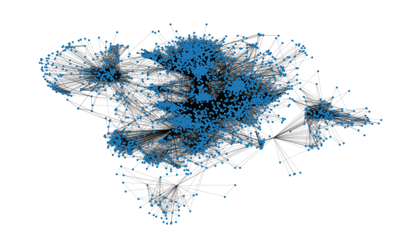
G.number_of_nodes()4039# Number of edges G.number_of_edges()88234np.mean([d for _, d in G.degree()])43.69101262688784shortest_path_lengths = dict(nx.all_pairs_shortest_path_length(G))# Length of shortest path between nodes 0 and 42shortest_path_lengths[0][42] 1diameter = max(nx.eccentricity(G, sp=shortest_path_lengths).values())diameter8# Compute the average shortest path length for each nodeaverage_path_lengths = [ np.mean(list(spl.values())) for spl in shortest_path_lengths.values()]# The average over all nodesnp.mean(average_path_lengths)3.691592636562027# We know the maximum shortest path length (the diameter), so create an array# to store values from 0 up to (and including) diameterpath_lengths = np.zeros(diameter + 1, dtype=int)# Extract the frequency of shortest path lengths between two nodesfor pls in shortest_path_lengths.values(): pl, cnts = np.unique(list(pls.values()), return_counts=True) path_lengths[pl] += cnts# Express frequency distribution as a percentage (ignoring path lengths of 0)freq_percent = 100 * path_lengths[1:] / path_lengths[1:].sum()# Plot the frequency distribution (ignoring path lengths of 0) as a percentagefig, ax = plt.subplots(figsize=(15, 8))ax.bar(np.arange(1, diameter + 1), height=freq_percent)ax.set_title( "Distribution of shortest path length in G", fontdict={"size": 35}, loc="center")ax.set_xlabel("Shortest Path Length", fontdict={"size": 22})ax.set_ylabel("Frequency (%)", fontdict={"size": 22})
nx.density(G)0.010819963503439287nx.number_connected_components(G)1degree_centrality = nx.centrality.degree_centrality(G) # save results in a variable to use again(sorted(degree_centrality.items(), key=lambda item: item[1], reverse=True))[:8][(107, 0.258791480931154), (1684, 0.1961367013372957), (1912, 0.18697374938088163), (3437, 0.13546310054482416), (0, 0.08593363051015354), (2543, 0.07280832095096582), (2347, 0.07206537890044576), (1888, 0.0629024269440317)](sorted(G.degree, key=lambda item: item[1], reverse=True))[:8][(107, 1045), (1684, 792), (1912, 755), (3437, 547), (0, 347), (2543, 294), (2347, 291), (1888, 254)]plt.figure(figsize=(15, 8))plt.hist(degree_centrality.values(), bins=25)plt.xticks(ticks=[0, 0.025, 0.05, 0.1, 0.15, 0.2]) # set the x axis ticksplt.title("Degree Centrality Histogram ", fontdict={"size": 35}, loc="center")plt.xlabel("Degree Centrality", fontdict={"size": 20})plt.ylabel("Counts", fontdict={"size": 20})
node_size = [ v * 1000 for v in degree_centrality.values()] # set up nodes size for a nice graph representationplt.figure(figsize=(15, 8))nx.draw_networkx(G, pos=pos, node_size=node_size, with_labels=False, width=0.15)plt.axis("off")
betweenness_centrality = nx.centrality.betweenness_centrality( G) # save results in a variable to use again(sorted(betweenness_centrality.items(), key=lambda item: item[1], reverse=True))[:8][(107, 0.4805180785560152), (1684, 0.3377974497301992), (3437, 0.23611535735892905), (1912, 0.2292953395868782), (1085, 0.14901509211665306), (0, 0.14630592147442917), (698, 0.11533045020560802), (567, 0.09631033121856215)]plt.figure(figsize=(15, 8))plt.hist(betweenness_centrality.values(), bins=100)plt.xticks(ticks=[0, 0.02, 0.1, 0.2, 0.3, 0.4, 0.5]) # set the x axis ticksplt.title("Betweenness Centrality Histogram ", fontdict={"size": 35}, loc="center")plt.xlabel("Betweenness Centrality", fontdict={"size": 20})plt.ylabel("Counts", fontdict={"size": 20})
node_size = [ v * 1200 for v in betweenness_centrality.values()] # set up nodes size for a nice graph representationplt.figure(figsize=(15, 8))nx.draw_networkx(G, pos=pos, node_size=node_size, with_labels=False, width=0.15)plt.axis("off")
closeness_centrality = nx.centrality.closeness_centrality( G) # save results in a variable to use again(sorted(closeness_centrality.items(), key=lambda item: item[1], reverse=True))[:8][(107, 0.45969945355191255), (58, 0.3974018305284913), (428, 0.3948371956585509), (563, 0.3939127889961955), (1684, 0.39360561458231796), (171, 0.37049270575282134), (348, 0.36991572004397216), (483, 0.3698479575013739)]# Besides , A specific node v The average distance to any other node can also be easily calculated by a formula :1 / closeness_centrality[107]2.1753343239227343plt.figure(figsize=(15, 8))plt.hist(closeness_centrality.values(), bins=60)plt.title("Closeness Centrality Histogram ", fontdict={"size": 35}, loc="center")plt.xlabel("Closeness Centrality", fontdict={"size": 20})plt.ylabel("Counts", fontdict={"size": 20})
node_size = [ v * 50 for v in closeness_centrality.values()] # set up nodes size for a nice graph representationplt.figure(figsize=(15, 8))nx.draw_networkx(G, pos=pos, node_size=node_size, with_labels=False, width=0.15)plt.axis("off")
And the centrality of eigenvectors , In a similar way i.e
The above chart is available .
nx.average_clustering(G)0.6055467186200876plt.figure(figsize=(15, 8))plt.hist(nx.clustering(G).values(), bins=50)plt.title("Clustering Coefficient Histogram ", fontdict={"size": 35}, loc="center")plt.xlabel("Clustering Coefficient", fontdict={"size": 20})plzt.ylabel("Counts", fontdict={"size": 20})
nx.has_bridges(G)True# Number of output bridges
bridges = list(nx.bridges(G))len(bridges)75plt.figure(figsize=(15, 8))nx.draw_networkx(G, pos=pos, node_size=10, with_labels=False, width=0.15)nx.draw_networkx_edges( G, pos, edgelist=local_bridges, width=0.5, edge_color="lawngreen") # green color for local bridgesnx.draw_networkx_edges( G, pos, edgelist=bridges, width=0.5, edge_color="r") # red color for bridgesplt.axis("off")
nx.degree_assortativity_coefficient(G)0.06357722918564943nx.degree_pearson_correlation_coefficient(G) 0.06357722918564918
colors = ["" for x in range(G.number_of_nodes())] # initialize colors listcounter = 0for com in nx.community.label_propagation_communities(G): color = "#%06X" % randint(0, 0xFFFFFF) # creates random RGB color counter += 1 for node in list( com ): # fill colors list with the particular color for the community nodes colors[node] = colorcounter44plt.figure(figsize=(15, 9))plt.axis("off")nx.draw_networkx( G, pos=pos, node_size=10, with_labels=False, width=0.15, node_color=colors)
colors = ["" for x in range(G.number_of_nodes())]for com in nx.community.asyn_fluidc(G, 8, seed=0): color = "#%06X" % randint(0, 0xFFFFFF) # creates random RGB color for node in list(com): colors[node] = colorplt.figure(figsize=(15, 9))plt.axis("off")nx.draw_networkx( G, pos=pos, node_size=10, with_labels=False, width=0.15, node_color=colors)
[1]https://networkx.org/nx-guides/content/exploratory_notebooks/facebook_notebook.html#id2
[2]http://snap.stanford.edu/data/ego-Facebook.html
边栏推荐
- 网上开通证券账户安全吗 手机炒股靠谱吗
- Skills needing attention in selection and purchase of slip ring
- 接口测试框架实战(一) | Requests 与接口请求构造
- Lambda expression
- Database interview questions +sql statement analysis
- XSS notes (Part 2)
- At present, which securities company is the best and safest to open an account for stock speculation?
- 【毕业季】角色转换
- Central Limit Theorem
- Flutter series: flow in flutter
猜你喜欢

Lambda expression

Basic introduction to C program structure Preview

CH423要如何使用,便宜的国产IO扩展芯片

Esp32 add multi directory custom component

Implementation of ARP module in LwIP

接口测试框架实战(一) | Requests 与接口请求构造

Tsinghua & Zhiyuan | cogview2: faster and better text image generation model

建模规范:环境设置

自定义类加载器对类加密解密

ESP32-SOLO开发教程,解决CONFIG_FREERTOS_UNICORE问题
随机推荐
统计无向图中无法互相到达点对数[经典建邻接表+DFS统计 -> 并查集优化][并查集手册/写的详细]
What are the skills and methods for slip ring installation
Kept to implement redis autofailover (redisha) 14
微博评论高性能高可用架构
buuctf-pwn write-ups (6)
Lambda expression
ML:机器学习工程化之团队十大角色背景、职责、产出物划分之详细攻略
Kept to implement redis autofailover (redisha) 16
Memcached foundation 2
如何把老式键盘转换成USB键盘并且自己编程?
Xiaobai looks at MySQL -- installing MySQL in Windows Environment
XSS notes (Part 2)
大白话高并发(一)
These 10 copywriting artifacts help you speed up the code. Are you still worried that you can't write a copywriting for US media?
CH423要如何使用,便宜的国产IO扩展芯片
Memcached foundation 7
Processing of slice loss in ArcGIS mosaic dataset
清华&智源 | CogView2:更快更好的文本图像生成模型
3線spi屏幕驅動方式
Weibo comments on high performance and high availability architecture