当前位置:网站首页>Matplotlib attribute and annotation
Matplotlib attribute and annotation
2022-06-28 09:39:00 【Beginner Xiaobai Lu】
List of articles
There are two main ways to decorate most icons : Use procedural pyplot Interface ( namely matplotlib.pyplot) And more object-oriented native matplotlibAPI.
matplotlib The main thing is to understand figure( canvas )、axes( Coordinate system )、axis( Axis ) The relationship between the three .

remove set_axis_off,set_axis_on,set_axisbelow, Get rid of the rest set_ Prefix can be used as plt.subplot Parameters of .
plt.subplot(211, sharex=ax1, sharey=ax1, label='label',alpha=0.5, fc='r', yscale='log')
Axes Drawing method
| Method | explain |
|---|---|
| Axes.plot | take y Yes x Draw as a line or mark . |
| Axes.errorbar | take y And x Draw as lines and with error bars / Or mark . |
| Axes.scatter | y And y The scatter diagram of |
| Axes.plot_date | Draw a graph that forces the axis to treat floating-point numbers as dates . |
| Axes.step | Draw a ladder diagram . |
| Axes.loglog | stay x Axis and y Plot on axis using logarithmic scaling . |
| Axes.semilogx | stay x Draw a graph with logarithmic scale on the axis . |
| Axes.semilogy | use y Plot logarithmic scale on axis . |
| Axes.fill_between | Fill the area between two horizontal curves . |
| Axes.fill_betweenx | Fill the area between two vertical curves . |
| Axes.bar | Draw a bar graph . |
| Axes.barh | Draw a horizontal bar chart . |
| Axes.bar_label | Mark bar chart . |
| Axes.stem | Create a stem chart . |
| Axes.eventplot | Draw the same parallel lines at a given location . |
| Axes.pie | Draw the pie chart . |
| Axes.stackplot | Plot stacking area . |
| Axes.broken_barh | Draw a horizontal sequence of rectangles . |
| Axes.vlines | At every x Draw from ymin To ymax The vertical line of . |
| Axes.hlines | In from xmin To xmax Each y Draw a horizontal line on . |
| Axes.fill | Draw filled polygons . |
| Axes.axhline | Add a horizontal line on the axis . |
| Axes.axhspan | Add a horizontal span on the shaft ( rectangular ). |
| Axes.axvline | Add a vertical line on the axis . |
| Axes.axvspan | Add a vertical span on the axis ( rectangular ). |
| Axes.axline | Add an infinite line . |
| Axes.acorr | draw x The autocorrelation of . |
| Axes.angle_spectrum | Draw the angle spectrum . |
| Axes.cohere | draw x and y Coherence between . |
| Axes.csd | Plot the cross spectral density . |
| Axes.magnitude_spectrum | Draw the amplitude spectrum . |
| Axes.phase_spectrum | Draw the phase spectrum . |
| Axes.psd | Plot the power spectral density . |
| Axes.specgram | Plot the spectrum . |
| Axes.xcorr | draw x and y Cross correlation between . |
| Axes.clabel | Mark contour map . |
| Axes.contour | Draw contours . |
| Axes.contourf | Draw a fill profile . |
| Axes.imshow | Display data as an image , That is to say 2D On the regular grid . |
| Axes.matshow | take 2D The values of a matrix or array are drawn as color coded images . |
| Axes.pcolor | Create a pseudo color map with an irregular rectangular grid . |
| Axes.pcolorfast | Create a pseudo color map with an irregular rectangular grid . |
| Axes.pcolormesh | Create a pseudo color map with an irregular rectangular grid . |
| Axes.spy | draw 2D Sparse pattern of the array . |
| Axes.get_xaxis_transform | Get for drawing x Axis labels , Conversion of tick marks and gridlines . |
| Axes.get_yaxis_transform | Get for drawing y Axis labels , Conversion of tick marks and gridlines . |
| Axes.get_data_ratio | Returns the aspect ratio of the scaled data . |
Axes About the method of coordinate axis
| Method | explain |
|---|---|
| Axes.axis | A convenient way to get or set some axis properties . |
| Axes.set_axis_off | close x and y Axis . |
| Axes.set_axis_on | Turn on x and y Axis . |
| Axes.set_frame_on | Set whether to draw axis rectangle patch . |
| Axes.get_frame_on | Gets whether the axis rectangle patch is drawn . |
| Axes.set_axisbelow | Sets whether the axis tick marks and grid lines are above or below the graph . |
| Axes.get_axisbelow | Gets whether the axis scale and grid line are above or below the graph . |
| Axes.grid | Add gridlines . |
| Axes.get_facecolor | Get the surface color of the shaft . |
| Axes.set_facecolor | Set the surface color of the shaft . |
| Axes.invert_xaxis | reverse x Axis . |
| Axes.xaxis_inverted | return x Whether the axis is along “ back ” Direction orientation . |
| Axes.invert_yaxis | reverse y Axis . |
| Axes.yaxis_inverted | return y Whether the axis is along “ back ” Direction orientation . |
| Axes.set_xlim | Set up x Axis range . |
| Axes.get_xlim | return x Axis range . |
| Axes.set_ylim | Set up y Axis range . |
| Axes.get_ylim | return y Axis range . |
| Axes.set_xbound | Set up x The upper and lower boundaries of the axis . |
| Axes.get_xbound | Returns... In ascending order x The upper and lower boundaries of the axis . |
| Axes.set_ybound | Set up y The upper and lower boundaries of the axis . |
| Axes.get_ybound | Returns... In ascending order y The upper and lower boundaries of the axis . |
| Axes.set_xlabel | Set up x The label of the shaft . |
| Axes.get_xlabel | obtain xlabel Text string . |
| Axes.set_ylabel | Set up y The label of the shaft . |
| Axes.get_ylabel | obtain ylabel Text string . |
| Axes.set_title(self, label, fontdict=None, loc=None, pad=None, *, y=None) | Set the title for the axis .fontdict:{‘fontsize’: rcParams[‘axes.titlesize’],‘fontweight’: rcParams[‘axes.titleweight’], ‘color’: rcParams[‘axes.titlecolor’],‘verticalalignment’: ‘baseline’,‘horizontalalignment’: loc}.loc : {‘center’, ‘left’, ‘right’} |
| Axes.get_title(self, loc=“center”) | Get axis title .left,center,right. |
| Axes.legend | Place a legend on the shaft . |
| Axes.get_legend | return Legend example , If no legend is defined , Then return to None. |
| Axes.get_legend_handles_labels(self, legend_handler_map=None) | Returns the handle and label of the legend |
| Axes.set_xscale | Set up x Axis scale . |
| Axes.get_xscale | return xaxis The scale of ( With str Express ). |
| Axes.set_yscale | Set up y Axis scale . |
| Axes.get_yscale | return yaxis The scale of ( With str Express ). |
| Axes.set_xticks | Set up xaxis Scale position of . |
| Axes.get_xticks | Return to data coordinates xaxis Scale position of . |
| Axes.set_xticklabels | Use the string label list to set xaxis The label of . |
| Axes.get_xticklabels | obtain xaxis Scale labels for . |
| Axes.get_xmajorticklabels | return xaxis Major scale labels for , As a list of Text. |
| Axes.get_xminorticklabels | return xaxis Sub scale labels for , As a list of Text. |
| Axes.get_xgridlines | return xaxis Grid lines as Line2Ds A list of . |
| Axes.get_xticklines | With x Is returned as a list xaxis The scale line of Line2D. |
| Axes.xaxis_date | Set axis scale and label , To move the x The data of the axis is regarded as the date . |
| Axes.set_yticks | Set up yaxis Scale position of . |
| Axes.get_yticks | Return to data coordinates yaxis Scale position of . |
| Axes.set_yticklabels | Use the string label list to set yaxis label . |
| Axes.get_yticklabels | obtain yaxis Scale labels for . |
| Axes.get_ymajorticklabels | return yaxis Major scale labels for , As a list of Text. |
| Axes.get_yminorticklabels | return yaxis Minor scale labels for , As a list of Text. |
| Axes.get_ygridlines | return yaxis Grid lines as Line2Ds A list of . |
| Axes.get_yticklines | return yaxis The scale mark of is used as Line2Ds A list of . |
| Axes.yaxis_date | Set axis scale and label , To move the y The data of the axis is regarded as the date . |
| Axes.minorticks_off | Remove the small clicking sound on the shaft . |
| Axes.minorticks_on | Show smaller scale on axis . |
| Axes.ticklabel_format | To configure ScalarFormatter Used for linear axes by default . |
| Axes.tick_params | Change tick marks , Appearance of tick mark labels and gridlines . |
| Axes.set_major_locator(self, locator) | Set the scale position .locator : ~matplotlib.ticker.Locator |
Axes.set_xticks(self, ticks, minor=False)
Set up x Axis scale , By default, the scale also has a label .
- ticks: This parameter is x List of axis scale positions .
- minor: This parameter is used to set the primary or secondary tick marks
Axes.set_xticklabels(self, labels, fontdict=None, minor=False, **kwargs)
Set with string label list xaxis label .
- labels: This parameter is a list of string labels .
- fontdict: This parameter is the dictionary that controls the appearance of the scale label .
The default value box is :{‘fontsize’: rcParams[‘axes.titlesize’],
‘fontweight’: rcParams[‘axes.titleweight’],
‘verticalalignment’: ‘baseline’,
‘horizontalalignment’: loc} - minor: The default value is :False, Whether to set secondary tick mark labels instead of primary tick mark labels .
import numpy as np
import matplotlib.pyplot as plt


def main():
    fig = plt.figure()
    ax = fig.add_subplot(1, 1, 1)
    ax.plot(np.random.randn(1000).cumsum())
    ticks = ax.set_xticks([0, 250, 500, 750, 1000])
    label = ax.set_xticklabels(['one', 'two', 'three', 'four', 'five'], rotation=30, fontsize='small')
    ax.set_title('My')
    ax.set_xlabel("Stages")
    plt.show()


if __name__ == '__main__':
    main()
annotation annotate
annotate Used to add text annotations to data on graphics , And support the scribing tool with arrow , It is convenient for us to add description information in the right place .
Axes.annotate(s, xy, *args, **kwargs)
- s: The content of the comment text
- xy: Annotated coordinate points , Two dimensional tuples are shaped like (x,y)
- xytext: Coordinate point of annotation text , It's also a two-dimensional tuple , Default and xy identical
- xycoords: Coordinate system attribute of the annotated point , The allowed values are as follows
| Property value | meaning |
|---|---|
| ‘figure points’ | Take the lower left corner of the drawing area as the reference , The unit is the number of points |
| ‘figure pixels’ | Take the lower left corner of the drawing area as the reference , The unit is the number of pixels |
| ‘figure fraction’ | Take the lower left corner of the drawing area as the reference , The unit is percentage |
| ‘axes points’ | Take the lower left corner of the sub drawing area as the reference , The unit is the number of points ( One figure There can be multiple axex, The default is 1 individual ) |
| ‘axes pixels’ | Take the lower left corner of the sub drawing area as the reference , The unit is the number of pixels |
| ‘axes fraction’ | Take the lower left corner of the sub drawing area as the reference , The unit is percentage |
| ‘data’ | With the annotated coordinate point xy For reference ( The default value is ) |
| ‘polar’ | Do not use local data coordinate system , Use polar coordinate system |
- textcoords : Coordinate system properties of annotation text , Default and xycoords Same property value , It can also be set to different values . In addition to allowing input xycoords The attribute value , You can also enter the following two types :
| Property value | meaning |
|---|---|
| ‘offset points’ | Relative to the annotated point xy The offset ( The unit is dot ) |
| ‘offset pixels’ | Relative to the annotated point xy The offset ( Unit is pixel ) |
- arrowprops: The style of the arrow ,dict( Dictionaries ) Type data , If the attribute is not empty , An arrow will be drawn between the annotated text and the annotated point . If not set ’arrowstyle’ keyword , The following keywords are allowed :
| keyword | meaning |
|---|---|
| width | The width of the arrow ( The unit is dot ) |
| headwidth | The width of the head of the arrow ( spot ) |
| headlength | The length of the head of the arrow ( spot ) |
| shrink | The percentage of shrinkage at both ends of the arrow ( Account for the total length ) |
| ? | Any keyword |
If set ‘arrowstyle’ keyword , The above keywords cannot be used . The allowed values are :
| The style of the arrow | attribute |
|---|---|
| ‘-’ | None |
| ‘->’ | head_length=0.4,head_width=0.2 |
| ‘-[’ | widthB=1.0,lengthB=0.2,angleB=None |
| ’ | - |
| '- | >’ |
| ‘<-’ | head_length=0.4,head_width=0.2 |
| ‘<->’ | head_length=0.4,head_width=0.2 |
| '< | -’ |
| '< | - |
| ‘fancy’ | head_length=0.4,head_width=0.4,tail_width=0.4 |
| ‘simple’ | head_length=0.5,head_width=0.5,tail_width=0.2 |
| ‘wedge’ | tail_width=0.3,shrink_factor=0.5 |
- annotation_clip : Boolean value , Optional parameters , The default is empty. . Set to True when , Only when the annotated point is in the sub drawing area can the annotation be drawn ; Set to False when , The annotation is drawn wherever the annotated point is . Only when the xycoords by ‘data’ when , A null default value is equivalent to True.
Example : Set the color and indentation of the arrow
import numpy as np
import matplotlib.pyplot as plt

fig, ax = plt.subplots()

#  Draw a cosine curve
t = np.arange(0.0, 5.0, 0.01)
s = np.cos(2*np.pi*t)
line, = ax.plot(t, s, lw=2)

#  Draw a black , Arrows with indented ends
ax.annotate('local max', xy=(2, 1), xytext=(3, 1.5),
            xycoords='data',
            arrowprops=dict(facecolor='black', shrink=0.05)
            )
ax.set_ylim(-2, 2)
plt.show()

Example : Draw notes with different coordinate systems
import numpy as np
import matplotlib.pyplot as plt

#  In steps 0.005 Draw a curve
x = np.arange(0, 10, 0.005)
y = np.exp(-x/2.) * np.sin(2*np.pi*x)

fig, ax = plt.subplots()
ax.plot(x, y)
ax.set_xlim(0, 10)
ax.set_ylim(-1, 1)

#  The coordinates of the data axis and the pixel of the annotated point
xdata, ydata = 5, 0
xdisplay, ydisplay = ax.transData.transform_point((xdata, ydata))

#  Set the style of note text and arrow
bbox = dict(boxstyle="round", fc="0.8")
arrowprops = dict(
    arrowstyle = "->",
    connectionstyle = "angle,angleA=0,angleB=90,rad=10")

#  Set offset
offset = 72
# xycoords The default is 'data' Data axis coordinates , For coordinate points (5,0) Add notes
#  The annotation text refers to the annotation point to set the offset , towards the left 2*72points, Up 72points
ax.annotate('data = (%.1f, %.1f)'%(xdata, ydata),
            (xdata, ydata), xytext=(-2*offset, offset), textcoords='offset points',
            bbox=bbox, arrowprops=arrowprops)

# xycoords Take the lower left corner of the drawing area as the reference , In pixels
#  The annotation text refers to the annotation point to set the offset , towards the right 0.5*72points, Down 72points
disp = ax.annotate('display = (%.1f, %.1f)'%(xdisplay, ydisplay),
            (xdisplay, ydisplay), xytext=(0.5*offset, -offset),
            xycoords='figure pixels',
            textcoords='offset points',
            bbox=bbox, arrowprops=arrowprops)


plt.show()

Example : Notes on polar coordinates , Drawing in polar coordinates , And set the annotated points in the polar coordinate system , Place annotation text as a percentage of the plot area .
import numpy as np
import matplotlib.pyplot as plt

#  Draw a polar coordinate , And then to 0.001 Step length , Draw a spiral curve
fig = plt.figure()
ax = fig.add_subplot(111, polar=True)
r = np.arange(0,1,0.001)
theta = 2 * 2*np.pi * r
line, = ax.plot(theta, r, color='#ee8d18', lw=3)

#  The index is 800 Draw a dot at , And make notes
ind = 800
thisr, thistheta = r[ind], theta[ind]
ax.plot([thistheta], [thisr], 'o')
ax.annotate('a polar annotation',
            xy=(thistheta, thisr),  #  The annotated points follow the polar coordinate system , The coordinates are angle and radius
            xytext=(0.05, 0.05),    #  The annotation text is placed in the drawing area 0.05 Percent
            textcoords='figure fraction',
            arrowprops=dict(facecolor='black', shrink=0.05),#  The arrow line is black , Indent both ends 5%
            horizontalalignment='left',#  Align the left and low ends of the note text to the specified position
            verticalalignment='bottom',
            )
plt.show()

Mouse over to show hidden content annotate Realization
- establish [ spot , notes ] Right list , By default , Comments are not visible
- Every time a mouse movement is detected , Will register a function “on_move”
- on_move The function iterates through each point and comment , If the mouse is now at one of the points , Make its associated comments visible , If not , Make it invisible .
import matplotlib.pyplot as plt

fig = plt.figure()
po_annotation = []
for i in range(0, 10):
    x = i
    y = x**2
    point, = plt.plot(x, y, 'o')
    annotation = plt.annotate(('x='+str(x), 'y='+str(y)), xy=(x+0.1, y+0.1), xycoords='data', xytext=(x+0.7, y+0.7),
                                textcoords='data', horizontalalignment="left",
                                arrowprops=dict(arrowstyle="simple",connectionstyle="arc3,rad=-0.1"),
                                bbox=dict(boxstyle="round", facecolor="w",edgecolor="0.5", alpha=0.9)
                                )
    annotation.set_visible(False)
    po_annotation.append([point, annotation])

def on_move(event):
    visibility_changed = False
    for point, annotation in po_annotation:
        should_be_visible = (point.contains(event)[0] == True)
        # print(point.contains(event)[0])

        if should_be_visible != annotation.get_visible():
            visibility_changed = True
            annotation.set_visible(should_be_visible)

    if visibility_changed:
        plt.draw()

on_move_id = fig.canvas.mpl_connect('motion_notify_event', on_move)

plt.show()

边栏推荐
- The private attribute of this class can be used directly? New() in use!!!
- Fastjason filter field
- PMP Exam key summary IX - closing
- A classic JVM class loaded interview question class singleton{static singleton instance = new singleton(); private singleton() {}
- Scenario method and error recommendation method for learning basic content of software testing (2)
- Inventory of excellent note taking software: good-looking and powerful visual note taking software, knowledge map tools heptabase, hydrogen map, walling, reflect, infranodus, tiddlywiki
- Key summary IV of PMP examination - planning process group (2)
- 异常的产生,及解决
- 2020-10-27
- 小米旗下支付公司被罚 12 万,涉违规开立支付账户等:雷军为法定代表人,产品包括 MIUI 钱包 App
猜你喜欢

Resource scheduling and task scheduling of spark

SQL optimization experience: from 30248 seconds to 0.001 seconds

桥接模式(Bridge)

代理模式(Proxy)

Screen settings in the source code of OBS Live Room
SQL 優化經曆:從 30248秒到 0.001秒的經曆

Stock suspension
Ingersoll Rand panel maintenance IR Ingersoll Rand microcomputer controller maintenance xe-145m
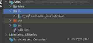
JDBC connection database (MySQL) steps

详解final、finally和finalize
随机推荐
Boundary value analysis method for learning basic content of software testing (2)
Apache Doris becomes the top project of Apache
2022-06-27:给出一个长度为n的01串,现在请你找到两个区间, 使得这两个区间中,1的个数相等,0的个数也相等, 这两个区间可以相交,但是不可以完全重叠
DBeaver安装与使用教程(超详细安装与使用教程)
Screen settings in the source code of OBS Live Room
01 distributed system overview
Prototype chain JS
1182: effets de la photo de groupe
JSON数据与List集合之间的正确转换
new URL(“www.jjj.com“)
Function sub file writing
Illustration of MySQL binlog, redo log and undo log
Apache Doris 成为 Apache 顶级项目
SQL 優化經曆:從 30248秒到 0.001秒的經曆
全局异常处理器与统一返回结果
Music website design based on harmonyos (portal page)
微信小程序开发日志
代理模式(Proxy)
Decision table method for basic content learning of software testing (2)
详解final、finally和finalize