当前位置:网站首页>How to use data to tell a wonderful story?
How to use data to tell a wonderful story?
2022-06-23 05:04:00 【Desai intelligent digital visual interactive platform】
- What is data narrative
Definition of data story telling : Transform data information analysis into a widely accessible form of data visualization , Through the use of visual tools to visualize and analyze data, the process of influencing various business decisions, strategies and actions of enterprises . Data storytelling has many advantages to promote business development .
Data narration can effectively convey the information plot and the intimacy of narration , Visualize with the right data , Organize data into logic , And simplify the complicated data information , Use simpler visual narration to attract the target audience .
- How to tell stories with data
How to use data to create attractive 、 A lot of information 、 A compelling story , So as to achieve the purpose of effective communication , And how to fit the chart , How to eliminate clutter , How to focus the audience's attention , How to think like a designer , Turn the data into a wonderful story . And explain it together with case study .
- Establish a clear audience
In the production Data visualization Before , Clearly know who your audience data is ? You need them to know or do something ? We use it 《 Contemporary parents' International Children's Day 》 As an example , It is clear that the data audience is : children 、 Parents . Want them to know , Children's Day is coming , And the data related to children's day and children's day of parents' childhood . The determination of audience users can be Visual narration Framework , It establishes the basis of data presentation effect and Visual narrative The need for .

- Select a valid chart
Presentation of data , What is the best way to show ? There are many types of data visualization charts : Broken line diagram 、 Histogram 、 Sort chart 、 Mind mapping 、 Radar map 、 Heat map 、 Box picture 、 Waterfall Plot 、 Maps, etc , What kind of data is suitable for each chart and what kind of scenario is suitable for ?
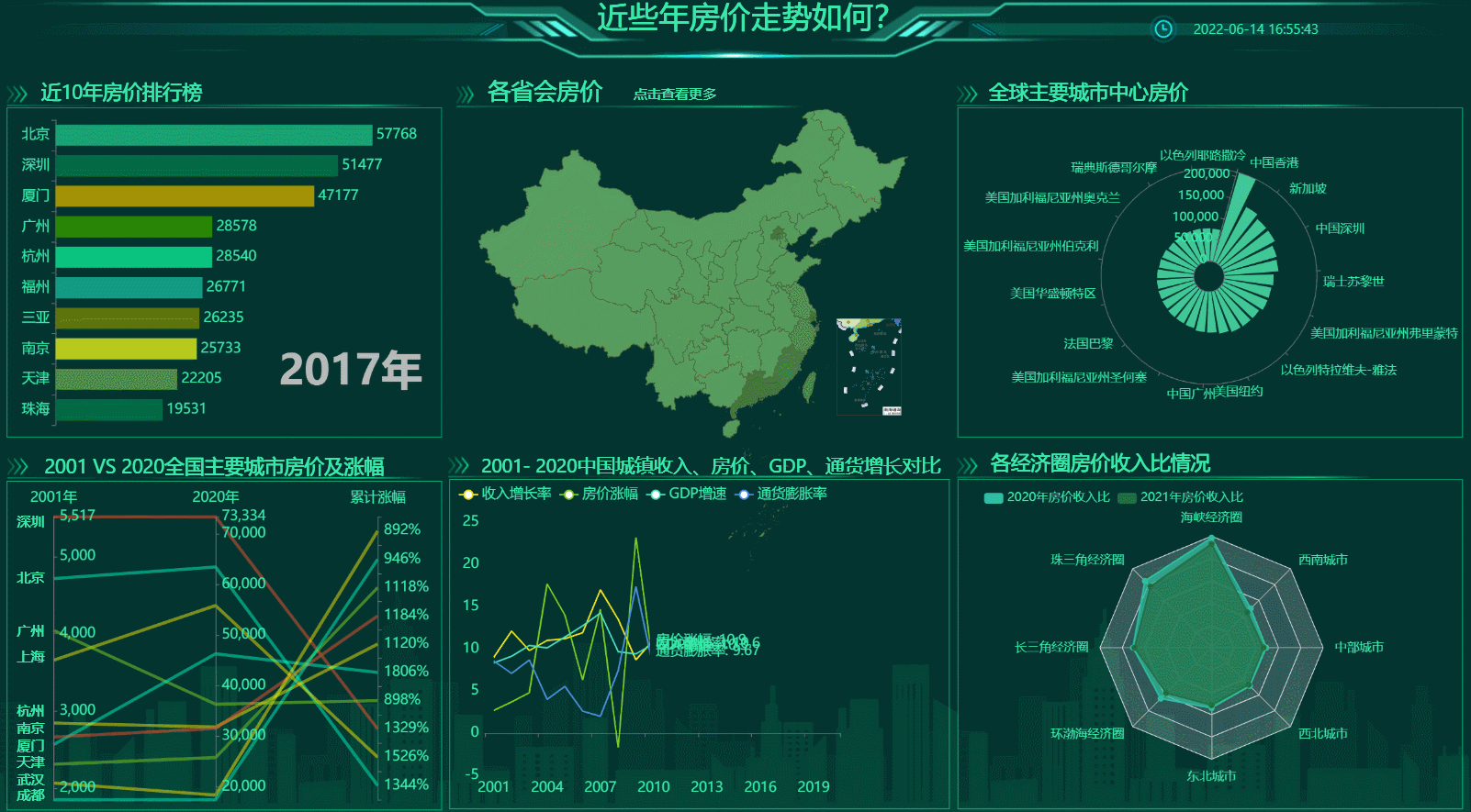
With 《 What is the trend of house prices in recent years 》 As an example . The housing price data of each provincial capital includes all provinces and cities in the country , It is best to use the map of China ; near 10 Ranking of annual house prices , The data spans the time dimension of ten years , Use dynamic data sorting diagram to show the best . Choose the chart with the right data , Is the best way to display data visualization .
- The large screen design should focus on the line of sight and avoid clutter
Clutter is your enemy , Data visualization screen The most taboo is disorder . When a blank page or screen , The audience's energy is occupied by the disordered charts . At this point, the meaning that the large screen wants to convey needs to spend more attention to try to identify , It also takes up extra brain power .
How to design a large screen , We need to think like designers , Strategically establish a graphical hierarchy , Help guide the audience to understand the information in the desired order .
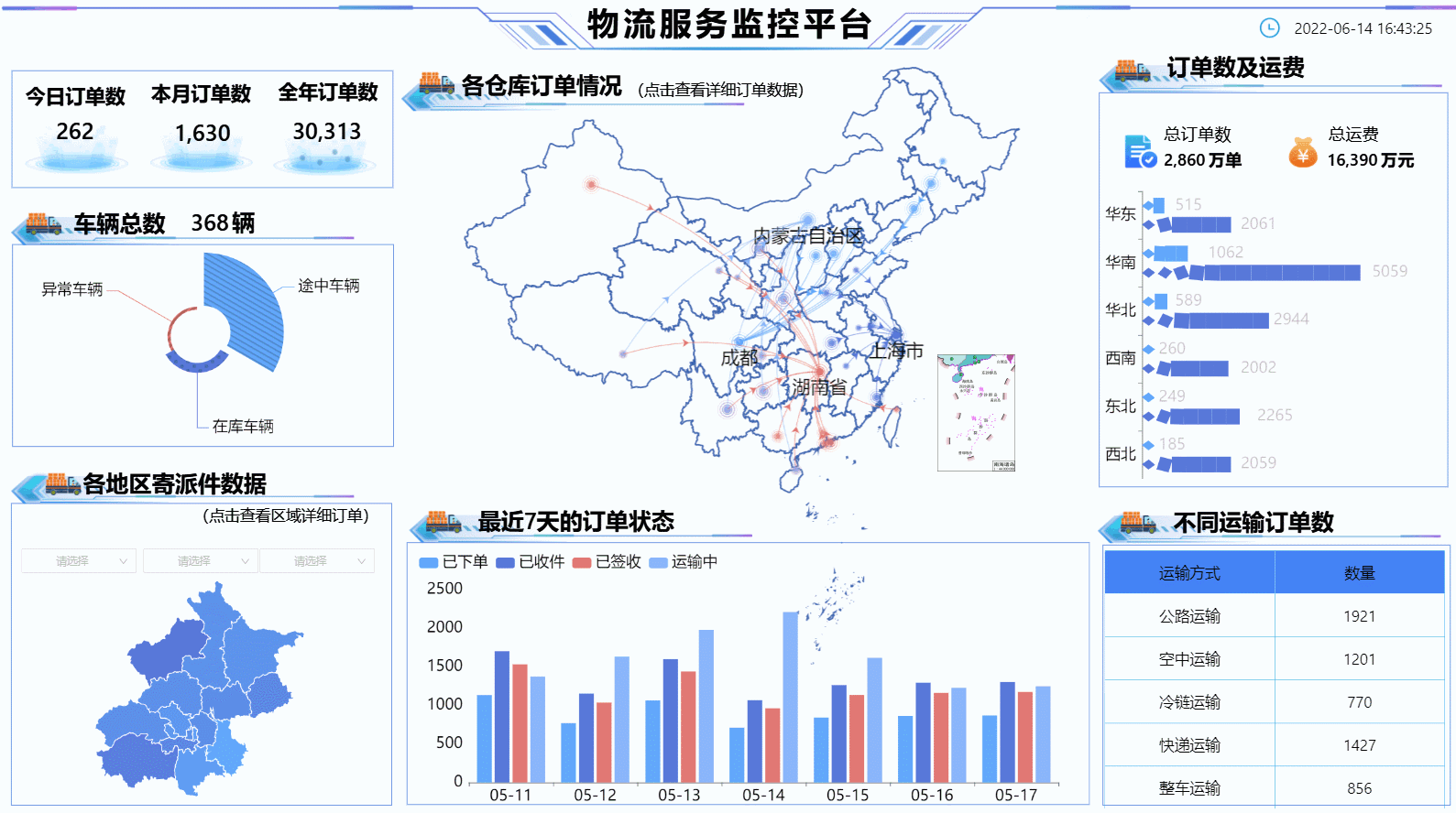
With 《 Logistics service monitoring platform 》 As an example , Visually, it is simple without losing its level , The large screen highlights the size of the chart 、 Color 、 Location and other attributes , And guide the audience to pay attention to what the designer expects from these attributes . Orders of each warehouse , Position in the middle and highlight the size , The vision tells us that this is the key data of the large screen .
- Choose the right data visualization tool
Choose a good one Visualization tools , It is the basis for data to tell a good story . There are many visualization tools in the domestic market , How to choose is particularly important .
First of all, the data chart should be rich , The more the better , The greater the range of options ; The second is operability , The simpler, the better , It is best to Zero code configuration ; Last but not least , free ! No charge for use . These points of this platform are consistent with , Friends who have visual needs can try it out .

- Conclusion
Data visualization It is the crystallization of science and art , It has a scientific side , We can follow the data to find the rules , There is also an artistic side , Present data with visible beauty , Use artistic thinking to simplify the process of audience understanding information .
边栏推荐
- 物体结构图,快速图解物体内部结构
- 开关磁阻电机悬浮驱动IR2128小结
- Precautions for running high-frequency and high-speed signal lines near PCB board - basic principles for high-frequency and high-speed signal design
- CAN总线基础知识
- Openjudge noi 1.13 51: ancient password
- The paddepaddle model is deployed in a service-oriented manner. After restarting the pipeline, an error is reported, and the TRT error is reported
- 不归零编码NRZ
- Win10 view my Ini path
- Const understanding one
- Less than a year after development, I dared to ask for 20k in the interview, but I didn't even want to give 8K after the interview~
猜你喜欢
The solution to prompt "this list creation could be rewritten as a list literal" when adding elements to the list using the append() method in pychart

ICer技能02makefile脚本自跑vcs仿真

电流继电器HDL-A/1-110VDC-1
Amazing tips for using live chat to drive business sales

Shadertoy basic teaching 02. Drawing smiling faces
Laravel中使用 Editor.md 上传图片如何处理?

ApiPost接口测试的用法之------Get

微信小程序实例开发:跑起来

TabControl style of WPF basic control

物体结构图,快速图解物体内部结构

随机推荐
Shadertoy basic teaching 02. Drawing smiling faces
Thinkphp6 template replacement
altium designer 09丝印靠近焊盘显示绿色警告,如何阻止其报警?
Usage of API interface test ------ post
1183. electricity
美团好文:从预编译的角度理解Swift与Objective-C及混编机制
Chrome debugging tips
Gson typeadapter adapter
prometheus、influxdb2.2安装及flume_export下载编译使用
左值与右值
centos7安装postgresql8.2.15及存储过程创建
Laravel 8.4 routing problem. At the end is the cross reference table on the left side of the editor, which can be understood by Xiaobai
Openwrt directory structure
go学习记录二(Window)
An understanding of free() (an error in C Primer Plus)
电流继电器HDL-A/1-110VDC-1
欢迎使用CSDN-markdown编辑器
重装Cadence16.3,失败与成功
PCB -- bridge between theory and reality
Abnova abcb10 (human) recombinant protein specification