当前位置:网站首页>An article takes you to understand CSS gradient knowledge
An article takes you to understand CSS gradient knowledge
2020-11-06 20:42:00 【Python advanced】
CSS3 Gradients allow you to smoothly transition your background color between two or more colors .
earlier , You have to use images to achieve these effects . However , By using CSS3 Gradients can reduce download time and bandwidth usage . Besides , Scaled elements look better when zooming , Because gradients are generated by browsers .
One 、 Browser support
The number in the table specifies the first browser version that fully supports this property .( From Baidu )
After the number -webkit- perhaps -moz- You need to specify the prefix when you use it .
| attribute | Chrome | Firefox | Safari | Opera | IE |
|---|---|---|---|---|---|
| linear-gradient | 26.0 10.0 -webkit- | 10.0 | 16.0 3.6 -moz- | 6.1 5.1 -webkit- | 12.1 11.1 -o- |
| radial-gradient | 26.0 10.0 -webkit- | 10.0 | 16.0 3.6 -moz- | 6.1 5.1 -webkit- | 12.1 11.6 -o- |
| repeating-linear-gradient | 26.0 10.0 -webkit- | 10.0 | 16.0 3.6 -moz- | 6.1 5.1 -webkit- | 12.1 11.1 -o- |
| repeating-radial-gradient | 26.0 10.0 -webkit- | 10.0 | 16.0 3.6 -moz- | 6.1 5.1 -webkit- | 12.1 11.6 -o- |
Two 、CSS3 Linear gradient ( Down / Up / towards the left / towards the right / tilt )
To create a linear gradient , Must define at least two color stops . Color stop is the color you want to render between smooth transitions . You can also set a starting point and a direction ( Or the angle ) And gradient effects .
grammar :
background: linear-gradient(direction, color-stop1, color-stop2, ...);
HTML Code :
<!DOCTYPE html>
<html lang="en">
<head>
  <meta charset="UTF-8">
  <title> project </title>

</head>
<body>

  <div id="grad1"></div>
</body>
</html>
for example :
Linear gradient - Up and down
Show a linear gradient from the top . It starts in red , Transition to yellow :
<style>
    #grad1 {
        height: 200px;
        background: blue; /*  For browsers that don't support gradients  */
        background: -webkit-linear-gradient(blue, yellow); /* Safari 5.1  To  6.0 */
        background: -o-linear-gradient(blue, yellow); /* Opera 11.1  To  12.0 */
        background: -moz-linear-gradient(blue, yellow); /* Firefox 3.6  To  15 */
        background: linear-gradient(blue, yellow); /*  Standard grammar  ( Must be the last ) */
    }
</style>

Linear gradient - Left to right
for example :
Show a linear gradient from left . It starts in red , Transition to yellow
<style>
    #grad1 {
        height: 200px;
        background: blue; /*  For browsers that don't support gradients  */
        background: -webkit-linear-gradient(left, blue , yellow); /* Safari 5.1  To  6.0 */
        background: -o-linear-gradient(right, blue, yellow); /* Opera 11.1  To  12.0 */
        background: -moz-linear-gradient(right, blue, yellow); /* Firefox 3.6  To  15 */
        background: linear-gradient(to right, blue , yellow); /*  Standard grammar  ( Must be the last ) */
    }
</style>

Linear gradient - Diagonals
Diagonal gradients can be achieved by specifying horizontal and vertical starting positions .
The following example shows a linear gradient starting from the upper left corner ( To the lower right corner ). It starts to be red , Transition to yellow :
<style>
    #grad1 {
        height: 200px;
        background: blue; /* For browsers that don't support gradients  */
        background: -webkit-linear-gradient(left top, blue, yellow); /* Safari 5.1  To  6.0 */
        background: -o-linear-gradient(bottom right, blue, yellow); /* Opera 11.1  To  12.0 */
        background: -moz-linear-gradient(bottom right, blue, yellow); /* Firefox 3.6  To  15 */
        background: linear-gradient(to bottom right, blue, yellow); /*  Standard grammar ( Must be the last ) */
    }
</style>

1. Use angle
If you want more control over the gradient direction , You can define an angle , Not the intended direction ( Next 、 On 、 Left 、 Wait right ).
grammar
background: linear-gradient(angle, color-stop1, color-stop2);
The following example shows how to use an angle on a linear gradient :
for example :
#grad {
  width: 100%;
  height: 100px;
  background: blue; /*  For browsers that don't support gradients  */
  background: -webkit-linear-gradient(-90deg, blue, yellow); /*  Safari 5.1  To  6.0 */
  background: -o-linear-gradient(-90deg, blue, yellow); /*  Opera 11.1  To  12.0 */
  background: -moz-linear-gradient(-90deg, blue, yellow); /*  Firefox 3.6  To  15 */
  background: linear-gradient(-90deg, blue, yellow); /*   Standard grammar  */
}

2. Use multiple stop colors
The following example shows a linear gradient with multiple stop colors ( From top to bottom )
for example :
#grad {
  background: blue; /*  For browsers that don't support gradients  */
  background: -webkit-linear-gradient(blue, yellow, green); /*  Safari 5.1  To  6.0 */
  background: -o-linear-gradient(blue, yellow, green); /*  Opera 11.1  To  12.0 */
  background: -moz-linear-gradient(blue, yellow, green); /*  Firefox 3.6  To  15 */
  background: linear-gradient(blue, yellow, green); /*  Standard grammar  */
}

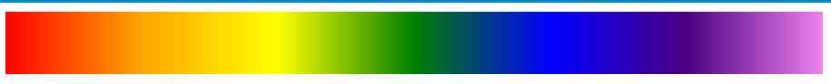
The following example shows how to use rainbow colors and some text to create a linear gradient ( From left to right )
Gradient background
for example :
#grad {
  background: blue; /* For browsers that don't support gradients  */
  /*  Safari 5.1  To  6.0 */
  background: -webkit-linear-gradient(left,red,orange,yellow,green,blue,indigo,violet);
  /*  Opera 11.1  To  12.0 */
  background: -o-linear-gradient(left,red,orange,yellow,green,blue,indigo,violet);
  /*  Fx 3.6  To  15 */
  background: -moz-linear-gradient(left,red,orange,yellow,green,blue,indigo,violet);
  /* Standard syntax */
  background: linear-gradient( To  right, red,orange,yellow,green,blue,indigo,violet);
}
3. Transparency of use
CSS3 Gradients also support transparency , Can be used to create a fade in effect .
Add transparency , We use it rgba() Function to define the stop color . stay rgba() The last parameter of the function can be taken from 0 To 1 Value , And define the transparency of the color :0 Indicates full transparency ,1 The color is the complete representation of ( The opacity ).
The following example shows a linear gradient starting from the left . It's starting to be completely transparent , Transition to full red :
#grad {
  background: blue; /*   Browsers that don't support gradients  */
  background: -webkit-linear-gradient(left,rgba(255,0,0,0),rgba(255,0,0,1)); /*Safari 5.1-6*/
  background: -o-linear-gradient(right,rgba(255,0,0,0),rgba(255,0,0,1)); /*Opera 11.1-12*/
  background: -moz-linear-gradient(right,rgba(255,0,0,0),rgba(255,0,0,1)); /*Fx 3.6-15*/
  background: linear-gradient(to right, rgba(255,0,0,0), rgba(255,0,0,1)); /*Standard*/
}

4. Repeat linear gradient
repeating-linear-gradient() Function to repeat a linear gradient :
for example :
#grad {
  background: blue; /*   Browsers that don't support gradients  */
  /* Safari 5.1  To  6.0 */
  background: -webkit-repeating-linear-gradient(blue, yellow 10%, green 20%);
  /* Opera 11.1  To  12.0 */
  background: -o-repeating-linear-gradient(blue, yellow 10%, green 20%);
  /* Firefox 3.6  To  15 */
  background: -moz-repeating-linear-gradient(blue, yellow 10%, green 20%);
  /* Standard syntax */
  background: repeating-linear-gradient(blue, yellow 10%, green 20%);
}

3、 ... and 、CSS3 Radial Gradient ( Defined by the center )
The radial gradient is defined by its center .
To create a radial gradient , You must also define at least two stop colors .
grammar
background: radial-gradient(shape size at position, start-color, ..., last-color);
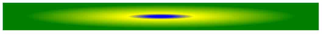
Radial Gradient - Evenly spaced stop color ( Default )
The following example shows a radial gradient , Its color is evenly spaced :
#grad {
  background: blue; /*  browsers that do not support gradients */
  background: -webkit-radial-gradient(blue, yellow, green); /* Safari 5.1  To  6.0 */
  background: -o-radial-gradient(blue, yellow, green); /*  Opera 11.6  To  12.0 */
  background: -moz-radial-gradient(blue, yellow, green); /*  Firefox 3.6  To  15 */
  background: radial-gradient(blue, yellow, green); /* Standard syntax */
}

Radial Gradient - Stop colors at different intervals
The following example shows a radial gradient with different spacing of color gradients :
#grad {
  background: blue; /* Browsers that don't support gradients  */
  background: -webkit-radial-gradient(blue 5%, yellow 15%, green 60%); /* Safari 5.1-6.0 */
  background: -o-radial-gradient(blue 5%, yellow 15%, green 60%); /*  Opera 11.6-12.0 */
  background: -moz-radial-gradient(blue 5%, yellow 15%, green 60%); /*  Firefox 3.6-15 */
  background: radial-gradient(blue 5%, yellow 15%, green 60%); /* Standard syntax */
}
1. Set shape
The shape parameter defines the shape . It can take a circle or an ellipse . The default value is ellipse .
The following example shows a circular radial gradient :
<!DOCTYPE html>
<html lang="en">
  <head>
    <meta charset="UTF-8">
    <title> project </title>
    <style>
      #grad1 {
        height: 150px;
        width: 200px;
        background: -webkit-radial-gradient(blue, yellow, green);
        /*  Safari 5.1  To  6.0 */
        background: -o-radial-gradient(blue, yellow, green);
        /*  Opera 11.6  To  12.0 */
        background: -moz-radial-gradient(blue, yellow, green);
        /*  Fx 3.6  To  15 */
        background: radial-gradient(blue, yellow, green);
        /*  Standard grammar ( Must be the last ) */
      }

      #grad2 {
        height: 150px;
        width: 200px;
        background: -webkit-radial-gradient(circle, blue, yellow, green);
        /*  Safari 5.1  To  6.0 */
        background: -o-radial-gradient(circle, blue, yellow, green);
        /*  Opera 11.6  To  12.0 */
        background: -moz-radial-gradient(circle, blue, yellow, green);
        /*  Fx 3.6  To  15 */
        background: radial-gradient(circle, blue, yellow, green);
        /*  Standard grammar ( Must be the last ) */
      }
</style>
  </head>
  <body>

    <h3> Radial Gradient - shape </h3>

    <p><strong> The ellipse ( This is the default ):</strong></p>
    <div id="grad1"></div>

    <p><strong> round :</strong></p>
    <div id="grad2"></div>

    <p><strong> Be careful :</strong> Internet Explorer 9  And earlier versions don't support gradients .</p>

  </body>
</html>

2. Repeat radial gradient
repeating-radial-gradient() Function is used to repeat radial gradients :
for example :
#grad {
  background: blue; /* Browsers that don't support gradients */
  /*  Safari 5.1  To  6.0 */
  background: -webkit-repeating-radial-gradient(blue, yellow 10%, green 15%);
  /*  Opera 11.6  To  12.0 */
  background: -o-repeating-radial-gradient(blue, yellow 10%, green 15%);
  /*  Firefox 3.6  To  15 */
  background: -moz-repeating-radial-gradient(blue, yellow 10%, green 15%);
  /* Standard syntax */
  background: repeating-radial-gradient(blue, yellow 10%, green 15%);
}

Four 、 summary
This article is based on html Basics , Through to css The gradient effect is explained in detail , Two common gradients are introduced . Through rich cases, we can better understand , To experience the use of gradients , Hope to help you learn better .
Want to learn more Python Web crawler and data mining knowledge , Go to a professional website :http://pdcfighting.com/ Want to learn more Python Web crawler and data mining knowledge , Go to a professional website :http://pdcfighting.com/
版权声明
本文为[Python advanced]所创,转载请带上原文链接,感谢
边栏推荐
- 消息队列(MessageQueue)-分析
- What if the front end doesn't use spa? - Hacker News
- Elasticsearch Part 6: aggregate statistical query
- 使用 Iceberg on Kubernetes 打造新一代雲原生資料湖
- Even liver three all night, jvm77 high frequency interview questions detailed analysis, this?
- Jmeter——ForEach Controller&Loop Controller
- Even liver three all night, jvm77 high frequency interview questions detailed analysis, this?
- StickEngine-架构11-消息队列(MessageQueue)
- Outsourcing is really difficult. As an outsourcer, I can't help sighing.
- GUI engine evaluation index
猜你喜欢

Even liver three all night, jvm77 high frequency interview questions detailed analysis, this?
What are PLC Analog input and digital input
What is the meaning of sector sealing of filecoin mining machine since the main network of filecoin was put online
What are Devops
es创建新的索引库并拷贝旧的索引库 实践亲测有效!
如何对数据库账号权限进行精细化管理?

Swagger 3.0 brushes the screen every day. Does it really smell good?
游戏开发中的新手引导与事件管理系统
Contract trading system development | construction of smart contract trading platform
C#和C/C++混合编程系列5-内存管理之GC协同
随机推荐
Analysis of serilog source code -- how to use it
A small goal in 2019 to become a blog expert of CSDN
快速排序为什么这么快?
C + + and C + + programmers are about to be eliminated from the market
Custom function form of pychar shortcut key
DC-1靶機
Named entity recognition in natural language processing: tanford core LP ner (1)
Introduction to X Window System
JNI-Thread中start方法的呼叫與run方法的回撥分析
開源一套極簡的前後端分離專案腳手架
StickEngine-架构12-通信协议
FastThreadLocal 是什么鬼?吊打 ThreadLocal 的存在!!
大道至简 html + js 实现最朴实的小游戏俄罗斯方块
01. SSH Remote terminal and websocket of go language
Contract trading system development | construction of smart contract trading platform
2020年数据库技术大会助力技术提升
It is really necessary to build a distributed ID generation service
Even liver three all night, jvm77 high frequency interview questions detailed analysis, this?
【学习】接口测试用例编写和测试关注点
Helping financial technology innovation and development, atfx is at the forefront of the industry